.
I don't do many "How To" posts about cartooning. I don't feel particularly well qualified--there are 3.74 million people doing this stuff better than me and I think of my own work as just adequate. I write and draw well enough to tell any story I can think up. I try to improve. I also think as fewer and fewer creators show interest in story or craft and readers' standards slip, my work will gradually look better and better.
.
(That last is a joke, but in fact I think few people making a living cartooning today--some very celebrated and successful--could have gotten a job in the 1950s. There are some legitimate reasons for that: styles and tastes change, and modern readers value a quirky authorial voice. That's great. Still, I can't think of more than a dozen contemporary cartoonists who would've been fit to clean brushes for Walt Kelly, Milt Caniff, Will Eisner or Stan Drake. Including me. Those artists knew so much we don't even know we don't know.)
.
However, I drew some stuff in the past few days that I thought turned out all right and might make a nice "How To" post. I noticed I'd used three different techniques to show the boundary between light and dark on a shaded object, and thought I could write about the techniques and the thinking behind them.
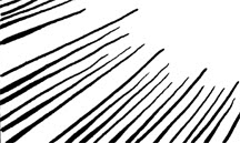
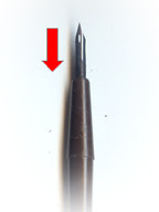
This is pretty simple but also exacting and a bit tedious. I'd use it to shade a smooth but not necessarily shiny object in bright light; it also makes a fine "Ka-Pow!" effect. Using a crow-quill nib, I start each line at the narrow pointy end nearest the light source and pull the pen toward me, pressing down gradually to make the line thicker as it goes.
You can do this very precisely using a straight edge to make sure the lines are straight and all converge to a single point. In this case I wanted to suggest a less even surface so I did it freehand. I wanted them wiggly and uneven.
The next surface is illuminated by a single bright light source that casts deep shadows. In this case, it's a cavern wall.
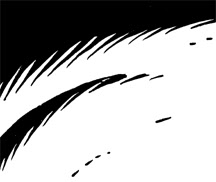
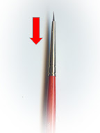
I do about 80% of my cartooning with a brush, this included. The technique is almost the same as above: starting at the pointy end of each shadowy spike, I pull the brush toward me (toward the top in this picture) and apply more pressure to widen it as I go.
You can pull the brush at the same angle for every point or, as I did here, change the angles to suggest and enhance the curve of the surface. Each gives you a different look.
The surface below is a hard, dark, and metallic. The points showing the transition from light to shadow are short because the edge is sharp.
.
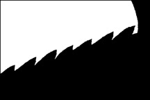
I could very well have just drawn a straight line instead, but wanted to suggest a rough texture, like iron. I used the same brush here, and again started with the tip at the pointy end of each spike. But instead of pulling the brush backward, I swept it sideways to make a thicker sawtooth line.

I only notice now that I haven't done any cross-hatching lately. I can cross hatch; I guess I'm just going for a cleaner, slicker look than that. In general, when I find myself wondering if I should cross hatch an area, I decide I'm better off just making it black instead. I think spotting blacks is a dying art--notice how few areas of solid black there are in a typical page of contemporary comic strips or comic book panels--and I try to exercise it when I can. It really helps a picture jump off the paper.
None of this decisionmaking is really conscious. I don't spend a lot of time mulling it over (maybe that's one of my problems...). I do think about what and where the object is, and my pen or brush seems to know how to do the rest. I trust my tools.
.
No comments:
Post a Comment