Thursday, August 28, 2014

Jack Kirby


I hadn't intended to write anything on the great comic book artist Jack Kirby, who would've been 97 today if he hadn't died in 1994 (I always find it odd when someone wishes a dead person a "happy birthday" as if they care--commemoration I understand, but celebration?). Then I came across enough other mentions of it that I thought I could muster a Facebook quip, then enough others that I thought I could make a post of it. And here it is.

Kirby represents a lot of things to the comics industry, and has come to represent more since his death. In his time, he was a dynamic storyteller whose style was unique and unmistakably his. Along with Stan Lee, Kirby built Marvel Comics in the 1960s. The X-Men, the Fantastic Four, the Silver Surfer, Captain America, Thor, the Hulk, the Avengers: without Kirby, they'd have been very different or not existed at all (I pointedly omitted Spider-Man and Iron Man, whom Kirby had little to do with). Perhaps more importantly than the multitudes of characters he created, Kirby brought a grandeur and pop-art respectability to comics. He made them cool, even for adults.

That is not a trivial accomplishment.

In later years, Kirby became estranged from Lee and Marvel, and switched his allegiances to DC Comics, where he wrote and drew some of the strangest Superman and other stories ever told. Without a writing partner to rein him in (or stifle him), Kirby produced some pretty wild and crazy stuff--not all of which I'd call "good" but ALL of which was interesting, worthwhile and, again, uniquely, idiosyncratically Kirby. Questions of "plot," "story," "logic" and "characterization" fall by the wayside when you're being punched in the face by a four-color dynamo.

One of those weird Superman stories.

After his passing, Kirby became the quintessential "Comics Creator Done Wrong." Comics were a different business when Kirby got his start in the 1930s and '40s, and aren't celebrated for their enlightened labor policies even now. It goes without saying--and yet is still occasionally argued in court--that writers and artists like Kirby had no ownership of the characters they created. It's called "work for hire." There were no royalties or profit-sharing. Kirby's creations have made billions of dollars for movie studios and shareholders, millions of dollars for the actors hired to portray them, and comparative pennies for Kirby and his heirs.

Generally, I don't like judging people and practices of the past by the standards of the present (yes, horrified future citizens of the 22nd Century, I burned fossil fuel and ate meat!). Times were different. The business was different. Expecting a 1940 pulp-paper publishing house to live up to 21st-Century intellectual property ideals seems grossly unfair to me. STILL...a movie studio could slip 1% of Robert Downey Jr.'s paychecks to the Kirby family and set them up for life. S'all I'm sayin'.

Writer Mark Evanier, who worked as Kirby's assistant, often says that Jack saw it all coming: ideas from the comics spilling into other media, mainstream acceptance, movies and TV adopting the language and spectacular imagery of comics as soon as their technical capabilities caught up with the imaginary vistas one man could conjure with a pencil. None of the current success of superheroic entertainment would have surprised him.

Like a lot of comic book readers, I didn't like or get Kirby when I was a kid, being more impressed by the "realistic" illustrative styles of artists like John Buscema or Neal Adams. As often happens, as my sophistication as a comics consumer (and later, a comics creator) grew, so did my esteem for Kirby. His imagination was unparalleled, his output prodigious. His work is pure, distilled, iconographic comics ENERGY.

Comics journalist Tom Spurgeon posted a nice large gallery of Kirby artwork, which represents just a tiny fraction of his output. Rather than duplicate Tom's effort, I'll post one of my favorite Kirby pieces that doesn't have any superheroes in it at all. I saw this in the beautiful big book Kirby: King of Comics written by Evanier (and edited and published my my editor and publisher). I don't really know Mark but I've met and talked with him a few times, and when his book came out I told him there was one page in particular that really knocked my socks off. He knew exactly which one I meant without me saying another word.


It's a double-page spread from a story titled "Street Code" drawn in 1983. This is Kirby's pencil art, not yet inked for publication. The detail in this is incredible. Astounding. Even more impressive is how those details are composed so that the setting and all the action are perfectly clear. Areas of black and white guide the reader's eye around the page exactly as Kirby intended, taking in a dozen different dramas in this theater of the street. So much rich detail, from the prices of the fruit to the architecture of the tenements, yet there's nothing muddled about it.

There's also some typical Kirby wonkiness in this drawing. Kirby approached human anatomy as more of a suggestion, and his perspective could be very . . . impressionistic. For example, that car on the right is huge and the back of that horse-drawn ice wagon is nearly two stories tall. Those are not flaws that need to be fixed. Those are Kirby. When the rules get in the way of storytelling, the rules lose. Being "better drawn" would not make it a better comic.

Jack Kirby was a comics giant who needs to be remembered and appreciated. I guess his birthday is a good day to do that.
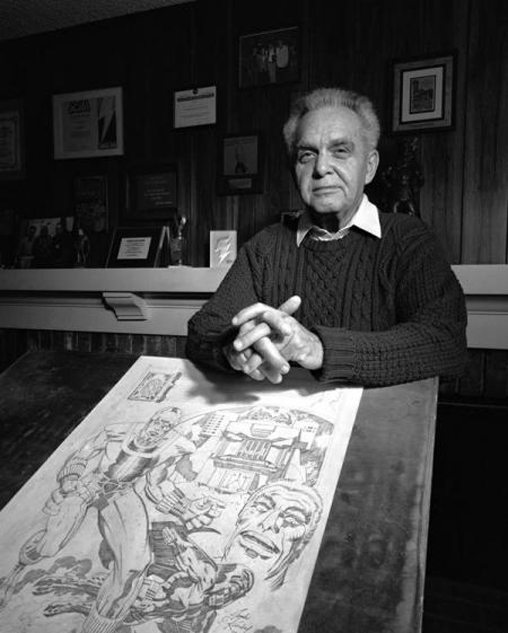
Photo by Greg Preson, I'm informed.

Thursday, August 21, 2014

A Tale of Two Pages

I was working on my webcomic, The Last Mechanical Monster, and found some forgotten files that I thought might make a good, quick, process post. Some folks enjoy my occasional looks at how I make comics (always with the caveat that my way isn't the only way or right way, it's just mine). Here's some behind-the-scenes on two pages of my webcomic, Pages 82 and 83.

Page 82. For some reason, I kept a scan of my blue-line artwork for this page, which I don't normally save. I'll explain. Comics are traditionally drawn on paper with pencil, then gone over with black India ink to make the lines sharp and clear for reproduction.

(This all assumes that the modern cartoonist isn't working totally digitally, which many are. I'm a dinosaur.)

Conventional graphite pencils--such as the good ol' No. 2--are fine for penciling and many cartoonists use them. However, after being inked, those pencil lines need to be erased.

I don't like to erase; it takes time, dulls the black lines, and risks smudging the art or damaging the paper.

Instead, I use blue pencil. It's a habit I picked up in the days, decades past, when light blue was used in printing and publishing because it didn't show up in photostats and photocopies. The pencil lines essentially turned invisible, leaving only the black inked lines. It still kinda works like that, except now I delete the blue lines in Photoshop.

So here's my blue-line pencils for Page 82, with the borders already ruled in black. In this scan I've increased contrast to make the blue lines dark enough to see. In real life, they're very light.


As I've gained experience and confidence, my penciled art has gotten more spontaneous and loose. I try not to overthink it. It's "swoopy." If I were penciling for someone else to ink later (as is common in comic book production), I'd add more detail and work "tighter." But since I'm a one-man show, I trust myself to remember what I intended and choose the best line to ink among the three or four penciled lines I might draw.

I also mention something every time I describe my process because it's very important: the words go first. In the old days that was literally true: the text was lettered onto the board before anything else was inked. These days I letter digitally, so it happens last. But when I'm sketching the page I still place the words first, and leave plenty of space for where I know they'll go. On this particular page, the words are all captions narrating a flashback, so placement was easy. It's more important with dialog in word balloons, which have to be carefully placed to guide and pull the reader through the page.

Also notice the center panel, which has a note that reads, "House of Jewels. Copy Fleischer?" I hadn't yet decided how to draw that panel, and ended up digitally manipulating a screen capture from the 1941 Fleischer "Superman" film that my webcomic used as a launching point.

Unfortunately, I didn't save any interim steps, but here's the final Page 82 as it appeared in the webcomic:


A word about lettering: I do it digitally now. I didn't used to; Mom's Cancer is all hand-lettered right on the original artwork, just as it appears in the book. In fact, it's that experience that converted me to digital. Hand lettering is very hard to edit--you have to rewrite it and try to take up the same amount of space. It's hard to lengthen or shorten. When it comes time to translate a comic into foreign languages, you have to go through and delete the text from each individual word balloon and caption so it can be replaced. Far easier--far, far easier--to edit at the speed of typing, lengthen or shorten at will, and delete at the touch of a keystroke. The lettering is still mine. I sampled letters from Mom's Cancer to create my own font/typeface. I wrote a much more detailed blog post about that process a few years ago.

Page 83. I don't have any early drafts of Page 83 to share, but there's still some stuff I can talk about. First, here's the page:


Our point of view is very near ground level, which is a dramatic perspective that has to be handled carefully. The bottom or base of every object in the drawing is in a narrow band near the bottom of the page. A little girl, a giant robot, an adult woman, two cars, a couple of skyscrapers: if you're off by even a hair, the girl could look like a giant or the skyscrapers look like dollhouses.

Perspective helps define the space. The diagram below shows a Horizon Line (pink), which is the key to perspective. I deliberately placed the Horizon Line to be at the little girl's eye level (even though we can't see her eyes) to strengthen the idea that we see what she sees. This drawing has three Vanishing Points, which is atypical for me--usually two Vanishing Points are adequate, but this dramatic angle demanded the third. Two of the Vanishing Points are on the Horizon Line, and the angles of the skyscrapers point to them (blue and green lines). The third Vanishing Point is in mid-air above the Robot's head (orange lines) because we're on the ground looking up at it.


[This particular drawing is complicated by the fact that the two buildings sit at an angle to each other, rather than parallel or perpendicular, so each building actually has two Vanishing Points on the Horizon Line, for a total of five in this drawing. But that's over the top. Never mind.]

When I'm drawing, I define the Horizon Line and Vanishing Points by drawing a sort of grid. I don't have an example of how I did it for Page 83, but here's a page I did for Whatever Happened to the World of Tomorrow showing all the perspective grid lines:

Also three-point perspective, this time looking down. All these lines were originally light blue.

I've learned that whenever I'm having trouble with a drawing--it's just not working or I can't figure out how to make it look right--that about half the time, I haven't defined my Horizon Line and Vanishing Points. Get them right and everything else falls into place.

Page 83 also showcases a weakness of mine that I might as well be honest about: cars. I already came clean about how poorly I draw automobiles in a blog post a few years ago when I was making WHTTWOT. Every high school art class has one student, usually a boy, who excels at drawing squealing hot rods belching fire from their shiny chrome pipes. I was not that boy. Cars are hard because they have a lot of complex curves and everyone is very familiar with them, so if the proportions aren't right they instantly perceive it. So I cheat.

In this case, I took snapshots of a model 1939 Chevy from an appropriate low angle. This is one of the same models I used in the chapter of WHTTWOT set in 1945.


I then used Photoshop to convert those snapshots to a light blue "duotone" (50% cyan) and print them onto a piece of heavy paper.


Next step: trace the photos. There's more thought and skill involved in this step than you might think. I used the same brush I use on everything else, keeping in mind that I'd be shrinking the cars to a very small size in the final art. Consequently, I drew with a thicker line than I otherwise would've, and left out a lot of detail. It didn't matter if the line was a little shaky: it wouldn't show when reduced, and to the extent it did show, it'd just make them look as if they were drawn by hand rather than a machine.


Then I scanned the drawings into Photoshop and made the blue disappear . . .


. . . and inserted the cars into the final drawing. Notice that I flopped one of them so it's headed into the composition rather than out of it.

I think that process probably sounds more complicated and time consuming than it is. I'm not proud that I need to resort to it, but it's the fastest way for me to get the results I want. I can live with it.

That didn't turn out to be as quick a post as I thought.

Tuesday, August 19, 2014

Something More Pleasant?

I just finished Roz Chast's graphic novel Can't We Talk About Something More Pleasant? There are words I don't like to use because they only appear in stuffy book reviews: "unflinching," "carefully observed," "towering achievement." But what a book.

Chast writes and draws about shepherding her neurotic, difficult parents through the end of their lives in a way that'll make you both love and hate them, and want to give Chast a hug. The highest compliment I can give Chast is that she's honest, particularly about herself. Her book is (I can't think of another way to say it) an unflinching, carefully observed, towering achievement.

My friends in Graphic Medicine should pay attention, it's a big contribution to the field.


Sunday, August 17, 2014

Back to Blair


For my birthday a few months ago, my daughters gave me a certificate good for one free admission to the Mary Blair exhibition at the Walt Disney Family Museum in San Francisco, because they're that cool. Since the show closes in just a few weeks, I cashed in my certificate yesterday. Karen and I and the girls had a great time.

Museum Pro Tip: If you're a member of any museum, check to see if that entitles you to free admission or discounts to other museums. Many have such arrangements, in particular through the North American Reciprocal Museum program, which networks almost 700 (!) of them. In our case, because I have a family membership to the Charles Schulz Museum, we got into the Disney Family Museum free and only had to pay an extra five bucks a head for the special Blair exhibit (which my girls didn't know on my birthday but didn't mind taking advantage of). My Schulz membership paid for itself in one visit. Deal!

Mary Blair was an artist who did much of her work for Walt Disney over several decades, but also did art for Little Golden Books, greeting cards, and non-Disney films. She was a concept artist for Disney movies such as Peter Pan, Alice in Wonderland, and Cinderella, and designed tile murals for Tomorrowland and Disney World's Contemporary Resort. Her best-known project is probably Disneyland's "It's a Small World" attraction which, as I wrote in an appreciation of Blair in 2011, whether you love or hate it, you have to admit she designed the heck out of.

As I also wrote in that 2011 blog post, I didn't used to like her style. I thought it was simple and sentimental. It wasn't until later, when I began to think seriously about art and comics, and to do my own professional work, that I got what she was doing. Her geometrical, flat, almost cubist style was deceptively sophisticated, and her sense of color was masterful. Walt Disney said she understood color better than anyone who ever worked for him. She achieved my cartooning ideal: distilling a subject to its simplest essence, so that a single brushstroke could capture a character or tell an entire story. You have to work really hard to make it look easy, and Blair was one of the best.

A watercolor study for Dumbo. A lot of these photos show glass reflections in them, hard to avoid.

One of Blair's more iconic images. This work was pretty large but many of them are surprisingly small.

Another iconic Blair graphic, from Alice in Wonderland.

This was probably my favorite piece in the exhibition, so I'm posting it extra large; it really knocked my socks off. From Cinderella. There's light blue glow from the Moon on the treetops (funny how you know those looming blue blobs are a forest even though they look nothing like a forest) and the magical white pumpkin carriage whose coach lamp lights up the back of the horses' necks as well as the ground below and the tree trunks alongside. That swoop of white that goes from the tree trunks to the carriage to the ground pulls your eye right to the focal point of the composition. There's a lot of goodness going on here.

Three concept art pieces from Peter Pan.
A close-up of the top painting above, found online. These are examples of the smaller pieces I mentioned, maybe 5 x 7 or 6 x 8 inches or so. Many had four pinholes in the corners, from (I presume) when they were mounted on corkboards at the Disney studios during film production for the animators to study.
Another Peter Pan. Again, look at the light on the sails, illuminated from unseen lamps on the ship's deck. Makes you want to peek around the rock and see what's going on. Also the sparkling stars in the glowing water that don't reflect any stars we see in the sky, giving the scene a weird magical quality.
A cool Christmas card design.

The Disney Family Museum exhibition gives a good survey of her career, from early student work to her late efforts. It's interesting to see her style evolve from good but unexceptional watercolor illustrations to some point in her mid- to late-twenties when you say, "There she is!" Mary Blair wasn't born with her trademark style, she created it. I imagine her thinking "Wow, this really works!" and building it brick by brick.

A watercolor by young Mary as an art student.
An overview of the Blair exhibition space, which covers two floors. Color!

It's depressing and humbling to realize she was a better artist at 25 than I'll ever be. That's the risk you take going to museums.

I also came away with a feeling I remember having after seeing a show of director/animator Tim Burton's work at the New York Museum of Modern Art: awe for how prolific she was. Like Burton, Blair must've gotten up every morning and created three amazing things before breakfast. Paintings, sculptures, textiles, tiles. Both artists made me feel incredibly lazy.

In addition, the Blair exhibition inspired me to get back to color--real color, not Photoshop color. For years I've focused on black ink on white paper, and I love black ink on white paper, but seeing her pieces made me feel like a man in the desert who didn't realize he hadn't had a drop of water in a long time. No promises, but I'd like to take up watercolors again, or perhaps even give gouache--my least favorite medium and Blair's best--another try (shudder). I'm unlikely to share the results but I think it'd do me some good.

So I got a lot out of the Blair exhibition and, even if you're not a wannabe artist like me, I recommend it. It's only at the Disney Family Museum until Sept. 7. Go spend the day at the Presidio, enjoy some of the best views of the Golden Gate Bridge on Earth, hike down to Fort Point under the bridge, say "Hey, this is where Jimmy Stewart pulled Kim Novak out of the Bay in 'Vertigo'," have a good day.


Friday, August 15, 2014

Snoopy, Bingo, Doolittle and Me

The Charles M. Schulz Museum celebrated its 12th anniversary with free admission and ice cream cake last night. Had a nice low-key time talking with museum Education Director Jessica Ruskin and two people I'm proud to know a little, Brian Narelle and his wife Robin Goodrow.

Brian is a cartoonist/writer/actor who uses comics therapeutically (I need to hook him up with Graphic Medicine...). In his younger days he was one of the stars of the cult classic sci-fi film "Dark Star" playing Lt. Doolittle, directed by a young up-and-comer named John Carpenter.

Brian drew dozens of sketches for kids, and had a line all evening long.
Lt. Doolittle (on left) looks very concerned. If you haven't seen "Dark Star" I recommend it: low budget, smart, weird, and very darkly funny.

If you were a kid growing up in the San Francisco Bay Area in the 80s and 90s, you may remember Robin as the star of the TV program "Buster and Me." More recently she did a program called "Bingo and Molly." Lots of puppetry and positive messages, very sweet.

At arm's length with Robin.
This was Robin a few years ago, with a great ape named Vanilla. As I posted this photo, it occurred to me that Vanilla is pawing her almost exactly as I am in our selfie, just mirror-imaged. 

Between them they've got some Emmy Awards, and they're two of the kinder and gentler people I know. They also knew Robin Williams, so I spent a few minutes talking with Robin about him. Brian was too busy drawing cartoons for museum visitors; he had a line all evening, so I just had a moment to say Hi to him.

Nice people, nice place.