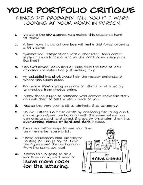
This advice is making the rounds of cartooning circles. Steve Lieber is a successful graphic novelist and comic book artist, mostly superheroes but also other genres. I'm sharing because I think it packs a lot of wisdom in one tight package and I don't disagree with any of it.
A great deal of comics craft is similar to filmmaking, and I find it interesting that the art forms developed on parallel tracks at about the same time (origin in the late 19th century, explosion of artistic innovation in the 1920s and '30s, etc.). We pull from the same toolbox.
For example, the "180-degree rule" says that you draw a line through the scene or the characters, and the artist's point of view--the "camera," if you will--always stays on one side of that line to avoid radical changes of perspective that confuse the reader/viewer.
Lieber's tips about composition, establishing shot (a wide view that shows the reader where they are and who's in the scene), and depth of field also apply to filmmaking. Making a comic is very similar to directing a movie, and a young cartoonist could learn a lot from a film studies course.
The tip I would emphasize, and the one I always encourage young artists to do myself, is Number 6: Draw from Life. Cartoonists simplify and stylize, it's what we do, but that simplification and stylization should still be rooted in reality. My main complaint about the manga-flavored stylization I see MANY young cartoonists adopt is less about the style itself, which I have no real beef with, than the fact that they're drawing someone else's version of a car or a cat or a face, not their own. Sit down and draw a cat from life as accurately as you can, then simplify it and polish it until you can't possibly draw the cat with fewer lines, and that's a cartoon cat in YOUR style that I bet won't look like anyone else's.
Number 11 is important. Whenever a drawing isn't working for me, and I just can't figure out how to arrange the characters and background, often it's because I haven't defined where they are in space. Establish a horizon line, draw a grid if you have to, and everything usually falls into place.
Number 12 I would amend to advise cartoonists to place the lettering first. Then you don't have to worry about leaving enough room for the words, you're drawing the art around them. Text pulls the reader's eye through the page, it guides them and sets the pace. If a reader gets lost, very often it's because you've placed the text wrong (the other big reason readers get lost is because you've laid out the panels wrong).
Making comics involves a surprising depth of craft that, when it works, should be invisible. Almost everybody learns by doing it wrong. I still do it wrong, just less than I used to.
