Nicely done! (I don't know why the audio blinks out at 20 seconds, but that's not important.) The technique is called "tilt-shift," and it's a way of tricking the eye to perceive real-life objects as if they were miniature models. The primary visual cue is focus, or depth of field. Think of it like this: if you look at a bunch of stuff on your desk, objects that are 2, 3 and 4 feet away from you are at different focal lengths. If you focus on one, the others are blurry. On the other hand, if you look at a bunch of stuff down the block, objects that are 1002, 1003, and 1004 feet away from you are all at virtually the same focal length and appear equally sharp.
So what you do is take a photo in which everything is at about the same focal length--overhead shots of large vistas work best--and progressively blur the bottom and top (that is, the nearest and farthest distances in the photo) to simulate being out of focus. I fake it in Photoshop, but you can also use a specialized camera lens to shoot tilt-shift photos in real time. It helps sell the illusion if you jack up the contrast until everything has a saturated, plastic sheen. The Allstate commercial goes further by making the action jerky, like stop-motion animation.
Here are some before-and-after photos I did back in October 2006 when I tried the technique. Some work better than others. I haven't played with it since, but would like to. Sometimes the results are pretty startling.
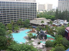
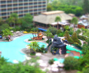
The swimming pool at the Disneyland Hotel. This one is helped by the fact that Disney builds things like pirate ships that already look like toys anyway.

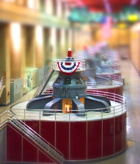
Hydroelectric turbines at Hoover Dam. This one was greatly enhanced by boosting the colors' intensity to a candy-colored glow.
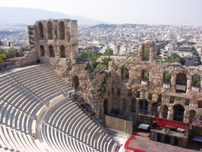

An ampitheater in Athens. This one was tricky. I kept the entire stone wall in focus while blurring the rest of the top and bottom of the picture. Then I cut out the arched windows to let the blurry background show through. I should've done more with the red-rimmed stage at lower right; in the tilt-shift image, it's hard to tell what and where it's supposed to be.
Here are a couple more. Again, some are better than others.

A rail station near Venice, Italy. I kept the yellow light pole in focus by masking it from the blurring effect, which helps sell the illusion.
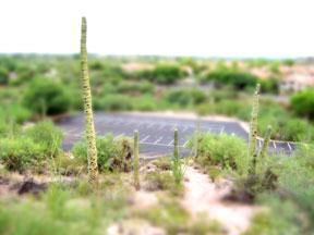
Cacti in Tucson, Arizona. The one on the left was probably 20 to 25 feet tall. Again, I masked the two tallest cacti to keep them sharply focused while gradient-blurring the background and foreground.
What I like about the tilt-shift technique is what it reveals about how we perceive, the cues we use to judge relationships and distance, and how amazing the brain is at putting it all together. Also how easily and subtly the brain can be fooled. It's pretty incredible when you think about it.
..
Oh, THANKS, Brian! Just what I need on a work night: an irresistible new toy for Photoshop!
ReplyDeleteYour tilt-shifted images are, predictably, fascinating, but (selfishly) what they've done for me is to kick me in the butt to try my hand at the form. A lot of my spare time recently has been spent on Flickr, and I can't escape an ongoing fascination of some of my favorite photographers with the tilt-shift, faux-mini thing.
Believe it or not, a search within Flickr for tilt-shift images produces more than 300 groups devoted to it!
I don't have very many images that lend themselves to faux-minis, but I do have a few of baseball games, which are prime candidates -- especially if one is of the economic class that sits in the "cheap seats" well above field level.
So I looked back through the archives, and found the game recounted in this entry in "SherWords": a family outing to the Oakland Coliseum for a game between the A's and the Seattle Mariners, where we sat in the second deck, about 20 feet above field level, minimally appropriate for Photoshopping a faux-mini, shift-tilt thingie.
Here's my first attempt at a tilt-shift from that outing. It could be tweaked a lot, and I will do that, but I wanted to link it in thanks to you for giving me the impetus to try the thing.
Just what I need on a work night.
But thanks anyway.
That's terrific! It's an amazingly convincing effect, isn't it? A baseball game is a perfect tilt-shift subject--as you said, the higher in the stands the better, because you'd get more difference between foreground and background, and it would better duplicate the POV of a person peering down on a table-top model.
ReplyDeleteI knew about the Flicker groups, found some of them back in 2006 ("you darn kids, why when I first did tilt-shift way back in the autumn of ought-six . . .). And here's a link to work by Olivo Barbieri, one of the first I know of to take tilt-shift and run with it:
http://www.metropolismag.com/story/20060116/model-world
Show us more! You may have inspired me to waste a day digging through my photo archives and making some new ones myself. Don't tell Karen.
If anyone else wants to give it a shot, there are some good tutorials online. Just google. One I found at www.photographyjam.com was very helpful.
Show us more!
ReplyDeleteDone!