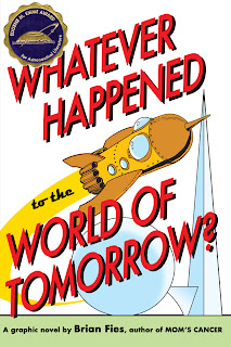
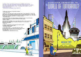
Making a book cover is a unique, challenging part of the publishing process. Different writers with different publishers have more or less frustrating stories than mine. I know of some writers who designed their own covers with little trouble at all, and others who had the decision taken entirely out of their hands and wound up with covers that misrepresented their stories and torpedoed any hopes of success.
My experience designing covers with Abrams for Mom's Cancer, the hardcover Whatever Happened to the World of Tomorow, and now the paperback WHTTWOT, falls toward the more happy, collaborative end of that spectrum (I blogged about the Mom's Cancer cover in 2006). However, it's a different type of collaboration than any other part of the publishing process. What happens on the inside of the book is a conversation primarily between my editor, Charlie Kochman, and me. In contrast, deciding what happens on the outside of the book involves many, many people, some of whom may not have even read it.
That's because (and what follows is purely my interpretation and opinion, not anything authoritative from Abrams) a cover's primary role is marketing rather than editorial. That's a keen distinction. A book's cover is the lure that teases a potential customer to pick it up. Secondarily, it's a statement about the publisher itself: "We make books that look like this." Corporate identity. Neither of these roles is something an author is necessarily attuned to or skilled at. Which is why, in addition to me and Editor Charlie, cover design involves graphic designers, art directors, marketers, publicists, and a whole committee of decision makers up to Abrams publisher Michael Jacobs.
On paper, I believe my contracts give Abrams the right to cover my books however they want. In practice, Editor Charlie promised that he'd never put a cover on my book I didn't like. He's as good as his word and so far we're three-for-three, although I've sometimes needed persuading. As a graphic novelist, I do have a small bit of leverage: if a cover idea requires any new art, they need me to draw it!
With that, I thought I'd describe some of what went into making the new paperback cover for WHTTWOT for all six of my readers who like peek-behind-the-curtain posts. It was a back-and-forth process over several weeks that involved me, Editor Charlie, Abrams Designer Sara Edward Corbett, and Abrams Art Director Chad Beckerman.
As I composed this post, I decided it wouldn't be fair to include sketches I received from Sara and Chad. Their work was part of a collaborative brainstorming process, some of which was pretty rough, and I don't think it's right to publish it. They should feel free to do their jobs without worrying whether some yahoo writer is going to post it on his blog months later. Rather, I'll just show sketches I did, with the understanding that ideas were flowing both directions and many of the concepts below stemmed directly from Sara's, Chad's and Charlie's contributions.
Idea Zero: make the paperback look just like the hardcover. Of course we couldn't do the die-cut paper "belly band" that wrapped around the hardcover, but Charlie and I were both impressed by how WHTTWOT's German publisher handled the hardcover, adding a glossy varnish over the top "futuristic" half of the image and giving the bottom half a matte finish:
So here's my first take, making the front look basically the same and flopping the futuristic tableau, which appeared under the belly band of the original, onto the back:
Even as I did it, I knew this idea was dead on arrival. The honest reason: the hardcover was not a big seller. Oh, I guess it sold all right, it wasn't a humiliating embarrassment, but it really didn't do as well as Abrams and I hoped and thought it might. Consequently, one big goal for the paperback is to attract readers who maybe didn't notice it, or didn't like what they noticed, before. Ergo, new cover.
Now the fun starts.
I argued strongly that whatever else the cover contained, it had to show the characters--either Cap Crater and the Cosmic Kid, or Pop and Buddy. I felt that it was important to emphasize their relationship--to say WHTTWOT is a story about these people as much as the evolving technology of the times. The first several rounds of cover design incorporated that element.
As we worked, Editor Charlie and I shared a concern that the cover not look too juvenile. It's a comic, yes, but not a children's book. That's a narrow tightrope to tread. I think we both felt this direction fell on the wrong side.
At the same time, I was trying to find some inspiration among paperback covers of the 1940s and '50s, examples of which abound online. That line of thinking led to this:
Meanwhile, Sara was offering her own take on retro styling, which led to concepts like these:
 |
| This wouldn't have been a cover by itself, but it influenced many ideas that used its circle "target" motif. I really liked this; in fact, I made myself a little pin-back button using this graphic. |
 |
| Sara also came up with the "sunburst" element that we played with a lot. |
 |
| I liked the nested and overlapping circles in this composition. Epicycles. |
Pretty far into the process, I decided I was wrong about needing the characters on the cover. We were already trying to convey a lot of information; characters just made the cover look cluttered and, again, juvenile. I think I may have dismayed Editor Charlie after championing the characters so enthusiastically and then changing my mind, but I really came to believe that the simpler and more iconic we made the cover, the better:
I may have been particularly frustrated the day I thought, "Fine, if they want to make sure everybody knows it's a comic book, let's just make it look like a gosh-darned comic book!" (I probably used language stronger than "gosh-darned" inside my head.) Hence:
Sometime in the middle of this process, my family and I took a vacation to Disneyland, where I saw a t-shirt in Tomorrowland and thought, "Hey, that'd make a great book cover!" The inspiration seemed entirely appropriate to me, since WHTTWOT pegs Walt Disney as one of the influential public figures who not only portrayed the World of Tomorrow but helped shape it. Also because a little piece of Tomorrowland actually makes a secret appearance in the book. I bought the shirt (tax write-off!) and came home to do a couple dozen variations on the theme:
 |
| The t-shirt |
 |
| Different colors, graphics, types, etc., pulling together many of the elements we'd developed thus far. |
I think a minor epiphany occurred when Sara did a sketch in which she wrapped my futuristic graphic cityscape, which appears in the background of the last sample above and comprised the back cover of the hardcover edition, around both front and back covers. I can't speak for anyone else, but for me that seemed to shake everything loose and reassemble it in a way that made perfect sense and looked perfectly right. Combining that with the other components we'd been working with gave us a semi-final cover that looks like this:
What this image doesn't show is that the cover will be printed on silver foil so it'll be shiny, particularly in spots like the spaceship windows and the Trylon and Perisphere. It's going to be very, very nifty.
One insight Charlie and I have discussed many times is that when a cover is finally right, you can't imagine it looking like anything else. It is what it was meant to be. You're all welcome to disagree, but I think Charlie, Chad, Sara, the Cover Committee and I achieved that here. I'm happy with it, proud of it, and can't imagine a better lure to draw in a potential reader.
 |
| Except this. Sadly, they didn't go for it, either. |


The thing is, this isn't just nifty.
ReplyDeleteAnd it isn't just very nifty.
I agree with you. It's very, very nifty.
(And this was fascinating to me. Thanks for sharing the process. There ARE reasons to work with the Big Guys Who Know Things.)
Nice.
ReplyDeleteWhat Mike said. Fascinating! And I can't wait to see the new cover at our local graphic novel emporium, Strange Adventures, which has stocked the hardcover religiously.
ReplyDeleteWow, that must have been agony coming up with so many different designs all to convey the same general idea. In my job designing and laying out circuits, they say, "Never fall in love with your layout," because no matter how well you do it, inevitably there will be changes required. Despite knowing that fact, it's always torture to redraw something you already did right the first time! I imagine it must be doubly hard for actual artists where the design truly comes from the heart. Thanks for sharing the path you had to take. Maybe I'll stop complaining about having to redraw layout. Well, complain less, anyway.
ReplyDelete"Never fall in love with your layout" is good advice, though sometimes it's impossible not to.
ReplyDelete