I'm annotating individual pages from my book Mom's Cancer as they're posted on GoComics.com. These are my notes on Pages 12 and 13 (June 8 and 11).
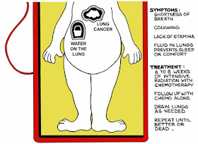
This image of Mom as the character in the "Operation" board game often gets a strong reaction. It tends to be one of people's favorites or least favorites.
Occasionally people who haven't read a comic since "Little Dot" in 1966 accuse me of "making fun of my mother's illness," which couldn't be further from the truth--but I think this might be the sort of drawing that leads them to believe that. It does combine the deadly serious with the absurd, which was one of the points of Mom's Cancer. So much of the situation was absurd!
I don't remember how I thought of using this iconography. I think I wanted to take a breath and summarize what Mom's condition was at this point. How to do that in a comic? You can't just list symptoms and treatments with words, you need a way to show them. Diagrams, x-rays? Somewhere in that train of thought, the board game came to me.
One thing I like about splitting the image into two pages is it naturally divides Mom's tumors, and therefore the treatments she received for them, between her head and her chest. Which is basically what happened: she had head doctors and chest doctors, and rarely did the twain meet.
In the first draft I posted online, I just drew the "Operation" character in its original style as a stand-in for Mom:
I never liked that solution--not least because I didn't want to get sued by Milton Bradley--but my problem was a simple one: I didn't want to draw my mother fat and naked! I don't know how long it took me to solve it by putting a medical dressing gown on her, but it was an embarrassingly long time.


Anyone can easily understand the complexity in narrating the intimacy of characters and attachment
ReplyDelete