Friday, May 28, 2010

Paint it Black

(This rerun from February 2009 might be a bit too "inside baseball" for some, but gets a lot of search-engine visits. This is the kind of thing I wish someone had told me before I started getting my comics in print.)
.
This is kind of a tough topic because it's about knowing how something on your computer monitor is going to look when it winds up in print--which I can only try to explain here using a computer monitor. Still, I'm gonna give it a shot because it's what I've been working on the last couple of days, and yet another way in which I'm trying to turn problems I had on Mom's Cancer into solutions for Whatever Happened to the World of Tomorrow?

I've posted before about how full-color pictures are typically printed using four colors of ink: cyan, magenta, yellow, and black (CMYK). If you've got an inkjet printer, same deal. The first three colored inks are transparent, so that printing cyan atop yellow produces green, for example. Black ink is . . . oh, I don't know . . . not quite transparent but definitely not opaque. Semi-transparent? The key is that, although black covers better than the other inks, it doesn't cover totally. You can't just paint an area black and expect it to cover everything underneath.

I don't think I'm giving away anything about a book titled Whatever Happened to the World of Tomorrow by revealing that some of it deals with outer space. Now, on my computer monitor, when I color an area with 100% black, it looks as black as the inkiest ink puddle at the bottom of an ink well on Planet Ink. But when I hand off those digital files to Designer Neil, he can push a button ("overprint preview" in Adobe InDesign) to approximate what they'll look like when reproduced with actual ink on paper. The result: something that appears solid black on screen comes out kind of charcoal gray in print.

Okay, I knew that. Learned it on Mom's Cancer. Black by itself doesn't cover as well as you'd like or expect. To help black ink look really black, you need to fortify it with other colors to make what's called a "rich black." It's like laying down a primer coat when painting a wall at home. As shown below, different color combinations yield different tints of black.

Four different blacks that would look identical on a computer monitor, but which I've processed here (as Designer Neil did) to approximate how they'd look in print. At upper left is 100% black by itself. Going clockwise are 100% black with 100% cyan, 100% black with 100% yellow, and 100% black with 100% magenta.

You might be tempted to mix all the colors with black--100% black plus 100% cyan plus 100% magenta plus 100% yellow--but that would be a gloppy mistake. You need to remember you're working with liquid inks on absorbent paper. Reality trumps theory. No one wants an ink slick.

What I didn't really have a handle on until Neil and I started talking was how those different tints of black would look together. For example, below is a panel with black and black on black: the shaded side of the Earth and the shaded side of the Moon on the blackness of space behind them. My goal was to make those three blacks very subtly different. To that end, the blackness of space has some cyan and magenta mixed into it, the blackness of Earth has a bit more cyan (hard to tell in this low-res image), while the blackness of the Moon has a greyish earthtone.


It took some effort to get the tones of those blacks to balance. If they're too different, the different elements can either wash out or become too prominent. For example, in my first try, the star background was too gray and the planets looked like stickers stuck on a piece of faded construction paper. I'm pretty happy with the look I achieved above.

Anyway, that's what I did today: went through the entire book looking at every big patch of black to decide if it needed other colors mixed with it (not all did), what those colors should be, and how they worked with other blacks, grays, and colors around them.

While I'm on the subject, I'll talk about grays. There are a couple of ways to skin that particular cat, and it helps to have a sense of how they'll each look in print. One way is to use only black ink printed in tiny dots of various sizes to give the illusion of different shades of gray, as in a black-and-white newspaper photo. The other is to mix cyan, magenta, and yellow inks (plus black for darker tones) to produce a gray.

In the image below, the top left square and top right square look like about the same shade of gray. They're not. The close-up views below show that the left gray box is composed of little black dots, while the right gray box is composed of overlapping cyan, magenta and yellow dots.

Two similar grays, but the one on the left is made up of black dots, while the one on the right is made up of cyan, magenta, and yellow dots.

While the grays look interchangeable on a computer monitor, they give you different effects in print. A black-only gray is colder and crisper, while a cyan-magenta-yellow gray is warmer and softer. It's a hard difference to describe but can be quite apparent on the page, especially when two different types of gray are next to each other. I had some trouble with that in Mom's Cancer, and tried to turn it to my advantage in WHTTWOT as a subtle effect I could deliberately wield where I wanted.

We'll see how it all works in actual print, and if it was worth the effort.

I understand Neil has already transmitted some final files to the printer. We'll still have opportunities to make changes to the proofs if needed, but the book is essentially locked down now. A milestone achieved.
Thursday, May 27, 2010

Three Shades

(This post is a rerun from October 2007 that still draws some visitors.)
.
I don't do many "How To" posts about cartooning. I don't feel particularly well qualified--there are 3.74 million people doing this stuff better than me and I think of my own work as just adequate. I write and draw well enough to tell any story I can think up. I try to improve. I also think as fewer and fewer creators show interest in story or craft and readers' standards slip, my work will gradually look better and better.
.
(That last is a joke, but in fact I think few people making a living cartooning today--some very celebrated and successful--could have gotten a job in the 1950s. There are some legitimate reasons for that: styles and tastes change, and modern readers value a quirky authorial voice. That's great. Still, I can't think of more than a dozen contemporary cartoonists who would've been fit to clean brushes for Walt Kelly, Milt Caniff, Will Eisner or Stan Drake. Including me. Those artists knew so much we don't even know we don't know.)
.
However, I drew some stuff in the past few days that I thought turned out all right and might make a nice "How To" post. I noticed I'd used three different techniques to show the boundary between light and dark on a shaded object, and thought I could write about the techniques and the thinking behind them.


This is pretty simple but also exacting and a bit tedious. I'd use it to shade a smooth but not necessarily shiny object in bright light; it also makes a fine "Ka-Pow!" effect. Using a crow-quill nib, I start each line at the narrow pointy end nearest the light source and pull the pen toward me, pressing down gradually to make the line thicker as it goes.


You can do this very precisely using a straight edge to make sure the lines are straight and all converge to a single point. In this case I wanted to suggest a less even surface so I did it freehand. I wanted them wiggly and uneven.

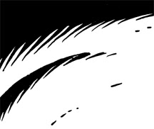
The next surface is illuminated by a single bright light source that casts deep shadows. In this case, it's a cavern wall.


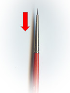
I do about 80% of my cartooning with a brush, this included. The technique is almost the same as above: starting at the pointy end of each shadowy spike, I pull the brush toward me (toward the top in this picture) and apply more pressure to widen it as I go.


You can pull the brush at the same angle for every point or, as I did here, change the angles to suggest and enhance the curve of the surface. Each gives you a different look.

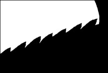
The surface below is a hard, dark, and metallic. The points showing the transition from light to shadow are short because the edge is sharp.
.


I could very well have just drawn a straight line instead, but wanted to suggest a rough texture, like iron. I used the same brush here, and again started with the tip at the pointy end of each spike. But instead of pulling the brush backward, I swept it sideways to make a thicker sawtooth line.


I only notice now that I haven't done any cross-hatching lately. I can cross hatch; I guess I'm just going for a cleaner, slicker look than that. In general, when I find myself wondering if I should cross hatch an area, I decide I'm better off just making it black instead. I think spotting blacks is a dying art--notice how few areas of solid black there are in a typical page of contemporary comic strips or comic book panels--and I try to exercise it when I can. It really helps a picture jump off the paper.

None of this decisionmaking is really conscious. I don't spend a lot of time mulling it over (maybe that's one of my problems...). I do think about what and where the object is, and my pen or brush seems to know how to do the rest. I trust my tools.
.

Wednesday, May 26, 2010

Two Hours in WimpyWorld

(Today's rerun isn't very old--October 2009--but it gets a lot of traffic for obvious reasons, and I had fun writing it. Most gratifyingly, Jeff got a kick out of it, too. In retrospect, I was a little hard on Publicist Jason: I only intended to tell a funny little story about a smoothie, but later heard he might've caught some real flak for it. No harm was meant or insult perceived on my end; he's a great guy, really.)
.
Jeff Kinney, author of the Diary of a Wimpy Kid series, had a signing at a Barnes & Noble bookstore about an hour from my home yesterday, and invited me down for a late lunch beforehand. I really didn't intend to mention it here. Spending time with a friend and then breathlessly blogging about it seems very uncool. However, I found the experience so unique and interesting I couldn't resist. Plus, as you'll see, Jeff knew I'd write about it. My rationalization: very little of this post--just one tiny story--is actually about Jeff. Mostly, it's about the world around Jeff. WimpyWorld.

Here's what you need to know: Jeff is on a book tour to support his new book, Diary of a Wimpy Kid: Dog Days, which is currently the bestselling book in the United States. Not kid's book, not graphic novel--the bestselling book, more than Dan Brown, Stephanie Meyer or Sarah Palin. This is the fourth book in the Wimpy Kid series. The first three books remain numbers 23, 24 and 29 on USA Today's list of the Top 150 Bestsellers. Altogether, they've sold tens of millions. A movie is coming out next spring. It's not quite Harry Potter territory, but it's close.

I know Jeff because we have the same editor and publisher. I was at the New York Comic-Con the day Jeff brought his book idea to Editor Charlie, and Jeff has been gracious enough to mention that he did so because he knew Abrams had published Mom's Cancer. So I witnessed Wimpy Kid's publishing birth, and gave Jeff some early advice that he remembers fondly even though he doesn't need it anymore, and we've stayed in touch. Let's just agree that he owes it all to me.

Jeff's signing yesterday was due to start at 5 p.m. We arranged to meet in front of the bookstore at 3 p.m. I arrived early to find a few hundred people already waiting in a line that meandered around the perimeter of the parking lot. They weren't waiting to see Jeff; they were waiting to get a ticket to see Jeff. Mall security looked like it was already overwhelmed and frantically called in reinforcements. A policeman cruised through to figure out why a line of pedestrians was backing up onto the city sidewalk a block away. I called Jeff's cell.

The line along the parking lot when I arrived. It quickly grew to turn right down the lane in the distance and spill out onto the city streets.

"Jeff, I'm in front of the store. I don't think you want to meet me here." I described the scene. He was surprised; apparently crowds have been more modest elsewhere.

"All right," he said. "When you see the bus, just knock on the door. We'll let you in and find somewhere to eat."

"The bus?"

"You didn't know about the bus?"

"No. You have a bus? A bus bus?"

Jeff laughed. "You'll know it when you see it."

A few minutes later, I knew it when I saw it:

The bus. It's usually rented by rock bands on tour. Its previous occupant was the singer Pink. I offered the driver $100 to drive it down my block. He didn't.

The crowd roared. Well, since most of the crowd was younger than 12, it more squealed than roared. Either way, it got excited and loud. I jogged to intercept the bus some distance from the bookstore. Instead of letting me on, Jeff got off, and we ducked into a restaurant while the bus continued to the store, a giant yellow decoy. We had a very nice, quiet time to relax and talk over a pizza, which I ate most of because Jeff has learned not to tackle a marathon booksigning on a full stomach. I let him pick up the check anyway. Two big, loud families of Wimpy Kid fans came in and sat behind us; Jeff kept his head down. We finished and walked over to the bookstore, where the line had vanished because folks had gotten their tickets and either gone inside or left to return later.

Jeff inside the bus. Big-screen TV and entertainment center, full bath, a big master bedroom in the back and six bunks for roadies (which he doesn't have). Evidently, driving around the country in one of these costs about the same as flying from city to city, with a lot more comfort and less hassle. Jeff invited me to stay aboard and ride to Los Angeles with him last night. I may kick myself the rest of my life for declining.

Finally making myself useful, I found Publicist Jason (who travels with Jeff) and helped smuggle Jeff through a side door into a back room of the store. It was now about 4 p.m., and the store had begun a scavenger hunt and other games to keep hundreds of little rascals busy, happy, and non-destructive. Jeff really wanted to start signing early so the kids wouldn't have to wait, but the ticket system made that hard to do. People who had stood in line longest to get the first tickets might not come back until the scheduled start at 5 p.m., and beginning early wouldn't have been fair to them. Jeff reluctantly agreed to stick to the plan, and instead sat down to sign every Wimpy Kid book the store had in stock that hadn't already been bought by fans waiting outside. He autographed probably 400 or 500 books before he even began the actual booksigning.

Jeff taking a call in the back room. Publicist Jason is at left and bookstore employees at right. I earned my keep by helping uncrate and stack books for Jeff to sign. Each box holds 40 books.

Here's the one story I'm going to tell about Jeff. I was distracted doing something else when Publicist Jason started to hand me his credit card. Jeff waved him off.

"What?" I asked.

"Would you mind getting Jeff a Jamba Juice?" Jason asked.

"No no," protested Jeff. "You don't have to."

"I'd be happy to get you a Jamba Juice," I said.

"No, it's fine."

"Really. No problem."

"It wouldn't be right," said Jeff. "Besides, you'd put it in your blog and make me look like a jerk."

Looks like I put it in my blog anyway, Jeff. You should've taken the Jamba Juice. (Luckily, Publicist Jason later had a chance to get the Jamba Juice himself.)

With boxes of books autographed and stacked, signing time rolled around. Announcements were made, lines formed throughout the store, a path was cleared between the back room and the signing table near the registers. Knowing I'd have no chance later, I said goodbye to Jeff and we lined up to pierce the throng, a phalanx of bookstore employees, Publicist Jason, Jeff, then me, with a couple of clerks guarding our rear. The door opened; we charged. Children squealed, women wept, and I think a blind man may have touched the hem of Jeff's garment and regained his sight.

A few feet before we reached the table I peeled out of formation and POP! in an instant I was out of the WimpyWorld bubble, just another member of the mob that security wouldn't let stand around taking pictures. (The problem isn't the pictures, it's the standing. Gotta keep things clear and moving.) I signed the store's one copy of Whatever Happened to the World of Tomorrow? and left for home.

Jeff at work. Barnes & Noble counted 2,800 people last night. Insane.

Brian Epstein managed The Beatles. He couldn't play an instrument and no one knew who he was, but everywhere The Beatles went Brian Epstein went, standing behind them or just outside the shot. For two hours yesterday, I got as close I will probably ever get to being Brian Epstein, and it was strange and fun. But I don't think I'd want to be Brian Epstein full time. And I know for sure I wouldn't want to be The Beatles.

.

Tuesday, May 25, 2010

Line

(Another rerun post that people using search engines seem to like, this one from October 2008. Although I hint at the end that I might follow up, I never really did. There's definitely a lot more to be said, and I'm more conscious than I was even two years ago that there are many valid perspectives on the subject. This isn't meant to be the right approach or only approach, just mine.)
.
It's easy to talk about "line" in drawing without ever really defining it. It's a vague and slippery arty-farty term that can make you sound smart without really pinning you down. "His work has such an expressive line!" Well ... who can argue with that? But what, if anything, does it mean? This post takes a stab at describing what I mean when I look at, judge, and draw a line.

I remember clearly the moment I first got the concept of line. It was a college life-drawing class, when the instructor showed us a cartoon by Michelangelo with everything in the image obscured except one line that ran from a figure's hip to its ankle. (Originally, a "cartoon" was a sketch an artist did in preparation for a painting and is the sort of cartoon I mean, although it is cheeky fun to refer to giants like Mike as "cartoonists." Technically true.) This ochre scribble had form and mass. It carried weight and seemed to twist in and out of the page. When you really looked at it, it was astonishingly graceful and expressive. And it was just a single line! Somewhere in my hippocampus, a penny dropped.

Cartoonists traditionally (that is, pre-digitally) draw their lines in pencil first, then go over them with ink pens or brushes to make them black. Many (probably most) artists like their pencils better than their inks, finding the preliminary work more spontaneous and lively. That's not true for me. I never feel like one of my drawings comes to life until I've inked it, and I think the quality of line and the tools I draw it with make the difference. Those tools are a fine sable or sable-synthetic brush and a variety of nibs, usually crow-quill.

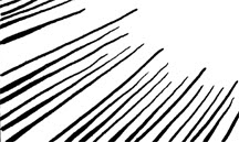
The lines above were made by (top to bottom) a brush, a stiff crow-quill nib, and a more flexible crow-quill nib. I make them thick or thin just by pressing harder or lighter as I draw. I can use these different line weights in a few ways: first, to indicate light and shadow; second, to suggest mass; third and more subtly, to represent something I'm not sure what to call but the best word I can think of is "tension."

Light and shadow are obvious. Lines facing toward the light are thin and those facing away are thick. Usually, light comes from overhead so lines defining the undersides or bottoms of things should be heavier. Mass is also obvious: heavy objects take thicker, bulkier, rougher lines than light ones. Anvils and clouds demand different line weights. Then there's "tension," by which I mean I make my lines thinner where an object is stretched or tight, and thicker where it's loose or full. It's easier to show what I mean with a quick example:

In this drawing, light's coming from above. My line is thinnest at the crown of the head both because it's nearest the light and the skin stretches tight and thin against the skull. In fact, it's so thin the line actually disappears for a bit. Ditto for the bridge of the nose: it's facing the light and the skin is taut. The line is thicker under the nose and lower lip, where shadows fall, and along the jawline, which is both farthest from the light and fleshier. However, it's thinner on the chin itself because the skin is firmer there. The lines defining the sides of the head gradually widen from top to bottom, indicating the transition from light to shadow and also the fact that the face gets looser toward the bottom. This is a slightly saggy middle-aged person; if I wanted to draw a teenager, I'd keep the line lighter toward the bottom because the skin is tighter.

Here's just another quick example showing two identically sized boxes, except the one on the left is hollow cardboard while the one on the right is solid concrete:
Obviously, the heavier object has a heavier line. Another difference between these cubes is that on the cardboard box the line weight is the same from top to bottom, while on the concrete cube the lines thicken from top to bottom. This implies that the bottom of the concrete cube is carrying a lot of weight, more and more as you approach the floor, while the cardboard box is light as a feather. I exaggerate this effect by widening the sides and rounding the corners of the concrete cube as if it were bulging under its own mass, while conversely narrowing the sides and sharpening the corners of the cardboard box as it it were holding itself up with no trouble at all.

I'm not sure how conscious I am of this stuff when I'm inking. It seems like a lot to think about! I know I always start with an awareness of where the light is coming from. The rest just seems to flow. I recall seeing a video of Charles Schulz teaching a cartooning class in the mid-1970s in which he told the students, "when you draw grass, think of grass." I don't mean to get too mystical mumbo-jumbo about it, but I think that's how it works. When I'm drawing cardboard or concrete I think "cardboard" or "concrete," and my brain-hand combo seems to do the rest.

Application, with a Bonus Rant
Now, in addition to thinking about and applying this stuff, you've got to simplify it. Cartooning is distillation, stripping a drawing down to the essential infomation needed to communicate. That's the toughest for me, and where I struggle the most. It's so much harder to draw something with two lines than twenty! I think this aspect of cartooning makes the line even more important as it's tasked with conveying more and more information. An inky squiggle can be a blade of grass, a coyote falling off a cliff, or a brick zipping past at the speed of sound. Only the skill of the cartoonist and the mind of the reader who comprehends the symbols and fills in the missing details gives the squiggle meaning.

What dismays and frustrates me is how few contemporary cartoonists seem to think about this stuff, or even be aware that they can or should think about this stuff. Fifty years ago, this is what professionals did. Understanding line was the bare minimum required to get into the club. Milt Caniff was a hugely influential giant to two or three generations of cartoonists not because "Terry and the Pirates" and "Steve Canyon" were swell comic strips but because he was a master of line. Same with Roy Crane, Walt Kelly, Wally Wood, or any of forty or fifty other greats I could list.
.
"Steve Canyon" by Milt Caniff. If I had 1%
of his ink-line mojo, I could die happy.

Without naming names or pointing fingers, that doesn't seem to be the case anymore.

It's tempting to pin the death of skillful linework on the rise of digital art--and I think poorly done digital art does have a bland, sterile coldness to it--but in fact some cartoonists (e.g., Darrin Bell) produce very lively lines on the computer. You just have to work at it. But in order to work at it, you have to realize it's worth knowing and doing in the first place. Unfortunately, I fear the art of cartooning has eroded to a state where many of its practitioners don't even know what they don't know. I'm far (way far) from an expert at any of this; the more I learn, the more I realize how ignorant I am. But I'm trying.

Cartooning is hard enough as it is. We've got a hundred years' worth of tools to do the job, many of them hand-forged and left for us by master craftsmen in decades past. Why anyone would toss out and neglect those tools until all they have left in the toolbox is a cracked hammer and bent screwdriver is beyond me.

UPDATE: Re-reading the next day, I realize a lot more could be said about line. This wasn't intended to be comprehensive, just a first stab. In addition to the few variations I described, lines can be bold, tentative, coarse, tremulous, precise, Impressionistic. Each affects the reader. An artist's line can become their signature: the smooth elegance of Al Hirschfeld or nervous scritchiness of Ed Koren are instantly recognizable. Lack of a lively line can also be a style choice. For example, "Dilbert" and "Pearls Before Swine" use very uniform lines that reinforce the bleakness of their universes. Whether or not Scott Adams and Stephan Pastis made that choice deliberately, I think it works for them.
There's a lot to think about. Maybe more later.
.

Monday, May 24, 2010

How Did I Miss This?!


Interrupting the reruns to celebrate the best literary news I've heard in a long time: the autobiography of Mark Twain is about to be published 100 years after his death, as directed in his will. I love Twain's work, consider myself a fan, but never heard of this autobiography (except as a failed project) or his strange stipulation. Apparently he wanted to speak his mind without hurting anyone's feelings or sullying his reputation. According to this article, while scholars have had access to the work and bits have been published before, more than half of the 5000 pages have never seen print.

I'll anticipate this eagerly. Will Twain, the quintessential American writer, delve into politics, race, art, literature? Will his frank opinions seem enlighted beyond their years or relics of old prejudices? Or, as some speculate, will they just be the bitter ramblings of an angry, dying old man?

Regardless, I love the idea of Twain becoming a literary celebrity in the 21st century, just as he was in the 19th and 20th. At this writing, pre-orders on Amazon have boosted the book's rank to #368 (that's high!), and it's not out until November. What a kick it would be to see the name "Twain" sitting atop the bestseller lists in 2010-2011.
.

How I Cartoon

(This post is a rerun from November 2005, when Mom's Cancer was at the printer and a few months from its debut. My cartooning technique hasn't changed a lot since I originally wrote this. I use non-photo blue pencil now instead of regular graphite--I always alternated between the two, and prefer to use blue because I don't have to erase it. I don't letter by hand on the originals anymore, and I'm much more facile with Photoshop these days. But this remains a valid "how to," especially the conclusion. "Bird by bird.")
.
All quiet on the literary front. As far as I know, printers in Asia are churning away, chunkity-chunking out copies of Mom's Cancer while I sleep peacefully through the night half a world away. I look forward to getting one in my hands. Meanwhile...

On my main site, I used to have a "How To" page describing how I drew Mom's Cancer. I took it down after a while--don't remember why, maybe it occurred to me that no one cared. But what is a blog if not a repository for material about which no one but its author might care?

My method is very "old-school" cartooning, with a bit of computerization thrown in at the end. Increasing numbers of cartoonists work entirely on computer and love the results. I haven't yet found a technology that gives me the same versatility and control I enjoy with a brush. Plus, for me, the act of putting pencil and ink on paper is the most satisfying part. Why would I want to give it up? In some circles, this makes me a dinosaur.

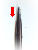
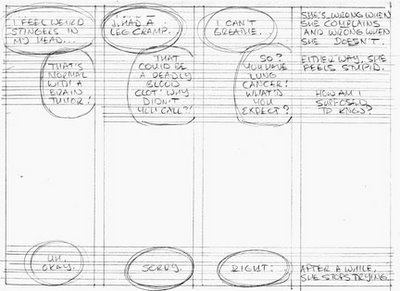
I begin with a script and a blank sheet of 9-by-12-inch 2-ply vellum bristol board. Following a rough thumbnail sketch on scratch paper, I rule in borders and lettering guides in light pencil, then rough in the captions and word balloons:


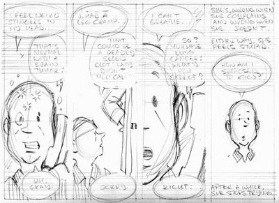
The words go first because it's critical that they have enough room and the eye follows them around the page as intended. Then I pencil the art. It's still pretty loose at this point:
I rule borders and other straight lines using a fountain pen, and letter with waterproof black India ink using Speedball nibs B-6 and B-5 (for bold).
Art is also inked with black India ink using a variety of small sable or synthetic brushes. Fine details and lines (like those on Mom's shirt or the pattern on her hat) are done with a crow-quill nib.

After erasing pencil lines with a kneaded eraser, I scan the art into Photoshop to add shading and any color needed. I also do a fair amount of editing at this stage...fixing mistakes, erasing blemishes, and sometimes rewriting entire bits of dialogue by cutting and pasting words or even individual letters. A few years ago, this would've been done with X-Acto knives, rubber cement and White Out. Computers are much better.

When I had the time to sit down and work non-stop, I could finish two or three pages per day. However, I very rarely got such time and did the best I could, when I could. The hardest part? Laying down Line One on Day One, knowing that I had more than 100 pages and many months to go. Anne Lamott tells a story about her 10-year-old brother struggling to complete a huge report on birds the night before it was due. Overwhelmed and immobilized, he asked his father how he could possibly get it done. Dad answered, "Bird by bird, buddy. Just take it bird by bird." That's how I did Mom's Cancer: bird by bird.

Sunday, May 23, 2010

Roots

(This post, a rerun originally posted in my old blog in June 2008, is a favorite of mine.)
.
Many people who aren't from California and have seen too much "Baywatch" are surprised by how agricultural the state is. California's Central Valley is some of the most productive farmland in the nation, and there are small towns a hundred miles from Los Angeles or San Francisco that are as rural as any you'd find in the deepest backwaters of South Dakota (and I pick on South Dakota because I love it). My father-in-law grew up in such a farm town, and it was to that town that Karen and I drove last weekend to attend the wedding of a friend's son.

We arrived several hours early because we wanted to check out a few things and meet Karen's sister and her family for lunch. The town had maybe 2500 people when my father-in-law was a boy working in his father's appliance store, but because it lies on a big highway and is within commuting distance of the Bay Area (it's a two-hour drive each way but some crazy people do it), it's grown to about 25,000. The highway is now lined with a Wal-Mart, Home Depot, Target and the like, which has destroyed the old downtown district three blocks away. Half the storefronts are deserted, the other half you wouldn't necessarily want to go into, but it still retains the architectural bones and charm of its early 20th-century origin. You think, "man, they'd really have something great here if they could just turn it around," but they probably won't and it'll all crumble away and that's the way of things these days.

After lunch, we all went to the local two-room museum because we'd heard there might be something of particular interest to us there. The "open" sign was up but the door was locked and we walked around puzzled, finally finding an unlocked side door that we obviously weren't meant to go through. But it had a bell on it, and we'd just begun to walk away when an 80ish docent poked his head through the door and beckoned us around to the front. He works in the back, you see, and gets so few visitors that it's easier for him to lock the front door and listen for the jingle.

The museum had a genuinely interesting collection of artifacts spanning the town's pioneering days through World War II. It also had what we'd come to see: a poster-sized photo of Karen's father at age 9, standing with his father (Karen's grandfather) in front of the appliance store with two workers, proudly displaying the latest mid-1940s models of Maytag washers. We took some pictures of the picture, which the docent was happy to place on an easel for us, and were talking with the old man when he asked Karen, "Say, whatever happened to your grandfather's rock collection?" Karen replied that her father still has most of it, and we walked away amazed and delighted that this really once was a town where everyone knew everyone else and there were still people sixty years later who remembered when ol' Frank had the best rock collection around.

We were reminded again at our next stop, the town's one antique shop. Like a lot of businesses, my grandfather-in-law's appliance store used to give away things with its name printed on them: calendars, can openers, dolls. A few survive in the family; we figured if we ever had the slightest chance of finding more it would be at the local antique shop. No luck, but we did discover the 90-year-old owner, a woman who'd lived there 70 years and clearly intended to end her days surrounded by stacks of mostly junk. She was a real sweetheart. When we explained who Karen was and what we were looking for, she said, "Oh yes, Frank the electric man! He was so nice!" She told us a few stories about the way the town used to be and how it isn't like that anymore. She's been robbed a couple of times recently--see where they damaged the drawer of the antique cash register with a crowbar?--and when we expressed amazement that she actually kept cash in the old thing, she taught my wife the trick to getting it open. Fortunately, her trust was not misplaced.

It became an unxpectedly heartwarming weekend for us, thanks to a museum volunteer and an antiques dealer who couldn't have been happier to meet my wife--Frank's granddaughter and little Bobby's daughter--and made us a bit homesick for a home we never had.
.

.

Saturday, May 22, 2010

How I Approach Cartooning

(This post is a rerun from September 2008, combining two posts I wrote on "How I Approach Cartooning" that seemed to be pretty well received.)
.
"I have made this letter longer than usual,
because I lack the time to make it short."
--Blaise Pascal

I tend to overwrite. I learned that about myself a long time ago--probably in my first real job out of college as a reporter for a small daily newspaper--and also learned to use it to my advantage. I made it part of my writing process. For example, when I write a first draft and check my word count, I'm very happy if it comes out 10% to 20% over. I know I can go through it a few times, tighten it up, release some gas, and polish it into a nice lean piece that clearly says what it needs to and nothing else. That's my goal.

I have a friend who wrote a novel. When he finished and started showing it to agents, they told him it was too long to be marketable in his genre. He'd have to cut it by a quarter. This seemed a daunting, despairing task: go through and slice out every fourth word? Impossible! His finely drawn characters would become caricatures, his carefully balanced plot would fall apart. Yet he did it, and when he finished cutting he was amazed how much it'd improved his book. Yes, he'd lost some favorite bits, but the novel had a new flow and energy that made it a better story.

Cartooning is that to an extreme. Back when I fruitlessly submitted comic strip ideas to newspaper syndicates, I made up a rule that if the text for a daily strip didn't fit on a 3-by-5-inch index card, it was too wordy. That worked pretty well. I wrote both Mom's Cancer and WHTTWOT as pages of script accompanied by doodles and thumbnail sketches that captured the visuals I imagined--the screenplay for the movie playing in my head. Then I cut.

Not everyone works that way. Some find inspiration in starting with the drawing, brainstorming visually and then building a story from that. Although an image sometimes comes to me full-blown, I usually start with words and then consciously seek opportunities for pictures to take their place, add meaning, and carry as much of the narrative load as possible. A graphic novel should be more than an illustrated prose novel. In my ideal graphic novel, both the words and art convey equal meaning and neither is complete without the other.

For example, in Mom's Cancer I wrote about the ordeal of managing Mom's many medications (pp. 59-61). In my first-draft script, I'd written something about it being like "walking a tightrope." Now, aside from that being a lazy, obvious simile I didn't like, I couldn't figure out how to illustrate it. What do you draw, Mom sitting around taking medications? Rows of pill bottles? Boring. I wanted to capture the precarious uncertainty of this experience and, at the same time, fix the clunky metaphor. My solution was to draw the metaphor: The pictures show Mom actually walking on a tightrope surrounded by danger while everything goes wrong around her, freeing the words from having to mention it at all. It also gave me a chance to play some absurd dark humor against Mom's grim situation. Cartooningwise, I was very satisified with how this bit turned out.

I looked for similar opportunities in WHTTWOT. I'm very aware of how my words and pictures balance, and which is pulling more weight through different passages. For example, the first chapter of WHTTWOT is exposition-heavy, so I deliberately followed it with a chapter that's almost pantomime with hardly any text at all. My aim was to give readers a break and exercise a different part of their brains that interprets visual rather than verbal information. The last chapter is again light on words and heavy on visuals, which reads quicker and I hope creates some momentum that pulls readers through. In addition, as the book nears the end, each page provides less visual information than the page before, prodding readers to pick up their pace as they barrel toward what I hope is a satisfying climax.

That's how I'm trying to manipulate you, anyway. Don't know if I pulled it off.


Historical Research
The story of Whatever Happened to the World of Tomorrow? covers more than three decades, from the late 1930s to the mid 1970s (plus a bit beyond). This raised a problem I'd never really dealt with before: doing historical research for a graphic novel.

Both the beauty and horror of writing a graphic novel is that nothing gets on the page by accident. If there's a person, car, rock, tree, trash can, or blade of grass in the picture, it's there because I wanted it there. This turns out to be a significant challenge when you go back in time. I struggled mightily to leave all my modern preconceptions behind and find references for everything I could. My characters drink soda pop in 1939; what shape and size were soda bottles then? What did a street light look like in 1945? When did kids start wearing high-top sneakers? What day and time did a particular TV show air, and what phase was the Moon in that day?

I collected probably a couple thousand pages of reference and read hundreds of pages more. I discovered that one problem with trying to get it right (and being terrified of getting it wrong) is potential paralysis: being afraid to do anything for fear that it isn't perfect. Eventually, I just figured I'd have to live with getting the big stuff as right as possible and minimize the risk of flubbing the small stuff as best I could. After absorbing all the research I could manage, I had to kind of relax, let it go, and just start to draw.

I tried to be thoughtful about my sources. For example, researching period clothing yields a lot of old magazine fashion spreads. But everyday people don't dress like fashion models then or now. Better are actual news or candid photos of the time showing real people living real lives. It's also tempting to look up "1945 automobiles" or "1965 business suits" and use the first examples you find. But nobody buys a new car and wardrobe every year. People drive 10-year-old cars and wear 5-year-old clothes. Few houses have all-new furnishings; right now in my living room I've got a 10-year-old couch and a 90-year-old phonograph. The people and places I draw should look that real and lived in.

Two examples of how that works in WHTTWOT: One panel is a big overhead shot of a kid's bedroom in 1965. Now, kid's bedrooms are often furnished with family hand-me-downs, so when I put a radio near the kid's bed I made it a small tube-powered model built in the mid 1950s (the same one I have in my bedroom passed down from my father-in-law). A chair in the corner of the kid's room--you know, that extra chair that doesn't fit around the dining room table so you stash it in the bedroom--is from a set made in the 1950s.

Also in the 1965 chapter, I put my characters in a '57 Chevy. That was a risk. First, as I've written before, I don't draw cars well, nor do I enjoy it. Not sure what I was thinking when I scripted a road trip. Second, the '57 Chevy is an all-time great classic car with legions of fans who know every bolt. (Digression: I was recently admiring a '57 Chevy in a parking lot when my wife Karen remarked that she'd had a friend in high school who'd owned one. "Oh, was he a classic car guy?" I innocently asked. "Not really," she answered. "Back then it wasn't really classic. It was just old." Ouch. Since Karen is younger than I am, I instantly felt positively antique.)

Despite the peril, I had both practical and creative reasons for picking the '57 Chevy. Practically, it was easy to find a good toy model and tons of reference photos for it (period photos only, since modern examples of the car often have subtle modifications I wouldn't want to accidentally include). Creatively, the car is strongly evocative of its time. And putting my 1965 characters in a 1957 Chevy said something about them: they had an eye for style and couldn't afford a newer car. They're middle or lower-middle class; an 8-year-old car is the best they could do, but they picked a good one.

I don't know if any of this will come across to the reader. I suspect not, but hope it accumulates into a kind of verisimilitude that makes the world of WHTTWOT seem more real than if I hadn't gone to the effort and just made it all up. I'm also positive that as soon as the book comes out I'll start hearing from readers telling me what I got wrong. I expect to know the anguish experienced by Cold Mountain author Charles Frazier when he discovered he'd had his Civil-War-era hero eat a variety of apple that hadn't been hybridized yet.

All I can answer is that I honestly did my best and if I tried any harder I wouldn't have been able to produce the book at all.


Friday, May 21, 2010

It's Quiet. TOO Quiet.

Blank

.
It's been quiet here at the Fies Files lately--a combination of more work than I have time to do and a lack of ideas to blab--sorry, blog--about. That'll be true for a while longer but not permanently. I'll be back sharing my uninformed opinions and baseless expertise in no time. Meanwhile, I am getting some good writing done, both boring day-job writing that pays the bills and pulse-pounding graphic novel writing that doesn't.
.
I was thinking of rerunning some old posts that seem to attract the most web searches, which may or not mean the same thing as "popular." They tend to be those that dig into the nuts and bolts of making comics. I'll see if I can cull some of them, and maybe some personal favorites, in the next few days. After all, I can count the number of people who've read my blog from the beginning without taking off my shoes, and a rerun's not a rerun if you've never seen it before.
.
Thanks for checking in from time to time, I appreciate it.
.

Tuesday, May 18, 2010

Lance Armstrong and I are Tight

The big AMGEN Tour of California bicycle race, whose prestige has grown in its few years of existence to make it one of the world's great biking events, completed its second stage in my hometown of Santa Rosa yesterday. Everyone made quite a big whoop-de-do about it, and enthusiastic crowds were huge despite light rain.

Unfortunately, that's not where I was. Instead, life took me to the Central Valley college town of Davis yesterday--where, coincidentally, the day's race began. And while I don't follow or really care much about the sport of cycling, when the circus comes to town and you have a chance to see the best at anything doing what they do, I think you take it. Which is how my girls and I ended up standing on a Davis boulevard about a mile downstream from the race's starting line.


My daughter Robin shot the video. Somewhere in there--I've no idea where--are Lance Armstrong, Levi Leipheimer, and another couple dozen of the most elite biking athletes in the world. You can hear me laughing about halfway through the video. That's because we'd spent several minutes devising our photography strategy, which the race itself destroyed in an instant. Somehow I'd pictured more racers more spread out. Instead, this tight little scrum blew by us in about two seconds. I thought I'd have time to shoot five or six photos. Instead, with the brief delay my digital camera takes to process each image, I had time for three: coming, whooshing past in a blur, and going.

If my schedule had cooperated, it would've been possible for me to see the start of the race in Davis and then drive home to catch its finish. That's not how my day went. But I'm glad we took the trouble to check it out. It was the most fun two seconds I can remember having in quite a while.

Monday, May 10, 2010

Frank Frazetta


Fantasy and comics artist Frank Frazetta died today. I never met Mr. Frazetta, and was a casual fan in the way that most who grew up reading comics were fans, which is to say I have huge respect but was never an expert or student of his work. I understand why his art is so beloved--one of his original paintings recently sold for $1 million--but I also understand the criticism that, for all his technical mastery, Mr. Frazetta's work remained more illustration than fine art and never really transcended its vulgar pulpy roots.

Not that there's anything wrong with that.

Despite my tepid veneration, I wanted to note Mr. Frazetta's passing by talking about one piece of his that knocked my socks off when I first saw it as a kid, established my personal gold standard for how good comic art could be, and is a little different from all the images that'll be illustrating his obit in the next few days (like the one above). This was a black-and-white drawing originally done for the cover of a Buck Rogers comic book in 1954:


Wow! Here's some of what I think is going on in this drawing of an alien taking aim at our heroes Wilma and Buck (scholars of Frazetta or the comic-book arts are welcome to correct me). I believe the original is ink on duoshade board, which was a type of heavy paper printed with fine hatching and cross-hatching that only became visible when the artist brushed chemicals on them--one chemical for light shading, another for dark. It was made until very recently, I've played with it myself. Everything that appears brown in this image is light or dark duoshade lines that would've looked gray in print.

This drawing is perfect. Perfect composition; the action is clear, the moment dramatic. Great mix of textures: the shiny smooth ship against the organic veiny hairiness of the alien against the rough rockiness of the Moon against the graceful wisps of nebula floating through distant space. Terrific use of light and shadow. I love the lunar craters and mares, defined not by outlines but by shadows. It's no coincidence that one bright swath of lunar highlands intersects the alien's head, while another points right to Buck's. White against gray against black, all organized to lead the reader's eye to the moment of conflict, where the pure black-on-white starburst on Buck's helmet makes the perfect target for the villain's gun.

Nearly every line in the alien's body, right down to the alignment of the buttons on his blouse, guides your attention to his (and Frazetta's) target: the head of Buck Rogers.

In addition, Frazetta perfectly balances the triangular shapes defined by the alien and the spaceship itself against the huge circle of the Moon, the circular dome of Buck's cockpit, and the smaller ovals that mark the back of the ship and the eddies in the nebula. That little point of the right wing that protrudes past the edge of the Moon's disk is important: it firmly establishes our little ship in space and, along with the intersecting nebula below it, "hooks" our eye and keeps it from following the arc of the Moon right off the edge of the page. I could go on.

Frazetta will be most remembered for his lush, lurid, fleshy, full-color paintings of barbarian warriors, savage beasts, and voluptuous princesses, and rightly so. But it's his early black-and-white comics work--influenced by Foster and Raymond, inked by Wood--that hit me young and took my breath away. That was really great stuff.

Despite the fact that hundreds of artists have built careers copying Frank Frazetta's style, none has come close to surpassing him. He was one of a kind.

Friday, May 7, 2010

Huffington Post Remembers Mom's Cancer for Mother's Day

This is really nice.

Publisher Lena Tabori put together a list of her seven favorite mother-themed books "as a mom and a publisher" for the popular Huffington Post site. One of them is Mom's Cancer.

Tabori writes: "In 116 simple and touching pages, he draws and tells the story of his mother's struggle with lung cancer (and ultimate triumph) and the parts played by he and his two sisters. It is oddly an American everyman's story of doctors and hospitals and denial and determination and hope. Strangely reassuring."

I think that's so terrific I won't even dispute Tabori's description of Editor Charlie as "brilliant" and "young." Many thanks to her and the Huffington Post for making this Mother's Day a bit more meaningful to me. Mom would've been thrilled.
.

Thursday, May 6, 2010

Once Upon a Time There Was a Boy Who Lived in the Desert

Never got around to watching the first three (that is, the real first three) "Star Wars" movies? I gotcha covered.

Wednesday, May 5, 2010

Postcard from Matamata

Google Alerts are strange and wonderful things. Scanning the web for key words and phrases--in my case, "Whatever Happened to the World of Tomorrow"--wherever they turn up, the alerts often unearth odd little jewels from other lands or the distant past.

Today, my Google Alert netted me an October 2009 blog post from the Matamata Public Library in New Zealand. Describing the library's collection of graphic novels, librarian Nick called WHTTWOT "an example of a graphic novel which isn't just a novel in comic form but a serious piece of writing which has depth and entertainment." The library has also included my book in a short list of "favourite books" on its site's sidebar.

Matamata is a community in northern New Zealand of about 12,000--6,000 in the township itself and another 6,000 on surrounding farmland. I'm delighted to learn that the area's bucolic beauty earned it a role as Hobbiton, verdant village of the Hobbits, in Peter Jackson's "Lord of the Rings" movies. I'd love to visit it someday . . . maybe stop by the library while I'm in the neighborhood.

I've written before about how publishing a book feels kind of like raising a child and sending it out into the world, never knowing quite where it's going, what it's up to, or what sort of riff-raff it's associating with. Once in a while you get a cryptic postcard: a note from a reader, a brief review. This postcard, mailed half a year ago and postmarked Matamata, is one of the neater ones I've received. If anyone from the Matamata Public Library finds this (maybe via Google Alert?), thanks.

Beautiful Matamata: land of Hobbits and librarians who like my book.
.

Tuesday, May 4, 2010

Sketchy Fan Appreciation

Because I am the King of Multimedia, I set up a Facebook Fan Page for WHTTWOT several months ago (I also have a personal Facebook page if you want to be my pretend friend; I'm not picky). Anyone on Facebook who likes the book is welcome to sign up. I myself am a fan of the Charles Schulz Museum, the Diary of a Wimpy Kid movie, Stephan Pastis, the Hubble Space Telescope and a few other things, including my own book.

A couple of weeks ago, WHTTWOT got its 100th Facebook Fan. Hooray! To mark the milestone and say thanks, I offered a free character sketch to anyone who asked for one by the next day. Any character--preferably one of mine, but not necessarily. The offer was time-limited as kind of a reward for paying attention and, frankly, because I really didn't want to do 100-plus drawings. I expected anywhere between 1 and 99 requests and ended up mailing out 18, which was a good number.

The drawings are about 4 x 6 inches, done with the same brushes, pens, ink, and paper I use for my real cartooning. In fact, although I called them "sketches," they wound up being pretty near finished art. Turns out my drawing motor only has one speed, unfortunately for me. But I really enjoyed doing these and the recipients who've gotten back to me seem happy with them. If you're not happy with your sketch, just remember what you paid for it.

A few examples are below. All the sketches (except one I forgot to scan before I mailed) are posted in the WHTTWOT Fan Page's photo album. Just click on a picture to make it bigger and read the notes.

This was fun! All my gratitude and appreciation to people who've read, liked and supported both WHTTWOT and Mom's Cancer, it means a lot to me.

Cap Crater for Philipp. The astounding thing about this drawing is that the post office delivered it to Austria in three days. Talk about the futuristic World of Tomorrow, that's amazing!
.
Valerie asked for Axis Ape, who appeared in exactly one panel of WHTTWOT. Great request!
.
Kid Sis for Susan, who was the kid sis in her family.
.
Dr. Xandra for Jim, who's studying to become an actual rocket scientist. Not an evil one, I hope.
.
Brian asked for a drawing of Buddy, representing himself as a boy, reading Popular Science with his cat Flash looking over his shoulder.
.
Duck Dodgers in the 24½th Century for Charles, who collects duck art. I thought of the subject myself.
.
Me, for my college buddy Tina, who knew me when.
.
Thanks again.
.