Showing posts with label Making a Book. Show all posts

Friday, January 23, 2026

Unboxing

I'm not cool enough to shoot an unboxing video, so how about an unboxing photo? "Mr. McFly! Mr. McFly! This just arrived! I think it's your new book!" said Karen when UPS dropped it off, because that's the ritual in OUR house. 

Presenting the 20th Anniversary Edition of Mom's Cancer, soon to be on bookshelves near you. In has 32 pages of new content, including 22 new pages of comics that tell what happened after the original book ended. It's the ultimate, definitive edition!

It should be in stores in early March. If you have any interest in buying a copy, it would be a big help if you'd pre-order it now, either from your local bookstore (preferred) or online retailer. Pre-orders tell bookstores and everyone up the chain to the publisher how well they can expect the book to do, and it's important to make a good first impression.

Plus, I will renew my traditional offer of mailing a free signed bookplate to anyone who wants an autographed book and sends me their mailing address. (Honestly, I haven't ordered those bookplates yet, but it's top of my to-do list!) Such a deal!

It's always a great day to hold your new book in your hands. They smell wonderful. Mom would've loved it.

Wednesday, April 16, 2025

Color in Practice

I've been corresponding with a student doing a master's dissertation who asked me about the use of color in Mom's Cancer. Honestly and immodestly, this isn't the first time an academic has asked about that. I liked my reply enough I thought it would make a good post about how I approach making comics.

The question was basically: why is so much of the story black-and-white, and how did I decide where and how to use color? I said: 

I have a lot of respect for black-and-white art as a medium, in the same way that critics respect black-and-white photography or movies. It’s a different medium with a long tradition, with its own rules of visual storytelling that are different than those of color.

Honestly, it was also faster and easier to not color all the pages. Back then, trying to document my Mom’s illness and treatment as it happened, I was in a hurry. 

Color has a very specific meaning and purpose in Mom’s Cancer. It is similar to the way color is used in the movie “The Wizard of Oz,” where Dorothy famously walks out of the black-and-white ordinary world of Kansas into the Technicolor fantasy world of Oz. In my book, color indicates that something out of the ordinary, subjective, or unreal is happening. It is first seen during Mom’s transient ischemic attack (TIA) as light blue spots that are meant to suggest the phenomenon is happening inside her head rather than actual blue bubbles floating through the room. Fantasy sequences, like the superhero fight, are likewise in full color. 

I also used golden-brown sepia color in the sequences that looked back at Mom’s past, to instantly signal to readers that this flashback was different from the regular storyline. My favorite use of color in the book is a very subtle example toward the end, when my grandmother’s casket is colored sepia, indicating that the past is being literally and metaphorically buried, and the flashbacks are done.

In general, color is an often ignored and underutilized tool in graphic storytelling. If you’re just coloring the sky blue and grass green, you’re missing half the fun! Different palettes can set a mood, establish character and place, convey emotion, and guide a reader’s attention and feelings in ways they don’t even realize. More cartoonists should think harder about color and do more with it!

Saturday, April 1, 2023

Since Nobody Asked; Well, One Person Asked

Here's a question I get asked from time to time, and so try to answer from time to time.

A neighbor wants to write a book. Her grandchild has been diagnosed with a disease, and she'd like to write a book about dealing with it as a family. That sounds nice! She's already done some research on similar books, and asked me for advice on getting hers published. Here (with some revisions) is what I replied:

I love the idea for your book. Getting published is a hard thing! You're already ahead of my first piece of advice, which is to put together a list of publishers who have done similar books. 

Step Two is to go online and see what those publishers' submission policies are. Many of them post them on their websites, and will tell you what they want to see in a book proposal. Give them exactly what they ask for. 

You may find that many (or most or all) of them won't accept proposals without an agent. If that's the case, you may need to get an agent, and I don't have experience with that. I don't have one (graphic novels are one little niche of the publishing world where they aren't entirely necessary). But I know it involves sending your proposal to a lot of agents and hoping one wants to take it on, and my advice for that is similar: you want to find agents that represent books that are kind of like yours and look up their submission policies!

One of the things I really hate about publishing is how many gatekeepers stand in your way.

You may find it better and easier to self-publish. The advantage is that you have all the control and keep all the money. The disadvantage is that publishers know how to promote books, can get them into Barnes & Noble, and have warehouses to store them. You could also do print-on-demand, where books are only produced when they're ordered, so you don't need to have boxes of them in your garage. And of course there's digital, which needs no printing, paper, or storage at all!

There used to be a stigma against self-published books but these days they look as professional and are about as respected as any other, and there have been a lot of very successful self-published books. I don't know much about self-publishing and can't advise you how to get it done.

HERE'S WHAT I RECOMMEND:

Look up publishers' submission policies.

If you find some that will accept proposals without an agent, put together a proposal and send it to those.

If ALL of them require an agent, then decide if you want to try to find one, or look into self-publishing.

If the submission policies don't specify what should be in your book proposal, I suggest that it comprise a one-page cover letter, the first chapter or a big chunk of the book fully written, and an outline of the rest. Nobody cares about a great idea. You need to send them something complete to prove that you can write and give them a taste of your style. If it's a short book, go ahead and write the whole thing.

The cover letter should explain why the potential market for your book is HUGE! Say something like, "In the United States, X million children under the age of 5 are diagnosed with this disease every year. This book will be unique because . . ." The bottom line is that a publisher cares less what a book is about than how many copies they can sell, so approach them from that business perspective.

ALSO, look out for scams! You may find people who will offer to read your book, give you feedback, and promise you publication if you just pay them $1000. No legitimate publisher or agent will make you pay them to look at your book! Now if you go the self-publishing route, you'll of course have to pay something to set your book up to do that. You'd also be smart to hire an editor. I have no idea how much that costs.

You're trying to do a hard thing, but it sounds like it could be worth it to me! I think you have a good and important story to tell.

Good luck!

BACK TO ME in the present:

I'm always careful to explain that, although I've had four books published (and am working on more!), I'm looking at the publishing world through a tiny window. My experience is limited to one publisher and one type of book: graphic novels. However, I have a lot of writer friends, we talk shop, and I don't think I'm too off-base here.

The real bottom line is: If you want to write a book, then sit down and write it. Write it as good as you can, then start showing it to people. If you get that far, you'll be ahead of about 95 percent of everyone else who has a great idea for a book but never puts it to paper (or electrons). Every author I know has a different and unique story of how they "made it." You'll figure it out as you go.

Wednesday, December 16, 2015

Book Mapping

"The dirty secret of comics is that a lot of it involves copy fitting."--Justin Green


Book maps are on my mind these days. They're production tools that publishers, and some authors, use when plotting out how a book will go together. Maybe you could adapt the idea to your own projects.

As with all my process posts, this is only one way to make the sausage. It's not the only or best way; it's just mine.

You'd think the graphic novelist's responsibility would be writing the words, drawing the pictures, and telling the best story they could. But in fact, the form shapes the content (only in print; online, none of these rules apply, which is one of the liberating things about it). Other things the graphic novelist needs to consider:

--Chapters should begin on right (odd-numbered) pages and end on left (even-numbered) pages, which means all chapters have an even number of pages.

--Two-page spreads need to span an even- and odd-numbered pair of pages.

--The number of pages in a book should ideally be divisible by 16, or at least 8, because those are the number of pages in a signature or half-signature (a "signature" being a bundle of sheets of paper used in the book-binding process). Mom's Cancer is 128 pages (16 x 8); Whatever Happened to the World of Tomorrow is 208 pages (16 x 13). The page count of any book you've ever read is some multiple of 4 because that's how they're made.

Mom's Cancer was a publishing production challenge because I created it as a webcomic with no regard for any of this stuff. Different pages are in black-and-white (b&w) or color depending on whether I thought it was right for the story. However, for print, it would have been really nice if the b&w and color portions had broken down neatly into signatures or half-signatures--for example, if the first 8 pages were color, the next 16 were b&w, the following 16 were color, etc. Being able to print a signature in b&w instead of full color drops its printing costs by about three-fourths. That's why, in a lot of books, you'll see a bunch of color illustrations all gathered together in the middle while the rest of the book is b&w. Those color pages are their own signature printed separately from the others. Spreading them throughout the book would have cost a lot more money.

Editor Charlie and I wrestled with recoloring or reorganizing Mom's Cancer to make the signatures work out. We couldn't; my use of color was too scattered and integral to the storytelling. Charlie finally made the tough, expensive call to print the whole book in full color even though most of it was b&w! He could have insisted that Mom's Cancer be entirely b&w and I probably would have agreed, but he was a mensch who did the right thing and that's one of the reasons I love him.

World of Tomorrow was a different challenge. If you've read it, you'll recall that I created fake "old comic books" inserted into the book to show the comics my character Buddy read in different decades. They were printed on different paper stock (the cheapest pulp we could find) than the rest of the book. Three of the inserts were 8 pages and one was 16 pages, and now you know why.

In addition to being half or full signatures themselves, they had to fall between other signatures. That meant that, for example, the first fake comic book had to follow Page 32 (16 x 2). No matter what else was happening in the story, the action had to break on Page 32.

That's hard to keep track of. You'd almost need some sort of  . . . map.

Here's what my book map looked like. In addition to tallying signatures and page counts, I also used it to manage my work flow.

My book map in an Excel spreadsheet. The left column is the signature count, where I kept track of  how many pages were in each half- or full-signature. The colored bars indicate chapters: blue is the front matter, orange/tan is Chapter 1, yellow is the first fake comic book insert (note that it follows Page 32, after which I restarted my signature count), followed by the remainder of Chapter 1 then the beginning of Chapter 2 in gray. Other columns provided a brief description to remind me what's on the page and check boxes to track my progress on each page. The final four columns tell me which pages I assigned to my Photoshop coloring assistants.

At the same time, unknown to me, Editor Charlie had made his own book map. It's laid out differently to give him information he needs, and it's interesting to compare and contrast.


Charlie's book map, also in Excel. The gray pages are front matter, followed by Chapter 1 in yellow, the comic book insert in orange, and Chapter 2 in blue. Again, notice that the orange insert falls after Page 32. One nice feature of Charlie's map is it clearly shows Chapters 1 and 2 beginning on right-hand pages (pp. 7 and 47). Charlie also called out the front and back covers of the fake comic book (pp. 31, 32, 41, 42) but, in fact, they were printed on the same paper as the signatures before and after the inserts so no special attention was required. 

I think book maps are particularly useful for graphic novelists because each page is a discrete unit that has to fit with all the others. In a regular text novel, a writer or editor can add or subtract words, paragraphs or even chapters without doing much damage; in a graphic novel, adding or deleting one page tips over a chain of dominoes that clatters through the entire book.

Book maps are on my mind because I'm making a new one for a new book I'm not talking about until contracts are signed. If all goes as planned, it'll be full color throughout (so that won't be a problem) and will also have a few "special features" that'll need to go between signatures. With a first draft almost done, it's time to see how it fits into the mold while it's still flexible enough to reshape.

. . .

Cartoonist Justin Green delivered the quip at the top of this post during his lecture at the 2015 Comics & Medicine Conference in Riverside, Calif. I think I was the only person in the audience who guffawed because I found it very funny and true.

Readers think writers and artists draw their words and images from the deepest wells of artistic self-expression. Well . . . ideally. But, at least in comics, more often than you'd think, I replace one word with another just because I'm out of space and it's shorter. I'll add or delete panels so the next chapter begins on an odd-numbered page. I'll tear up a story and reorganize it to put a signature break where I need it. Sometimes all you're trying to do is make the copy fit.

There's a nuts-and-bolts craftsmanship to publishing that I imagine some creators find frustrating but I really enjoy. It's like haiku: do whatever you want as long as it fits the structure. I like the constraints, especially the part where if you handle them right the reader never realizes they were there.


Friday, September 27, 2013

A Brief Message of Great Importance

I spoke with Editor Charlie a few days ago and learned that my publisher Abrams is reprinting Mom's Cancer! I guess they finally ran out of all the copies they printed before. This is really quite nice. Keeping an old backlist book "in print" is a show of confidence that it'll continue to sell a few now and then. Charlie also asked me an interesting question: "Is there anything you want to change?"

Well.

There are some things that, were I starting Mom's Cancer from scratch today, I'd do differently. But even the book's flaws (as I perceive them) are part of the story of making the book. It's a bit ragged in parts because I was a bit ragged when I made it. It has an urgency imposed by real life. I could write or draw some parts better but I think that'd make them less authentic, too. Even the slap-dash last-page coda revealing Mom's death, which Charlie and I added literally hours after she passed and before the book was due at the printer, and which some readers overlook, says something about the experience as we lived it.

So Charlie and I agreed that Mom's Cancer is a perfect little time capsule and we wouldn't change a jot. Any attempt to improve it would only diminish it. The only revision in the reprint will be to update the list of cancer-related resources in the back, some of which have changed URLs or gone out of business. Otherwise, we're going to leave it alone--forever, as far as I'm concerned.

* * *

I was hesitant to write about my compressed nerve the other day, seeing myself as a manly stoic who shouldn't whine about a little pain (no, really!). But you guys have been great. In addition to sympathy, I'm getting a lot of good practical advice and offers of help with exercises, ergonomics, physical therapy, etc. I'm surprised how many people I know who've been through the same thing. Much appreciated!

I'm feeling better now, and not entirely due to the drugs. My misbehaving nerve seems to be gradually loosening its grip on my right arm. If trends continue, I think I'll be all right within a week or so. Meanwhile, the pain is endurable, I'm sleeping much better, and I'm getting some work done.

Thanks for the support. And if it doesn't work out, my left hand still works fine.

Thursday, July 25, 2013

How I Make Comics

In my mind I think I write "How To" posts all the time. If you looked through seven years of archives on both this blog and its predecessor, you'd probably find dozens of them. However, I recently realized it's actually been a long time since I've described my overall cartooning process in any detail, and it's evolved a bit. So once more unto the breach.

First Critical Caveat: This is just my way. It's not the right way. There is no right way; whatever tools and methods work for you are fine with me. In fact, in our digital age in which increasing numbers of cartoonists work entirely in pixels on Wacom tablets and Intuos screens, my dedication to paper and ink makes me a dinosaur in denial that an asteroid has hit. My answer is the same as MAD Magazine cartoonist Tom Richmond's: paper and ink are fun. I enjoy the craft of creating a physical thing. Why would I give up the best part of the job?

What I can testify is that I've made a lot of mistakes, massaged out a lot of bugs, and this method works for producing publication-ready comic art. Revise the recipe to suit your taste.

My paper is 2-ply Bristol board, typically from Strathmore. For this project, my original page size is 27 x 42 cm (about 10.5 x 16.5 inches). Most artists draw 1.5 to 2 times larger than their comics' ultimate printed size, which in this case I don't know; I chose that size because its proportions are standard and it's the largest that fits on my scanner. My India ink is Dr. Ph. Martin's "Black Star." I used to use Higgins ink, but either their formula changed or my standards improved, because I find it unusable now. Too thin and blotchy. Martin's costs more but it's got a great consistency and covers paper like tar covers a road.

I typically write my comics first. It's an informal script, but in form and content resembles a screenplay: simple descriptions of settings and action, plus dialog. Sometimes a little doodle to remind me what I'm imagining. Not everyone scripts first. Some savants just start drawing and see what story comes out. I can't do that and barely comprehend it, but if you're a "pictures first" type of cartoonist you have my respect and admiration.

I'll often but not always do thumbnails--very rough sketches that lay out the page and the action in each panel. Sometimes the script is clear enough that I already see the page in my head and can go straight from script to penciling.

Pencils and Inks
Comics are traditionally drawn in pencil first, then gone over with black ink. This method is an artifact of century-old printing technology and isn't really necessary anymore, but it still works and is what I do. You can just use a plain ol' No. 2 graphite pencil, but you'll have to erase your lines later. I don't like to erase. It takes time and smudges ink lines. Instead, I use light blue pencil, another artifact of obsolete technology. In the old days of shooting Photostats, light blue became invisible so you didn't need to erase it. Even today, scanners and photocopiers don't reproduce it well, so it can still serve much the same purpose.

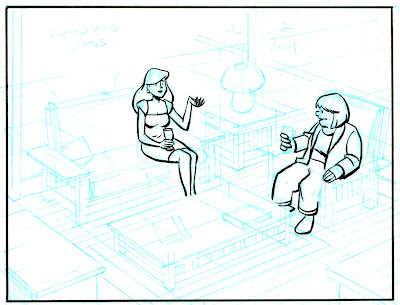
Here are my pencils for one panel of a comic I'm working on. I had to crank up the contrast very high to see the blue lines at all:


In this panel, two neighbors are having a glass of wine after work. First thing I want to point out, and this is very important: my top priority when composing a panel is figuring out where the words go. A lot of beginning cartoonists don't know this: THE WORDS GO FIRST. Blocks of text draw the reader's eye through the page, and their placement can make the reading experience an effortless joy or a hopeless muddle. It's not evident in the above scan, but I've sketched out a few key words from the script in the open space near the top of the panel (the one at top left reads "good old days") and am very aware of how much space the text will need.

Second thing I want to point out are the perspective lines. They all go toward two vanishing points far off-panel (actually, far off the edge of the paper as well). I don't lay out a perspective grid for every panel, but in this case--a medium-long shot that shows walls, a floor, furniture, and characters occupying that space--it's essential. Whenever I have trouble drawing something and it just isn't "working," I find that about half the time I've messed up my perspective somehow.

Next step: inking. In the old days, the words would be lettered on the page before anything else; that's how important they are. These days, I letter digitally near the end of the process (for reasons I'll explain later). As much as possible, I ink with a brush. Brushes take some practice but to me are worth it for the life they give a drawing. I use a "00" (double-zero) brush, which I understand is smaller than most cartoonists prefer, but I like the razor-thin line and fine control it gives me. Here I've drawn the panel border and inked the figures:

This panel is unusual in that I brushed very little of it. Generally I ink at least half of every page via brush, but this panel has a lot of fine straight lines that'll obviously require a pen. Sometimes I use a crow-quill dip pen, but in this case I'll use Pigma Micron pens in various sizes to complete the inking (I'm not a shill for Microns, but they make dark, colorfast lines that work well). Here's an intermediate step, in which I've defined the major shapes to make sure they're right before getting bogged down in fiddly bits.


Then the fiddly bits:


At last I join the 21st Century and scan the art into Photoshop. First step is general clean-up: smudges, smears, and other stuff that would've been fixed with white paint and rubber cement in the old days. I think you have to be very careful here. On a computer, it's very easy to zoom in on every microscopic spot and "fix" it until you've fixed all the spontaneity and life out of it. In my opinion, it's vital that the art still looks like it was done by a human rather than a robot. Know when to quit. At this point, I also use Photoshop to erase my blue pencil lines.


Here's some wisdom I learned from hard experience, and led to the Second-Best Advice I Ever Gave: when you scan your work into Photoshop, scan it at the highest resolution your computer can handle without choking. At a minimum, 600 dpi. I work at 900 dpi, but that's with original art drawn larger than the final art will be printed at, so it's really more like 1200 dpi. One reason is that, even if you're just doing a webcomic that'll be posted online at 72 dpi, you may need better-quality images down the road. Remastering original art is a painful waste of time.

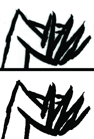
Here's another reason. At this stage, I do something that's hard to follow if you're not playing along (so don't worry if you're not): I convert my scan to bitmap (50% Threshold) and then back to CMYK mode. Why? Because converting to bitmap changes every pixel to either black or white--no grays. This gives me very crisp black lines that print and color very cleanly. As shown in the comparison below, where I've zoomed in to look at the hand of the woman on the sofa, it also gives lines a zig-zag sawtooth pattern. Scanning at high resolution makes the sawtooth disappear when you pull back.

Before (top) and after (bottom) converting back and forth to bitmap mode.

Now: Words. As I said, in the old days, the words would've been inked first, directly on the original art. That's how I did Mom's Cancer. That's real cartooning and I respect it. However, here's what I learned on Mom's Cancer: it also makes editing very difficult. Imagine you want to move a word balloon, change or delete a bit of dialog, or just fix a typo. With the text and balloons on the original art, you might have to redraw an entire panel. And that's not even considering deleting all the words to get the pages ready for foreign translations! With some regret, I decided that digital lettering was the way to go on Whatever Happened to the World of Tomorrow, and haven't looked back. I scanned samples of my own hand lettering from Mom's Cancer and used a program called FontCreator (not a plug, there are others) to turn them into a computer font, which I've used since. Balloons go on a separate Photoshop layer in a process that isn't worth describing. All easily editable.


Finally, Coloring. Again, in Photoshop*. There are some technical aspects of preparing art for color printing that aren't worth getting into. Most importantly, I recommend coloring your work in CMYK (cyan, magenta, yellow, black) mode rather than RGB (red, green, blue) mode because CMYK works best for printing inks on paper while RGB works best for shooting electrons at a computer monitor. Unless you're absolutely certain that your artwork will only ever be seen on a screen, use CMYK or brace for a world of hurt later.

(* I know quite a few artists who color their comics by hand using watercolors or what have you, including Vanessa Davis and Carol Tyler. I believe their pages are simply prepared for printing by photographing or scanning them, as you would any other piece of art. I think that's wonderful and has a lot of integrity. It's just not what I do . . . although I'd love to try it.)

So I colored this drawing just to show how it might look:


This coloring is quick and dirty, not final; if this panel ever sees print, it might look quite different. I would go to some effort to create a palette for every character and location (which I haven't done here) to give each a characteristic look and feel. My goal is to have the colors communicate something about the person and place, and lead your eye where I want you to look. A lot of colorists take full advantage of Photoshop to do highlights, shading, blending, and similar effects (lens flare!). I do some of that but not a lot. My comics aesthetic leans toward a limited palette of mostly flat colors. To me that says "comics." But that's just me.

That's pretty much how she goes. It may seem like there's a lot to it, but you get into a rhythm and it flows pretty easily. I enjoy the change of pace moving back and forth between the drawing board and computer. At the end of the day you can say you turned white paper and black ink into something that didn't exist yesterday, which can be a very gratifying (or frustrating or depressing or exhilarating) feeling.

Friday, July 13, 2012

ComiXology Distributing Digital 'Mom's Cancer'

HERE'S some news out of the San Diego Comic-Con I knew was coming but had to keep quiet until it was announced, which was evidently today: my publisher Abrams has signed an agreement with digital comics distributor ComiXology to carry a select list of Abrams' graphic novels, including my own Mom's Cancer.

Here's ComiXology's press release about it. In addition to Mom's Cancer, the other Abrams books getting the digital roll-out are My Friend Dahmer by Derf Backderf, Empire State: A Love Story (or Not) by Jason Shiga, Fairy Tales for Angry Little Girls by Lela Lee, and Cats, Dogs, Men, Women, Ninnies & Clowns: The Lost Art of William Steig by Jeanne Steig with illustrations by William Steig. That's some excellent company to be in!

Honestly, I don't really know what to make of this or how big a deal it is. Evidently, people may now read my book "through the power of ComiXology’s patent pending Guided View technology and CMX-HD." I don't know what that means. However, I do know that the ComiXology digital platform works on the iPhone, iPad, Android and Kindle Fire; I like the sound of that. ComiXology has provided more than 75 million downloads of more than 25,000 comics, so there's potential. But most of that total is Marvel and DC books bought by superhero fans--not traditionally my best customers, so who knows? I expect we'll tally somewhere between 1 and 1,000,000 downloads.

Basically, I look at it as one more unexplored medium, one more opportunity for Mom's Cancer to reach readers it didn't reach before (also a medium that didn't exist when I created the story!). That's what that book is about.

Thanks to the ComiXology folks for taking me on, and to Editor Charlie and the folks at Abrams for making it happen. Both show an impressive amount of faith that I hope my work justifies.

Monday, June 18, 2012

Hey Mister UPS Man

Look and see what came in the big brown truck for me:

Original hardcover on the left, new paperback on the right.
Photo by Karen, who deserves a better-looking husband.

Fresh off the boat from Editor Charlie, the first copy of the paperback Whatever Happened to the World of Tomorrow! This is my first real look at the silver foil cover, which is very hard to get a feel for on a computer layout, and it is gorgeous. This photo doesn't do it justice, you've gotta see it in person (my suggestion: buy a copy). My compliments again to designer Sara Corbett and Art Director Chad W. Beckerman, who worked with Editor Charlie and me to get this cover just right. I'll always love the original hardcover design but I think we topped it. Also thanks to Charlie and Abrams for releasing the book in paperback at all; they didn't have to. I couldn't be happier with the entire thing.

I don't know exactly when the book will be available in stores. Amazon has a release date of August 1, which is as authoritative as anything.

A couple of fashion notes: you may notice I got new glasses. I was looking to modernize from my traditional wireframes without overshooting all the way to hipster d-bag. Hope I hit it. If not, please don't say anything or you'll hurt my feelings. Second, I'm coincidentally wearing the shirt I drew myself wearing in The Adventures of Old Time-Traveling Brian Part 3. If that doesn't prove these stories are taken directly and faithfully from my actual life, nothing will.


Monday, May 14, 2012

Creating a Cover

Settle in. This is a long one.

Making a book cover is a unique, challenging part of the publishing process. Different writers with different publishers have more or less frustrating stories than mine. I know of some writers who designed their own covers with little trouble at all, and others who had the decision taken entirely out of their hands and wound up with covers that misrepresented their stories and torpedoed any hopes of success.

My experience designing covers with Abrams for Mom's Cancer, the hardcover Whatever Happened to the World of Tomorow, and now the paperback WHTTWOT, falls toward the more happy, collaborative end of that spectrum (I blogged about the Mom's Cancer cover in 2006). However, it's a different type of collaboration than any other part of the publishing process. What happens on the inside of the book is a conversation primarily between my editor, Charlie Kochman, and me. In contrast, deciding what happens on the outside of the book involves many, many people, some of whom may not have even read it.

That's because (and what follows is purely my interpretation and opinion, not anything authoritative from Abrams) a cover's primary role is marketing rather than editorial. That's a keen distinction. A book's cover is the lure that teases a potential customer to pick it up. Secondarily, it's a statement about the publisher itself: "We make books that look like this." Corporate identity. Neither of these roles is something an author is necessarily attuned to or skilled at. Which is why, in addition to me and Editor Charlie, cover design involves graphic designers, art directors, marketers, publicists, and a whole committee of decision makers up to Abrams publisher Michael Jacobs.

On paper, I believe my contracts give Abrams the right to cover my books however they want. In practice, Editor Charlie promised that he'd never put a cover on my book I didn't like. He's as good as his word and so far we're three-for-three, although I've sometimes needed persuading. As a graphic novelist, I do have a small bit of leverage: if a cover idea requires any new art, they need me to draw it!

With that, I thought I'd describe some of what went into making the new paperback cover for WHTTWOT for all six of my readers who like peek-behind-the-curtain posts. It was a back-and-forth process over several weeks that involved me, Editor Charlie, Abrams Designer Sara Edward Corbett, and Abrams Art Director Chad Beckerman.

As I composed this post, I decided it wouldn't be fair to include sketches I received from Sara and Chad. Their work was part of a collaborative brainstorming process, some of which was pretty rough, and I don't think it's right to publish it. They should feel free to do their jobs without worrying whether some yahoo writer is going to post it on his blog months later. Rather, I'll just show sketches I did, with the understanding that ideas were flowing both directions and many of the concepts below stemmed directly from Sara's, Chad's and Charlie's contributions.

Idea Zero: make the paperback look just like the hardcover. Of course we couldn't do the die-cut paper "belly band" that wrapped around the hardcover, but Charlie and I were both impressed by how WHTTWOT's German publisher handled the hardcover, adding a glossy varnish over the top "futuristic" half of the image and giving the bottom half a matte finish:

The German Edition: No die-cut belly band, shiny on the top, dull on the bottom. The title means, "And We Dreamed of the Future," which I liked maybe better than "Whatever Happened to the World of Tomorrow?" Wish I'd thought of it.

So here's my first take, making the front look basically the same and flopping the futuristic tableau, which appeared under the belly band of the original, onto the back:


Even as I did it, I knew this idea was dead on arrival. The honest reason: the hardcover was not a big seller. Oh, I guess it sold all right, it wasn't a humiliating embarrassment, but it really didn't do as well as Abrams and I hoped and thought it might. Consequently, one big goal for the paperback is to attract readers who maybe didn't notice it, or didn't like what they noticed, before. Ergo, new cover.

Now the fun starts.

I argued strongly that whatever else the cover contained, it had to show the characters--either Cap Crater and the Cosmic Kid, or Pop and Buddy. I felt that it was important to emphasize their relationship--to say WHTTWOT is a story about these people as much as the evolving technology of the times. The first several rounds of cover design incorporated that element.


As we worked, Editor Charlie and I shared a concern that the cover not look too juvenile. It's a comic, yes, but not a children's book. That's a narrow tightrope to tread. I think we both felt this direction fell on the wrong side.

At the same time, I was trying to find some inspiration among paperback covers of the 1940s and '50s, examples of which abound online. That line of thinking led to this:

Classic Futura font and "torn paper" styling, with the color palette taken from the key colors from different chapters. Editor Charlie's main concern: it's not particularly attractive and doesn't read at all when reduced or seen from a distance. He was right. 

Meanwhile, Sara was offering her own take on retro styling, which led to concepts like these:


This wouldn't have been a cover by itself, but it influenced many ideas that used its circle "target" motif. I really liked this; in fact, I made myself a little pin-back button using this graphic.
Sara also came up with the "sunburst" element that we played with a lot.
Still trying to work in the characters. Also trying to capture the idea that the book dealt with both the comic-book pop-culture World of Tomorrow and the actual World of Tomorrow as realized by the Hubble Space Telescope photo in the background.

I liked the nested and overlapping circles in this composition. Epicycles. 
  
We also played with different colors of type (often in the same font as the hardcover to connect the books together) and different blends of art, graphics and photography. We quickly concluded that photos of my spaceship model weren't working.

Pretty far into the process, I decided I was wrong about needing the characters on the cover. We were already trying to convey a lot of information; characters just made the cover look cluttered and, again, juvenile. I think I may have dismayed Editor Charlie after championing the characters so enthusiastically and then changing my mind, but I really came to believe that the simpler and more iconic we made the cover, the better:

I loved this idea, which I'm proud to say was entirely mine: a close-up of the uniform of the Cosmic Kid. I took photos of sweaters of mine with different textures, and composited and colored them in Photoshop. Love the snags. Charlie liked it a lot. Others were concerned it communicated nothing about the book's theme or contents. It doesn't even hint that it's a comic. They were right. But if the decision were completely up to me, I might have gone with this.

I may have been particularly frustrated the day I thought, "Fine, if they want to make sure everybody knows it's a comic book, let's just make it look like a gosh-darned comic book!" (I probably used language stronger than "gosh-darned" inside my head.) Hence:

Note that the blurb up top from Neil Armstrong, "I cried like a little baby," was a made-up placeholder. Sadly. Because that would be the best blurb ever. I really liked this concept but it didn't get any traction.

Sometime in the middle of this process, my family and I took a vacation to Disneyland, where I saw a t-shirt in Tomorrowland and thought, "Hey, that'd make a great book cover!" The inspiration seemed entirely appropriate to me, since WHTTWOT pegs Walt Disney as one of the influential public figures who not only portrayed the World of Tomorrow but helped shape it. Also because a little piece of Tomorrowland actually makes a secret appearance in the book. I bought the shirt (tax write-off!) and came home to do a couple dozen variations on the theme:

The t-shirt

Different colors, graphics, types, etc., pulling together many of the elements we'd developed thus far.

The idea was to make this cover look artificially old and pulpy, like the comic book pages within. The concern: potential readers glancing at it on the shelf would think it was actually old and pulpy. 


I think a minor epiphany occurred when Sara did a sketch in which she wrapped my futuristic graphic cityscape, which appears in the background of the last sample above and comprised the back cover of the hardcover edition, around both front and back covers. I can't speak for anyone else, but for me that seemed to shake everything loose and reassemble it in a way that made perfect sense and looked perfectly right. Combining that with the other components we'd been working with gave us a semi-final cover that looks like this:


What this image doesn't show is that the cover will be printed on silver foil so it'll be shiny, particularly in spots like the spaceship windows and the Trylon and Perisphere. It's going to be very, very nifty.

One insight Charlie and I have discussed many times is that when a cover is finally right, you can't imagine it looking like anything else. It is what it was meant to be. You're all welcome to disagree, but I think Charlie, Chad, Sara, the Cover Committee and I achieved that here. I'm happy with it, proud of it, and can't imagine a better lure to draw in a potential reader.


Except this. Sadly, they didn't go for it, either.

Friday, May 11, 2012

Shilling

In the past week or so, I've had three different people tell me they like reading my blog because it's interesting and funny.

I don't need that kind of pressure.

To give you a break from that high-quality reading experience, I'll shamelessly flog a couple of things.

First up is my publisher Abrams Books' catalog for Fall 2012, which features a full-page ad for the paperback edition of Whatever Happened to the World of Tomorrow. For those disinclined to click on the link and find Page 10, here's how it looks:


I'm sincerely touched that Editor Charlie and everyone at Abrams had enough faith in WHTTWOT to not only put it out in paperback in the first place, but to dedicate a full page of the catalog to it. They didn't have to do either. I expect I'll have more to say about how the paperback happened and why/how we redesigned the cover in future posts.

Speaking of the cover, that's not the final version of it above. It's close, but the catalog had to go to press before we were done designing it. In fact, Editor Charlie just e-mailed me a photo of the new cover's proof (the first one off the printing press to check for print quality and errors) and I couldn't be happier. Two words: "silver foil." It's gonna look fantastic!

Second, a listing for my contribution to the Team Cul de Sac book to help fund Parkinson's Disease research is now live on the Heritage Auction website. Inspired by "Cul de Sac" comic strip creator Richard Thompson, who has Parkinson's, Chris Sparks gathered artwork from dozens of cartoonists who interpreted Richard's characters in their own styles. In addition, the original art for the book will be auctioned beginning May 27 to raise more money for the cause.

My listing is just below "Calvin & Hobbes" creator's Bill Watterson's. I wish such close proximity somehow reflected the quality of my work, but it appears to be an accidental consequence of "Brian" following "Bill" alphabetically. I'll still take it.

You'll also note that Heritage hasn't posted an image of my drawing (or many others) yet. They're adding them a few at a time. Luckily, you've already seen it. I will be closely watching the auction and am prepared to make a generous face-saving bid on my own page just in case nobody else does. It'll be for two good causes: Parkinson's research and my pride.

If nothing else, please consider buying the book. It's a righteous deed. Plus, as my friend Mike Peterson pointed out, think about what a great autograph album it'd make as you hunt down all the cartoonists who contributed to it. Good luck with Watterson (or as I call him, "Bill").

Tuesday, April 17, 2012

Coming Attraction

Coming in paperback and available August-ish, quite possibly at a bookstore near you:


Catalogs have been shipped and an Amazon page created, so I can talk about it now. Paperback. $14.95. Exactly the same size and content as the hardcover, including the cool pulpy comic book paper. A new cover designed by me, Abrams graphic artist Sara Edward-Corbett and Art Director Chad Beckerman, with valued input from Editor Charlie Kochman.

Funnily enough, despite producing all the art and working on the cover with Abrams for weeks, I just realized now that the only version I have of the final composition is this relatively low-res image from Amazon. The sticker at top left is the American Astronautical Society's Eugene M. Emme Astronautical Literature Award; the quote at top is from The Village Voice: "A hopelessly optimistic moon-age daydream," which I've always chosen to take as a compliment.

Much more later!
.

Wednesday, September 14, 2011

Lunacy

I saw surprisingly little mention in the press commemorating the anniversary of that terrible day, 12 years ago yesterday, when a nuclear waste dump exploded on the Moon and propelled it deep into interstellar space. How quickly we forget. I still miss the tides.


No word from my publisher on my Mystery Project X book proposal but that's all right; I'm knee-deep (that's more than ankle-deep and less than hip-deep) in Mystery Project Y, which I'm also very excited about. They're very different in both form and content, which lets me flex different writing and drawing muscles. I also think I could get Y done much faster than X, so it may zoom ahead in my queue. That's assuming either of them actually flies, which is quite in doubt. If Editor Charlie can't do X, others have expressed interest in publishing it. If not them, maybe I need to revisit webcomics. It worked out all right before. On the other hand, it's a lot of work.

Backing me up on that last thought is this blog post by comic book artist Stephen Bissette explaining why he will not draw your graphic novel for you (hat tip to my pal Mike Lynch for the link). A lot of people contact Bissette absolutely positive that they've got a great idea for a best-selling book if only he would do them the favor of providing the art--often for free, although he'll obviously be richly rewarded when the money truck backs up to the author's door. Bissette's answer is kind but blunt:

* Drawing a graphic novel takes a long time--much longer than scripting one. How will he buy food and pay rent during those months or years?

* You are probably not interested in giving him the share of ownership, rights and control over the project that he'd want to make it worth his while. Even in the best professional arrangements, collaborating is creatively, ethically and legally difficult.

* If he had the time to draw your graphic novel, he'd much rather spend it working on one of his own ideas that he hasn't had time to pursue.

I receive a few e-mails like this. However, I think mine have a different cast to them because they're often from people who've read Mom's Cancer, gone through something similar in their own families, and with the very best intentions want to tell their story in the same way. They mean well, they don't know cartooning or publishing, but they're just aching to get it out somehow. I understand that.

My answer has the virtue of being both sincere and true: I can't tell your story. I don't know you. I wasn't there. Anything I'd draw would be second-hand reporting at best, lies at worst. The only person who can tell your story is you, and if you can't draw then you should find some other way. Writing, photography, video, HTML, collage, macaroni sculpture. If the message is important and true, the medium is nearly irrelevant.

Beyond that, my unspoken answer is the same as Bissette's: I don't have the time. If I did have the time, I'd rather spend it on my own projects (X, Y and beyond) that aren't repeats of things I've already done. There's probably no money in it for me; if there is, it isn't enough to pay me even near minimum wage for the hours I'd spend. I'm sympathetic and charitable, but not a solid one or two years' of hard work worth.

I think the disconnect here is that a lot of people don't realize how difficult it is and how long it takes. "They're simple cartoon drawings! You can bang them out in a few hours!" I take it as a compliment that I maybe make it look easy, but it's not. Mom's Cancer was the toughest thing I've ever done creatively, for obvious reasons. But even on Whatever Happened to the World of Tomorrow, which didn't impose the same emotional toll, I did thousands of hours of work and gathered thousands of pages of research (literally--I have three 500-page binders stuffed with material). Both projects demanded long months of total immersion. You're asking a lot.

I'm not whining--no one's ever held a gun to my head, and it beats coal mining. Just explaining why I Will Not Draw Your Graphic Novel Either.

* * *

Please allow me to draw your attention to two new Web thingies. First, a new blog by Friend O' The Blog Jim O'Kane, whose topics have already included fiddling, trains and 19th Century rocketry, so you know he's my kind of guy.

Second, the new home of the Toon Talk forum, recently relocated to a Facebook Group. Toon Talk was begun 10 years ago by cartoonist Darrin Bell ("Rudy Park," "Candorville") and for a long time was a nice place for pros and fans to meet and talk all types of comics. As sometimes happens, people gradually fell away and the forum became a ghost town. Honestly, I stopped visiting myself. When Darrin's web host wanted $250 he didn't have, Darrin moved the whole kit 'n kaboodle to free Facebook, where it's gotten more traffic in three days than it did in the past 30 months. I know not everyone does Facebook but I think it's a big improvement. Nice people, check it out.

* * *

I'll be visiting the USS Hornet again this weekend. Anybody want me to pick them up anything?
.

Thursday, July 7, 2011

Electrons for Sale! Get Yer Electrons, Right Here!

Big publishing news, at least to me: Mom's Cancer is now available for the Kindle, with other e-book platforms to follow very soon! Within a week or two I should be able to direct you to similar offerings for the Nook, Nook Color and Sony Reader, with Apple's iBookstore to follow later this summer.

This has been in the works for a while and I'm very excited about it. I'm interested to see how my book works in electronic format--which may prove difficult since I don't actually own any of those readers. But my artwork is clean and open enough, and my lettering large and legible enough, that I'd expect Mom's Cancer to look pretty sharp.

I'm especially gratified that my publisher Abrams went to the effort. Mom's Cancer was published almost exactly five years ago (that's so hard for me to believe that I checked the math twice) and is now a backlist book that wouldn't ordinarily get a new lease on life. It's nice to see that Editor Charlie and his bosses still have some confidence in it.

We've also had some conversations about what could come next for Whatever Happened to the World of Tomorrow, including softcover (not this year for sure, but maybe next) and e-book editions. The latter would be an interesting challenge, since we went to a lot of trouble to use different paper stock and such that wouldn't translate to the screen. Simply digitizing the existing layouts wouldn't work. I've already told Editor Charlie and Abrams's e-book person that when the time comes, I want to work closely with them to get that right.

Pretty cool, eh? Some days I like living in the Future.

UPDATE: As of this morning, it's available for the Nook as well!
.

Sunday, May 15, 2011

Literary Food for Thought

Two data points about the brave new world of publishing that caught my eye this morning:

Data Point One. The #1 bestselling book on Amazon right now is not yet in print. Titled Go the F**k to Sleep, it's billed as a children's book for adults. From its title, I'm guessing it's a twist on kids' bedtime books like Goodnight Moon but meant for parents who just want their little monsters to shut up and lie down. Sounds clever. Wish I'd thought of it.

What got my attention is that, as explained in this article, the book topped the bestseller list and has already been optioned for a movie due entirely to a PDF preview that got away from its publisher. Critics, buyers for bookstore chains, marketing people and others need to make decisions about books before they're physically printed, so publishers send them a PDF. Usually, they're held close to the vest. This one escaped into the wild. That's piracy, but it's also grassroots marketing--way better marketing than the publisher could have ever dreamed of doing on its own.

In the article, I enjoyed editor Ibrahim Ahmad wrestling with his dilemma: you don't want a million illegal free copies of your forthcoming book floating around the Internet, but at the same time those illegal free copies actually translated into pre-sales that will make both publisher and author barge-loads more money than they ever dreamed. Ahmad says he's fighting the piracy, but I don't think his heart's really in it. Understandably.

I'm not celebrating this story. In fact, it's pretty much the antithesis of how I think business, and the author-reader relationship, ought to go. "Give it away free to get exposure" is the opposite of how I'd choose to run my creative life--and yet this time, accidentally, it worked. I don't quite know what to make of it, but it got me thinking. Like I said, it's a data point.

Data Point Two. This article (originally by the Washington Post but since they currently appear to have a glitch on their website I linked to it elsewhere) features Nyree Belleville, a "thin, pretty brunette" who wrote 12 romance novels for a traditional publisher which then dropped her. Since her books had never earned her much anyway and she had nothing to lose, she reissued her first two novels as e-books.

(BTW, the article says that "her writing career was so flat line that one of her old publishers had even given her the rights to her first two novels." I bet that's not quite right. More likely, the books had gone out of print and the rights automatically reverted to Belleville under the terms of her contract. Nobody "gave" her anything.)

Those e-books made a few bucks. Then a few more. Belleville got the rights to two more of her books, wrote a new original one, dug up a few stories she'd written earlier in her career, and offered them all as e-books. In the first quarter of 2011, she sold 58,008 copies and made $116,264. Quite a comeback for a writer who a few months earlier thought her career was over.

The article also points out that such success is rare. Belleville had a big advantage being a known name with an established reputation and fan base in the print world. Far more common are the e-books that sell six copies to family and friends. Still, the economics are compelling. Notes the article, "it is possible for writers marketing a $4.99 self-published e-book to make more per copy than authors with a $24.95 hardcover." As an author with a $24.95 hardcover, that sounded about right and got my undivided attention.

Of course the most important question to me is: How does this affect me? I dunno. These are interesting times. Writers have exponentially more strategies and outlets available than ever, but consequently a greater challenge being heard above the din than ever. If there are no gatekeepers and everybody's a writer, how do you stand out from the crowd? Tell good from bad? Can a writer still lounge moodily in his garret and scritch away with a quill pen (as I am wont to do), or does the 21st Century author have to be a promoter, accountant, and computer guru, too?

Interesting times.

Saturday, January 15, 2011

Tapas

Bite-sized morsels, served Herb Caen style . . .

* * *
.
Karen and I saw "The King's Speech" a week ago . . . thought it was great and I recommend it. I wasn't sure how sympathetic I'd be to the plight of a spoiled royal whose worst problem during World War II was poor diction, but the story worked and the actors, particularly Geoffrey Rush, were terrific.
.
* * *

Before he died in 1910, Mark Twain spent 35 years sporadically working on his autobiography, on the condition that it not be published until 100 years after his death. And so it was, and so I bought it, and have spent two days reading the Introduction. I'm not a slow reader; the thing is a 700-page monster and the Autobiography proper doesn't begin until page 201. The best part: this is Volume 1 of 3.

What intrigues me about this exhaustive scholarly tome is that I bought it off a pallet at Costco, the palace of populism. University of California Press originally planned a print run of 7500 copies, which sounds about right for an academic book about a 19th-century author. As media and public interest grew, that number jumped to 50,000, then 275,000, then 500,000, and I have no idea how many copies are in print now. Having dipped in my toe, I guarantee that The Autobiography of Mark Twain will score the largest ratio of "Copies Purchased/Copies Actually Read" since Hawking's A Brief History of Time or Bloom's Closing of the American Mind.

Both of which I actually read.

I've been looking forward to Twain's autobio for years and will give it a fair go. I peeked ahead and know I'll find some worthwhile rewards. But I'll wager that Volumes 2 and 3 will sell signifcantly fewer copies, and will not be found stacked in pyramids atop the blades of a Costco forklift.

* * *

Speaking of 700-page monsters, the comics event I'm most looking forward to in 2011 is the release of Craig Thompson's Habibi (if indeed it is released in 2011 . . . I don't think the date has been formally announced). Thompson, whose memoir Blankets was a big success, has been working on Habibi since 2004. I'm not kidding about the 700 pages which, judging by samples posted on his blog, will showcase some of the best comics artwork I've ever seen. Amazing, breathtaking stuff.

What worries me (not that anyone asked) is its story, about which very little has been revealed. I don't know how a white American man from the devoutly Christian background so vividly described in Blankets can write authentically about the life of an ethnic Third-World Muslim woman (the titular Habibi) without being superficial, condescending, overly romantic, melodramatic, or just plain getting it wrong. I'm not being snide; I sincerely don't know how he could do it short of immersing himself in the culture for years. However, if Thompson pulls it off, Habibi could be that very rare accomplishment: a graphic novel rich and deep enough to actually be called a novel. In addition, it will win every award that exists and some that haven't been invented yet.

* * *

A book that definitely will not be released in 2011 is my Mystery Project X*. I had very little time to work on it the last few months of 2010 (you know I don't make a living doing comics, right?) but have really had a chance to buckle down the past couple of weeks. It feels great! Where I'm at: I have a 184-page script that I call my "locked-down" draft. That doesn't mean I won't change it, but I do think I finally have all the characters, dialog, plot twists, themes and motifs sufficiently settled to start drawing.

My next task is "thumbnailing," which means roughly sketching out the whole thing to see how the words and drawings lay out and work together. I didn't do a lot of thumbnailing on WHTTWOT and even less on Mom's Cancer, but I think it'll be necessary and helpful for this project. I've just begun (so far so good!) and figure that'll take several weeks. Just a few days ago I hit on the idea of thumbnailing digitally, entirely in Photoshop using a Wacom tablet, and I like it a lot. However, final art will be ink on paper, as God intended.

Once the thumbnails and a few pages of completed samples are done, they'll comprise a book proposal. My six loyal readers may recall that I discussed an earlier proposal for this same project with Editor Charlie just about a year ago. That was script only, plus a few pages of finished artwork, and I think Charlie and I both agreed it wasn't ready. It needed more work. Although Charlie has been as encouraging and supportive as I could hope and I have a commitment to show Mystery Project X to him first, I don't have a contract with Abrams or anyone else. They may not want it. Nobody may want it. These are hurdles to be jumped later, not to fret about now. If nothing else, I can always put it online and hope for the best. It worked pretty well before.


*Mystery Project X is not its real title.

Thursday, August 19, 2010

Dots, Part 2: The Empire CMYKs Back


First, read yesterday's post to catch up. Ready?

(By the way, I don't expect everyone to read these posts. Don't feel guilty for passing them by. But I bet they'll still be getting Google hits months from now!)

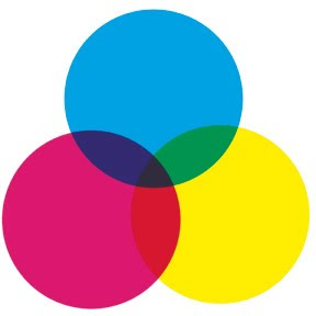
Color process printing is typically done with four inks: cyan, magenta, yellow, and black, abbreviated "CMYK" (I understand the "K" actually stands for "Key Color"--which is always black). Most of the color printing you see in books, magazines, newspapers, billboards, posters, and cereal boxes is CMYK.

The little color wheel up top shows how that works: overlapping transparent inks produce all the colors of the rainbow. C+Y = green, Y+M = red, M+C = violet, and C+Y+M = dark gray. When you use the halftone process to made different shades of those base colors, and add different shades of gray as well, you end up with a pretty large (but finite) palette.

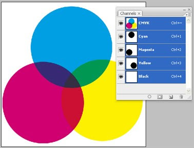
Here's a Photoshop screenshot to help illustrate my point. See the three "Channels" showing cyan, magenta and yellow? The little thumbnail images with each channel show the contributions of cyan, magenta and yellow to the large image--the three big circles. We'll be using Channels later and I wanted to offer a peek.


I'm going to write about CMYK vs. RGB for a second. "RGB" is "red-green-blue," the colors of light your computer monitor generates to compose images. The big difference between RGB and CMYK is that RGB mixes light while CMYK mixes pigment. Remember from junior high science how combining red, green and blue light makes white light? Well, combining red, green and blue (or cyan, magenta and yellow) pigment makes mud.

So if you're doing artwork that will only be seen on a computer--maybe a website or PowerPoint presentation--go ahead and work in RGB. But if there's a chance it'll be professionally printed someday--any chance at all--I'd advise working in CMYK from the start. Pretty much all CMYK colors can be converted to RGB equivalents, but a lot of RGB colors don't convert to CMYK. One day you'll try to print out a nice poster of your best webcomic and the colors will look like yak barf. I warned you.

Now let's do a color separation and make some dots! NOTE: there are other, better ways to do color separations in Photoshop. I did it in this labor-intensive, hands-on fashion because I wanted to accomplish some particular comic-booky effects with my pages. Nobody does real color separations this way, but my original anonymous questioner asked how I faked it for my book. This is how I did it.

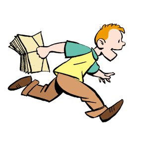
Here's our guinea pig, familiar from yesterday even if you don't remember Buddy from my book WHTTWOT. I deleted the gray ink wash background because we already dealt with grayscale halftone.


Here are the four CMYK channels that comprise that image:

Black. This is the basic line art, the part I drew with ink. Notice that there's also some gray that darkens the browns in Buddy's shoes and pants.


Cyan. But wait a second! If this is the cyan channel, why is this picture gray instead of cyan? Because the intensity of the gray indicates how saturated the cyan is. Remember, CMYK is meant for a printing press; this separation defines how much cyan ink the press will put on the paper. It's dark where the cyan is darkest, like on Buddy's turquoise shirt sleeves, and light where it's lightest.


Magenta. There's a bit in his hair, as you'd expect, and some in the brown of his pants and shoes. None in his shirt.


Yellow. Buddy's orange-red hair has a lot of yellow in it. His shirt is entirely yellow (notice there's no cyan or magenta in it). His flesh tone is a mix of magenta and yellow, while his brown pants and shoes combine all four colors.

Making Color Halftones
Hang in there. Now I'm going to take each CMYK channel individually, turn them into halftones like we did yesterday, then recombine them at the end.

I'll use the cyan channel as my example. Here it is again, same as above:


In Photoshop, right-click on the cyan channel (on the small panel I showed above), click "Duplicate," and from the "Destination--Document" pull-down menu select "New." A new window will open looking just like the image above.

Like we did yesterday, convert to Bitmap mode, then Halftone Screen. You should assign each screen a different angle at 15 degree increments to keep their dots from perfectly coinciding. For WHTTWOT (based on old printing practices) cyan is 105 degrees, Magenta 75 degrees, Yellow 90 degrees, and Black 45 degrees. Since we're doing cyan now, enter 105 degrees and whatever frequency that gives the dotty result you want:

See, just like yesterday. Now we're going to make it blue. Convert from Bitmap to Grayscale to CMYK mode. Then "Select Color Range," sample one of the black dots in the image, and "Edit--Fill" with 100% cyan (and 0% everything else):

Same for the other three channels (the order doesn't matter). Notice the different screen angles of the dots:

Now we're going to combine these four images into one. Copy or "Duplicate Layer" so they're all lying on top of each other in one file. Picture it like this: you've got four layers of paper, each printed in cyan, magenta, yellow or black, all stacked up.

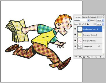
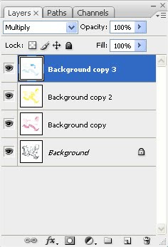
Now imagine making the paper transparent so you can see all the layers! That's done via the "Layers" control panel shown immediately below and in close-up. See the word "Multiply?" For each layer (except the bottom one), change that setting from "Normal" to "Multiply." Now your layers are transparent and the dots of color are free to mix and blend.

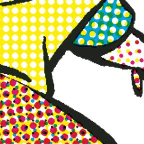
Below is a super close-up of our picture, showing how it works. Using nothing but cyan, magenta, yellow and black dots, we've produced turquoise, orange, browns, and peachy skin tones. Since your four colors are isolated on four different layers, it's easy to mess around with one color without changing the others. That's how I "printed" my old comic book colors out of register and introduced various blobby, smeary "defects."

Then if you're doing a graphic novel with 50 pages of old-timey comic book to fake, just do the same thing 49 more times and you're good to go. Good luck! I'm not dumb enough to try it again.

Completely unrelated but kind of cool: you're also now qualified to begin your second career as an art forgery and counterfeiting expert. While there's a long list of things that are reproduced by four-color process printing, there are a lot of things that aren't. For example, money. In addition, authentic silk-screen prints are made by squeezing many different colors of ink through stencils adhered to, yes, a silk screen. Some great old posters used 20 or more different inks to produce all their colors. If you look closely at a poster that says it's silk screened and see arrays of tiny dots like those in the image above, it's a reproduction. Likewise antique prints and etchings. Before the 20th century, printmakers created shades of gray by engraving fine cross-hatching or stippling on their plates. If you look closely and see tiny irregular dots, that's hand-crafted stippling. If you see dots too small and perfectly aligned for a human being to make, that's a modern copy.

If that tutorial wasn't sufficient, Wikipedia has some entries on CMYK, four-color process printing, and halftone. Also, I didn't say anything about Trapping. As always, I welcome additions, corrections, and discussion from people who know more about it than I do. Go nuts. I'm tapped out.

HOWEVER . . . If you've read this far, you might as well go ahead and check out this post from July detailing how I applied these techniques to make a page of my book, including adding imperfections intended to mimic bad printing technology and 70 years of age. It's fun!