Today's is about putting together one page of Whatever Happened to the World of Tomorrow--specifically, page 27, which is one of the early comic-within-a-comic pages meant to simulate an actual comic book from 1939. If you haven't seen WHTTWOT, the conceit was that these were the very same comics my characters were reading. The interior pages of these fake comics were printed on a rough newsprint paper stock, very different from the smooth glossy pages in the rest of the book. The amount of effort that went into mimicking a 70-year-old 10-cent comic recalls Mae West's line, "It cost a lot to make me look this cheap."
I started with the line art, which is India ink on two-ply Bristol board, 10 x 15 inches (~25 x 38 cm). You may be able to see some of my blue pencil underdrawing in the image below.
 Black-and-white line art: actual ink on paper!
Mindful of the tools and techniques that would've been used at the time, I drew with crowquill and other pen nibs rather than my usual brush, and used more hatching than I normally would. Backgrounds are deliberately less detailed and a bit abstract, befitting the era. On this page, I drew caption boxes and word balloons to be filled later with digital type. I later decided that was a mistake (much harder to edit) and began doing the boxes and balloons digitally as well.
I scanned the line art into Photoshop at 1200 dpi (huge file!), converted to Bitmap to get very clean black-and-white lines with no grays or fuzzy edges, then converted to CMYK to color it. Coloring was more complicated than filling in areas with the Photoshop bucket, worthy of a series of posts on its own. First, I used the very limited color palette available to comic printers in 1939 (my palette grew for the later comics because printing practices improved).
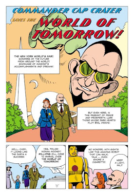 I only cheated on one detail: Officer Mooney's orange-red hair is a color that wouldn't have been available then. It was worth it; I've got a thing for redheads.
Second, I couldn't just color up to the edge of the black lines, or the next step in the process wouldn't work. Instead, I colored on a separate "layer" in Photoshop (think of it as coloring on a transparency laid atop the line art) and made sure to overlap the black lines so that the colors solidly butted up against each other with no gaps.
All colors in a comic book are combinations of transparent cyan, magenta, and yellow, with which you can make red, green, purple, brown, etc. Printing a comic is a four-color process: you run paper through the machine four times to imprint the cyan, magenta, yellow and black inks. "Screening" is the process of breaking colors up into very fine dots so when printed they give the illusion of different hues and shades:
 Roy Lichtenstein, eat your heart out.
I believe there's actually a button in Photoshop that'll screen for you in one quick step, but I didn't use it. I wanted to carefully control and manipulate the size and angles of the different colored dots (notice above that the red dots and blue dots line up at different angles). This was another variable that I changed to represent comics from different eras: as the years progress, the dots get finer and the "print quality" gets better.
"Registration" means how well the paper's four passes through the printer line up. Because this was supposed to be a cheap, poorly printed comic book, I wanted my registration to be poor. This was another quality that gradually improved in my fake comics as decades passed. Because I'd separated my cyan, magenta and yellow colors into three individual layers, I was able to nudge them around to deliberately throw them off-register. In the close-up below, notice how the blue is bumped to the left so it doesn't fill the letters, while the red and yellow are scootched slightly to the right (the yellow's hard to see, but you can spot a little yellow halo to the right of the red letters).
Somewhere around this step I added the indicia, or the (fake) legal notice, to the bottom of the page. In each era, I used appropriate language and typefaces taken from actual comic books, substituting my fictional "Capital Periodicals" for the real ones. This one was modeled after the indicia in Action #1, the first Superman comic, published in June 1938. The address 115 West 18th St., New York City is where my publisher Abrams is located. Hey, there could have been a comic book publisher working there years ago.
. (Funny digression: although I had examples of indicia from 1965 and 1975 in my personal comic book collection, I didn't have any from 1955. So when I went to the San Diego Comic-Con that year (2007?), I wandered from dealer to dealer asking to see the cheapest comic from 1955 they had. Didn't care about the title, story, character, writer, artist, publisher or condition; I just wanted it for its indicia. Some eyed me as if I were crazy. "Weirdest comic book collection ever." I think I finally found a beaten-up old Batman for $5.)
To reinforce the idea that these comics were cheap, disposable ephemera, I wanted to introduce even more printing errors--which, again, became less frequent as the fake years passed. So I added blotches and smears to suggest poorly cleaned and maintained printing equipment that defaced the paper as it rolled through. The light blue spatters below were made by dripping black ink drops onto a sheet of white paper, scanning them, and turning them cyan and transparent. Similar process for the smudge. I created quite a library of various drips, blobs and smears.
.

One of my favorite stories about publishing WHTTWOT involves the paper. As I mentioned, Editor Charlie and I had the idea to print these comics-within-the-comic on cheap pulp paper. Now, my publisher, Abrams, has a long history as a very high-quality publisher of high-end art books, and the Abrams paper people kept bringing Editor Charlie samples of paper that were way too good. Too white, too thick, too glossy. They just weren't getting it. Finally, Editor Charlie brought them an old comic book from home. The paper people looked at it; felt it. The light bulb went on. "Oh!" they exclaimed. "You want really bad paper!" Yes, we want really bad paper. We got it.
.
As bad as the paper actually is, I wanted to make it look worse. So over each page, printed right up to the edge of the paper, I added an artificial transparent newsprint texture to yellow and age them even more. To get the texture, I dug an old sheet of newsprint from my college art portfolio and scanned the back of the drawing to capture an authentic blotchy, pulpy yellow:
.

It's hard to see in this scan, but the right edge of this piece is quite a bit browner than the rest because it had been exposed to more light over the years. When I laid this texture over each page, I made sure that the darker edge always lined up toward the outside, where the comic book pages would've gotten more light. This newsprint texture was another variable I could "improve" as I mimicked comics from subsequent decades. The four fake comics throughout the book are printed on the same pulp paper, but it gets less and less yellow as the years go by until in the "1975" comic the artificial texture is barely there at all.
.
Finally, a tiny detail I'm proud of. Comics are held together with two staples through their spines. Those staples are lubricated with trace amounts of oil, and over the decades that oil would sometimes leach into the surrounding paper. So on each page, where the staples would go, I darkened the newsprint texture to represent oil stains from the staples:

The result:

10 comments:
I'm glad you went through the trouble to add the discoloration, smears, drips and printing "errors" to the comics section. It made WHTTWOT extra charming.
"Even if no one else notices, I'll always know I got it as right as I could."
That's how good stuff happens. I would add that there is a difference between consciously noticing and feeling the effects of something. Whether or not anyone ever commented on it, they certainly saw it and it changed their perception.
(More generally, with regard to the book, if someone later encounters something they first saw in your work, you want the reaction to be "Hey, I remember that!" and not "So that's what that was supposed to be!" And I think you did a good job of accomplishing that -- whether anyone noticed or not.)
WHTTWOT is a work of art on multiple levels. there are more than a few of us that, when we pick up your book, think, "whoa, great ideas, really nice, complex work" about you, and, although it may only be guys like me, also realize how much your publisher -- and Charlie -- believe in the validity of your ideas.
I have a stack of comics from the early 70s, and I smiled with nostalgia while reading your comics in the book. As far as I'm concerned, you got it dead-on. Great job. And thanks for explaining the process.. all the work that goes into it makes me appreciate it even more.
Could you expand on the process of creating the benday dots? I'm not sure if you did this in Phothoshop - or if so, how.
I began creating my own patterns in Gimp to mimic benday coloring - but I haven't worked out all the kinks - or decided on the best way to do things.
Anon., too bad you're anonymous because this is an old post and I'd have preferred to answer in you some detail privately. In brief, I did do it in Photoshop by converting a copy of each CMYK Channel (that is, cyan, magenta, yellow and black) to Mode--Bitmap--Halftone Screen. Set Shape to "Round" and play with the Frequency to get the dot resolution you need. Then convert back to whatever mode you want to work in (e.g., CMYK). For my four-color Ben Day (nice to see you use that term, not many do anymore) separations, I gave each color a different angle that would have been used in old comics printing. Each channel emerges from the screening process as black dots, which I then Select and Fill appropriately (e.g., if it's the magenta channel, I made all the black dots 100%M).
So keeping it simple, let's say I wanted to screen a piece of grayscale art. I'd take the black-and-white line art and shade it with different grays, either by hand or Photoshop. Then I'd convert to Mode--Bitmap--Halftone Screen as above. If I had no color, I'd set the Angle to 45 degrees. The key to making this work is to start with a high-resolution image--otherwise, your smooth lines will get very choppy. I scan my original art at at least 900 dpi.
Then it's just a matter of playing with it until you get the effect you want.
You can use the same technique to create sheets of different dot patterns and densities you can use in your art. Just fill an entire image with a shade of black (e.g., 10%, 20%, etc.), convert to Halftone Screen, re-convert to Grayscale or CMYK, and save the result. Then I guess you could color them or do whatever you want.
Thanks for your very detailed answer. I'm Anon from a day ago.
I used to work on a web comic a few years ago, and I'm in the process of getting back into it again.
I'm not sure that I understand the process as you described it exactly - but that may be because I don't have Photoshop (I'm using Corel Painter Essentials 4 and Gimp).
It would be great if you could take your comment from yesterday and turn that into a tutorial with images to show step by step. Gimp only has a filter called Newsprint - which looks ok - but not great and it doesn't offer a lot of control.
Which version of Photoshop are you working with (and could you recommend an older version that I could purchase used for something under $200 which would offer everything I need for drawing comics?
Thanks for coming back. My description above isn't very clear; if we were sitting in front of the same computer, I could show you in about five minutes. I like your idea of doing it as a tutorial and might do that soon, if I can find the time.
I really only know Photoshop and don't consider myself much of an expert on digital art. However, from what I've seen and heard, Photoshop is pretty much the standard for doing digital comics art these days (I have some friends who prefer Illustrator, which fits well with their simple line art, but isn't typical).
I currently have Photoshop CS3, but I actually did both of my books using an old version 5.5, which was a student package. It worked great. I don't know if you could find a copy on eBay or from a friend--one of the nice features of 5.5 was that it didn't require registration to activate.
You mentioned (in the Dots entry) these posts might be read months later. Well it's years and this is what I've been researching. I've been drawing and distressing entirely in Illustrator but the lack of the halftone screening leaves my dot patterns lacking. I will be making some tries in Photoshop using your bitmap technique. Thanks for the information.
Good luck with it, Grennpear!
Post a Comment