In my mind I think I write "How To" posts all the time. If you looked through seven years of archives on both this blog and
its predecessor, you'd probably find dozens of them. However, I recently realized it's actually been a long time since I've described my overall cartooning process in any detail, and it's evolved a bit. So once more unto the breach.
First Critical Caveat: This is just
my way. It's not the
right way. There is no right way; whatever tools and methods work for you are fine with me. In fact, in our digital age in which increasing numbers of cartoonists work entirely in pixels on Wacom tablets and Intuos screens, my dedication to paper and ink makes me a dinosaur in denial that an asteroid has hit. My answer is the same
as MAD Magazine cartoonist Tom Richmond's: paper and ink are fun. I enjoy the craft of creating a physical thing. Why would I give up the best part of the job?
What I can testify is that I've made a lot of mistakes, massaged out a lot of bugs, and this method
works for producing publication-ready comic art. Revise the recipe to suit your taste.
My paper is 2-ply Bristol board, typically from Strathmore. For this project, my original page size is 27 x 42 cm (about 10.5 x 16.5 inches). Most artists draw 1.5 to 2 times larger than their comics' ultimate printed size, which in this case I don't know; I chose that size because its proportions are standard and it's the largest that fits on my scanner. My India ink is Dr. Ph. Martin's "Black Star." I used to use Higgins ink, but either their formula changed or my standards improved, because I find it unusable now. Too thin and blotchy. Martin's costs more but it's got a great consistency and covers paper like tar covers a road.
I typically write my comics first. It's an informal script, but in form and content resembles a screenplay: simple descriptions of settings and action, plus dialog. Sometimes a little doodle to remind me what I'm imagining. Not everyone scripts first. Some savants just start drawing and see what story comes out. I can't do that and barely comprehend it, but if you're a "pictures first" type of cartoonist you have my respect and admiration.
I'll often but not always do
thumbnails--very rough sketches that lay out the page and the action in each panel. Sometimes the script is clear enough that I already see the page in my head and can go straight from script to penciling.
Pencils and Inks
Comics are traditionally drawn in pencil first, then gone over with black ink. This method is an artifact of century-old printing technology and isn't really necessary anymore, but it still works and is what I do. You can just use a plain ol' No. 2 graphite pencil, but you'll have to erase your lines later. I don't like to erase. It takes time and smudges ink lines. Instead, I use light blue pencil, another artifact of obsolete technology. In the old days of shooting Photostats, light blue became invisible so you didn't need to erase it. Even today, scanners and photocopiers don't reproduce it well, so it can still serve much the same purpose.
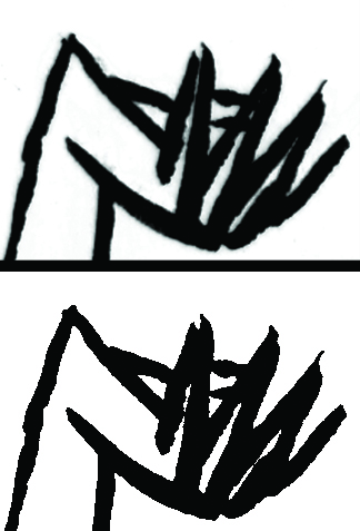
Here are my pencils for one panel of a comic I'm working on. I had to crank up the contrast very high to see the blue lines at all:
In this panel, two neighbors are having a glass of wine after work. First thing I want to point out, and this is very important: my top priority when composing a panel is figuring out where the words go. A lot of beginning cartoonists don't know this: THE WORDS GO FIRST. Blocks of text draw the reader's eye through the page, and their placement can make the reading experience an effortless joy or a hopeless muddle. It's not evident in the above scan, but I've sketched out a few key words from the script in the open space near the top of the panel (the one at top left reads "good old days") and am very aware of how much space the text will need.
Second thing I want to point out are the perspective lines. They all go toward two vanishing points far off-panel (actually, far off the edge of the paper as well). I don't lay out a perspective grid for every panel, but in this case--a medium-long shot that shows walls, a floor, furniture, and characters occupying that space--it's essential. Whenever I have trouble drawing something and it just isn't "working," I find that about half the time I've messed up my perspective somehow.
Next step: inking. In the old days, the words would be lettered on the page before anything else; that's how important they are. These days, I letter digitally near the end of the process (for reasons I'll explain later). As much as possible, I ink with a brush. Brushes take some practice but to me are worth it for the life they give a drawing. I use a "00" (double-zero) brush, which I understand is smaller than most cartoonists prefer, but I like the razor-thin line and fine control it gives me. Here I've drawn the panel border and inked the figures:
This panel is unusual in that I brushed very little of it. Generally I ink at least half of every page via brush, but this panel has a lot of fine straight lines that'll obviously require a pen. Sometimes I use a crow-quill dip pen, but in this case I'll use Pigma Micron pens in various sizes to complete the inking (I'm not a shill for Microns, but they make dark, colorfast lines that work well). Here's an intermediate step, in which I've defined the major shapes to make sure they're right before getting bogged down in fiddly bits.
Then the fiddly bits:
At last I join the 21st Century and scan the art into Photoshop. First step is general clean-up: smudges, smears, and other stuff that would've been fixed with white paint and rubber cement in the old days. I think you have to be very careful here. On a computer, it's very easy to zoom in on every microscopic spot and "fix" it until you've fixed all the spontaneity and life out of it. In my opinion, it's vital that the art still looks like it was done by a human rather than a robot. Know when to quit. At this point, I also use Photoshop to erase my blue pencil lines.
Here's some wisdom I learned from hard experience, and led to the
Second-Best Advice I Ever Gave: when you scan your work into Photoshop, scan it at the highest resolution your computer can handle without choking. At a
minimum, 600 dpi. I work at 900 dpi, but that's with original art drawn larger than the final art will be printed at, so it's really more like 1200 dpi. One reason is that, even if you're just doing a webcomic that'll be posted online at 72 dpi, you may need better-quality images down the road. Remastering original art is a painful waste of time.
Here's another reason. At this stage, I do something that's hard to follow if you're not playing along (so don't worry if you're not): I convert my scan to bitmap (50% Threshold) and then back to CMYK mode. Why? Because converting to bitmap changes every pixel to either black or white--no grays. This gives me very crisp black lines that print and color very cleanly. As shown in the comparison below, where I've zoomed in to look at the hand of the woman on the sofa, it also gives lines a zig-zag sawtooth pattern. Scanning at high resolution makes the sawtooth disappear when you pull back.
 |
| Before (top) and after (bottom) converting back and forth to bitmap mode. |
Now: Words. As I said, in the old days, the words would've been inked first, directly on the original art. That's how I did
Mom's Cancer. That's
real cartooning and I respect it. However, here's what I learned on
Mom's Cancer: it also makes editing very difficult. Imagine you want to move a word balloon, change or delete a bit of dialog, or just fix a typo. With the text and balloons on the original art, you might have to redraw an entire panel. And that's not even considering deleting
all the words to get the pages ready for foreign translations! With some regret, I decided that digital lettering was the way to go on
Whatever Happened to the World of Tomorrow, and haven't looked back. I scanned samples of my own hand lettering from
Mom's Cancer and used a program called FontCreator (not a plug, there are others) to turn them into a computer font, which I've used since. Balloons go on a separate Photoshop layer in a process that isn't worth describing. All easily editable.
Finally, Coloring. Again, in Photoshop*. There are some technical aspects of preparing art for color printing that aren't worth getting into. Most importantly, I recommend coloring your work in CMYK (cyan, magenta, yellow, black) mode rather than RGB (red, green, blue) mode because CMYK works best for printing inks on paper while RGB works best for shooting electrons at a computer monitor. Unless you're
absolutely certain that your artwork will only ever be seen on a screen, use CMYK or brace for a world of hurt later.
(* I know quite a few artists who color their comics by hand using watercolors or what have you, including
Vanessa Davis and
Carol Tyler. I believe their pages are simply prepared for printing by photographing or scanning them, as you would any other piece of art. I think that's wonderful and has a lot of integrity. It's just not what I do . . . although I'd love to try it.)
So I colored this drawing just to show how it might look:
This coloring is quick and dirty, not final; if this panel ever sees print, it might look quite different. I would go to some effort to create a palette for every character and location (which I haven't done here) to give each a characteristic look and feel. My goal is to have the colors communicate something about the person and place, and lead your eye where I want you to look. A lot of colorists take full advantage of Photoshop to do highlights, shading, blending, and similar effects (lens flare!). I do some of that but not a lot. My comics aesthetic leans toward a limited palette of mostly flat colors. To me that says "comics." But that's just me.
That's pretty much how she goes. It may seem like there's a lot to it, but you get into a rhythm and it flows pretty easily. I enjoy the change of pace moving back and forth between the drawing board and computer. At the end of the day you can say you turned white paper and black ink into something that didn't exist yesterday, which can be a very gratifying (or frustrating or depressing or exhilarating) feeling.