Leaving a late comment on an old post, Anonymous asked me to "expand on the process of creating the benday dots" in Whatever Happened to the World of Tomorrow. I replied with a brief, inadequate explanation, to which Anon suggested I write up an illustrated tutorial. Just to be clear: I don't do everything that anonymous blog readers tell me to, but this one sounded interesting so I'm giving it a shot.
.
Standard Disclaimer: This isn't the only way, right way, or best way. It's just mine. Nor is this meant to be comprehensive. There's a lot I'm glossing over or don't know. It's an intro.
.
So we're talking about the dots, also known as halftone, screening, shading, Ben Day, benday, or Roy Lichtenstein's meal ticket. The dots were invented to reproduce a wide range of tones and tints in print media using very limited palettes. For example, for a long time newspapers could only print black ink on white paper. Nothing but black. So reproducing black-and-white photos with gradations of gray required printers to get clever in their use of black. The solution: use different sizes of tiny black dots spaced to convey the illusion of grays. That's still true today.
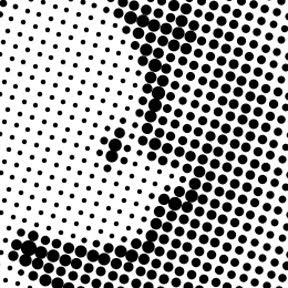
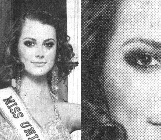 I scanned this photo from yesterday's newspaper. From reading distance, it looks like a black-and-white picture with a full range of gray tones. Close-up, it's a grid of different sized black dots.
 Same for comics. In the early days, cartoonists typically shaded via cross-hatching or stippling like their printmaking cousins did. But starting mid-century (20th, that is), the dots arrived. I've seen a few kinds, but the most widely used were sheets of transparent sticky plastic with the dot patterns printed on them. Brand names included Zip-A-Tone, Chart-Pak, and Letratone.
In addition to different shades of gray, there were special-effect patterns that came in different textures and gradients of light to dark. Hundreds of varieties! Artists cut out the shape they wanted to shade, peeled it off its paper backing, and stuck it to the art. I used to use these a lot. In fact, I still have several sheets stuffed under my desk.
.
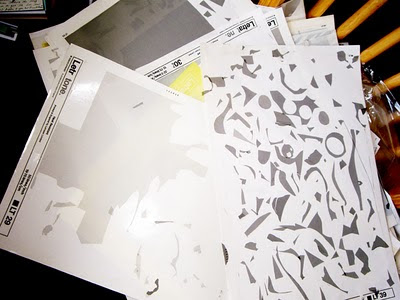
I nicked this photo of Letratone from cartoonist Eddie Campbell, but could have pulled the same sheets out of my briefcase.
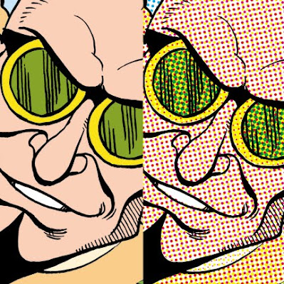
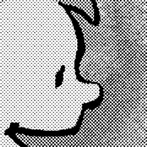
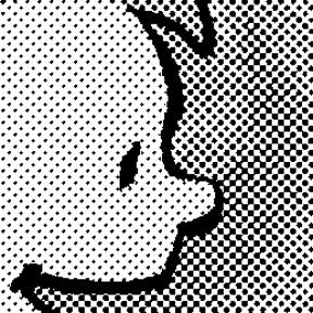
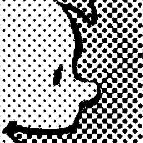
 In his later years, Charles Schulz was very playful and creative with his use of dots. In this example, he used them not only to shade the doghouse and Olaf's hat, but to convey the leafy texture of the hedge behind them. These were all the "cut and stick" kind.
What's fascinating is that, after seeming to fall out of fashion for a while, dots are coming back bigger than ever, thanks largely to manga. There's something about their pure, almost-retro cartoon iconography that appeals to young artists. Of course these days nobody is cutting and sticking anything to anything. It's all done by computer. I find it odd and charming that kids these days are using digital techniques to reproduce a graphic style that many of them probably don't know the origin of. Kind of a comics cargo cult.
One Way To Do It
Step One: Get Photoshop. (I'm reminded of Steve Martin's foolproof advice for becoming a millionaire. First, get a million dollars. Then . . .)
.
Anon asked me about other programs that might be more affordable than Photoshop. I don't know anything about them. There are many types of digital art programs; I assume some can make dots and some can't. Thanks to my artistic children and their friends, I have a dim semi-awareness of programs developed specifically for making manga that offer a library of templates and tools for applying a plethora of dotty effects. Haven't used them. Ask someone half my age.
In Photoshop, an artist can work on an image in different "modes." One mode is "CMYK," or cyan-magenta-yellow-black, for color work destined for print. Another mode is "Grayscale," for black-and-white pictures. The mode we care about is "Bitmap," in which images are rendered only in stark, grayless black and white--which, as you'll recall, is all our newspaper-printing ancestors had to work with. Ah ha!
Here's an example using Photoshop CS3, my current version. Things work very similarly in older versions. I know that because I did both of my graphic novels with Photoshop 5.5, a laughably antiquated program. I hear you snickering out there.
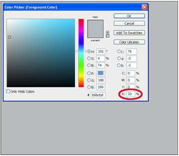
To start, I filled a rectangle with 33% black to make a medium gray. I started in CMYK mode and set the cyan, magenta, and yellow channels to 0% (meaning there's no trace of those colors in the gray) and the black "K" channel to 33%, as circled in red.
.
 Then I transformed the image from "CMYK" mode to "Grayscale" mode, and then to "Bitmap." You can't go directly from CMYK to Bitmap; don't know why. No big deal. Bitmap mode offers several options. We want "Halftone Screen." The window below pops up.
.
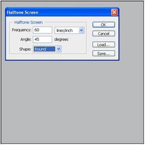
Now the fun starts. You can pick the shape of your dots (diamond, ellipse, line, square, cross . . .). Right-thinking purists choose "round." You can pick the angle your dots make on the page. For black dots, choose 45 degrees unless you're a crazed lunatic.
.
"Frequency" means how small your dots are. Bigger numbers = smaller dots (more per inch or cm). This is tricky. Higher frequency gives you smoother shading; on the other hand, if your dots are too small, they may look blotchy or produce moire patterns. It's important to think about how your art will be seen and reproduced, and the effect you want to convey (e.g., you may or may not want the dots to be apparent). This decision will require some judgment and trial and error. If you're doing art that you already know will be reproduced in a particular medium, ask your editor/publisher/designer/art director/printer their halftone line screen specifications. They'll give you a number; you do the math, taking into account any size difference between your original and published art. When in doubt, err on the side of bigger dots (i.e., smaller frequency).
.
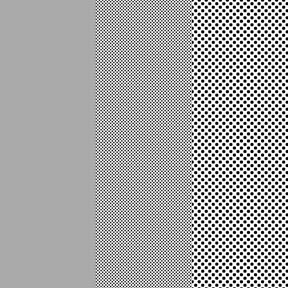 An example of my 33% gray straight (left) and halftoned at two different lines per inch. The halftone frequency in the middle is four times that of the right. It doesn't look like it close up, but if you stood far enough away or shrank the image small enough, these three fields would be the same shade of gray. .
.
I know some artists who do exactly what I did above to create a library of dot patterns they can then use to shade their comics--an almost exact analog of the old technique of cutting them out with a knife and pasting them down, using Photoshop layers or brushes to apply their pre-made dot patterns to their work. I guess it works for them. Personally, I don't see the point. It seems unnecessarily time consuming and artistically limiting (what if you want to use some tone or pattern you don't have a sheet for?). I say: shade your black-and-white artwork however you want--doesn't have to be on a computer, you could just as well color it with markers or paint and then scan it--and then do the halftone screening in one step when you're done.
.
Fun Time!
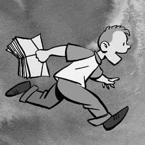
As a demo, I put together a black-and-white drawing colored in shades of gray with an ink wash background. I added the wash because I wanted something with some subtle variation to it.
.
.
Fun Time!
As a demo, I put together a black-and-white drawing colored in shades of gray with an ink wash background. I added the wash because I wanted something with some subtle variation to it.
.
This was originally a pretty high-resolution image: about 2 by 2 inches at 800 dpi. That matters, for reasons that I'll try to explain later. My fundamental advice when doing any digital art: Work at the highest resolution your computer can handle. Then, as the last step, convert to whatever resolution and format are needed for your final product.
.
So here it is, halftoned exactly as described above: Grayscale to Bitmap to Halftone Screen, with round dots at 45 degrees. There's no point in reporting the Frequency, since your results will be different with different size art done at a different resolution and not rescaled for reproduction on a blog. I just wanted you to be able to see the dots.
.

And here's an extreme close-up of same. Note the different size dots to the right that reproduce the uneven shading of the ink wash. Notice also that Photoshop's "Halftone Screen" mode did not mess up the original black line art, which is as smooth and unpixelated as ever. That's one reason for working at high resolution: going into Bitmap mode eliminates any gray "anti-aliasing" that softens the black lines. Low-resolution line art will emerge from Bitmap as a choppy, sawtoothed mess.
 To give some idea of the different looks you can achieve, here's the same image at half the halftone frequency above:
.
And half again:
.
.
When you're all done, don't forget to switch back to Grayscale, CMYK, or other mode as appropriate, since you'll find you can't do much useful in Bitmap mode.
It wouldn't be fair to move on without acknowledging that Photoshop does have one button that offers to do it all for you faster and easier than the whole Bitmap rigamarole. It's under Filter--Pixelate--Color Halftone, and it looks like this:
 If you want, fool around with the "Max. Radius" value and see what happens. The results look like this:
.
Here's a close-up that reveals why I don't like or use it. See how it renders not just the grays, but also the black line art, as dots?
.
That's unacceptable for my purposes, and not consistent with the old comic book printing techniques I was mimicking in WHTTWOT. However, this may be exactly the right look for your project. If so, it's an easy way to go.
.
For some terrific additional reading on the subject, please see these blog posts by Eddie Campbell, who applies dots exceedingly artistically and, in my opinion, is one of the few people in the business really trying to make literary comics for grown-ups (warning: there are some drawings of nekkid people at that link). Comments and corrections from artists who know more about the subject than I do will be happily accepted.
.
.
Next: Color! (Click on this sentence to go to the next post.) Spoiler alert: It's four times as complicated.
.
3 comments:
Brilliant! I'm the 'anon' guy from your earlier post and I'm really glad you're doing this.
I expected that you were going to create multiple layers for each different color part of the image and then set the halftone of each section independently. Shows what I know. I'm looking forward to the 2nd part!
I never knew that that old comics were colored by cutting and pasting the dot areas directly on the image. That really makes you appreciate the amount of dedication, work and sweat involved.
You do see a lot of older comics combining dotted coloring with solid areas of color - but the solid areas were generally (maybe always, I don't know) primary/basic colors.
I'm glad you posted the link to Eddie Campbell's blog. I had done a good bit of searching and not found any cartoonists talking about the process of doing Ben Day coloring until I found your blog a few weeks ago. Have you read David Boring by Dan Clowes? He does some really nice Ben Day coloring but I have no idea if it was done old school or not.
I can't help asking a few extra questions while I'm here...
I've recently begun getting back into an old story that I had started as a web comic a few years back and want to do it right this time. I'm still in the process of working out character designs and my overall workflow and process, but I have most of the story in my head and I'm really excited about it.
I think that I'll end up drawing most everything on paper then scanning that to do the color work on the computer. I've been experimenting with different resolutions and I'm starting to get an idea about the file sizes and image quality on screen, but I still have a lot of questions that I need to answer. For instance, I'm not sure if a 1200 dpi image is too much - or not enough. I do want to plan on someday publishing everything in book form, so I want to make sure that in 5 years, I'll still be resolution-safe. I scanned one image in at 2400 dpi and didn't notice a huge difference on screen - and I'm having a tough time gauging what the actual printed difference between these resolutions will be. These images were 4"x4" and the file sizes quickly became a little crazy - 60Mb for the 1200 dpi version (with several layers and some initial coloring). That's fine with me, but the saves do take a while in Gimp.
Actually, I think 2400 will be pushing it for my computer.
If I'm planning on drawing a long story, do you think it's crucial that all work for that story be scanned at a consistent resolution? Or, will the publishing requirements for printing today be out dated by the requirements of tomorrow?
In that thinking-about-publishing-in-the-future vein, do you think I'll end up regretting changing my workflow/process in the middle of the story - (for example, resolution: dpi, lpi, color profile (I don't think Gimp is doing proper CMYK coloring), image dimensions, etc.)
When you worked on the Ben Day images, did you find that the look of the image on screen pretty much mirrored the look of the image when printed or was that something that you did a lot of trial and error tests to learn?
Thanks for the great post.
I just got WHTTWOT the other day and I'm really enjoying it!
M42 (my favorite cloud of interstellar gas!), glad you like my post and link to Eddie Campbell. Thanks also for checking out my book.
I hope my follow-up post answers most of your questions. It sounds like I did my dots pretty much like you thought I would. I have read "Boring" and Clowes, but don't know how he made his dots.
Regarding resolution, good question. When I did "Mom's Cancer," I didn't know any better and worked at 600 dpi, which was too low. It took great effort to fix. On WHTTWOT, I worked at 1200 dpi (and those were BIG pages!), which was about all my computer could handle without choking. Some files with multiple layers approaced 1 GB in size. However, I did flatten and reduce them to 800 dpi when I submitted them to my publisher, keeping the 1200 dpi versions as my master file copies. 800 printed up very well.
I can't see any reason, now or in the future, to use 2400 dpi. Printing technology isn't that good and the human eye just can't see the difference. I think somewhere in the 900 to 1200 range will suffice for pretty much any purpose you'll need.
Regarding how my benday looked on-screen versus in print, I did do test printings to check that out. Basically, I found that things printed darker than I expected. Especially cyan, which looks like a nice light blue on-screen but can print as a very dark, saturated blue that overpowers detail. In that respect, I found printing my pages on my simple home inkjet printer very helpful. It doesn't have the quality of a real press, of course, but gave me a sense of how computer images made of light would translate to ink on paper.
Bitte mehr davon! Habe gerade erst meine Liebe für Anime und Mangas wiederentdeckt und lese jetzt schon einige Zeit durch deine Seite owo
Post a Comment