First, read yesterday's post to catch up. Ready?
(By the way, I don't expect everyone to read these posts. Don't feel guilty for passing them by. But I bet they'll still be getting Google hits months from now!)
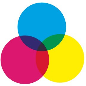
Color process printing is typically done with four inks: cyan, magenta, yellow, and black, abbreviated "CMYK" (I understand the "K" actually stands for "Key Color"--which is always black). Most of the color printing you see in books, magazines, newspapers, billboards, posters, and cereal boxes is CMYK.
The little color wheel up top shows how that works: overlapping transparent inks produce all the colors of the rainbow. C+Y = green, Y+M = red, M+C = violet, and C+Y+M = dark gray. When you use the halftone process to made different shades of those base colors, and add different shades of gray as well, you end up with a pretty large (but finite) palette.
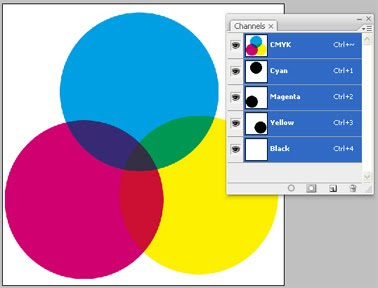
Here's a Photoshop screenshot to help illustrate my point. See the three "Channels" showing cyan, magenta and yellow? The little thumbnail images with each channel show the contributions of cyan, magenta and yellow to the large image--the three big circles. We'll be using Channels later and I wanted to offer a peek.
I'm going to write about CMYK vs. RGB for a second. "RGB" is "red-green-blue," the colors of light your computer monitor generates to compose images. The big difference between RGB and CMYK is that RGB mixes light while CMYK mixes pigment. Remember from junior high science how combining red, green and blue light makes white light? Well, combining red, green and blue (or cyan, magenta and yellow) pigment makes mud.
So if you're doing artwork that will only be seen on a computer--maybe a website or PowerPoint presentation--go ahead and work in RGB. But if there's a chance it'll be professionally printed someday--any chance at all--I'd advise working in CMYK from the start. Pretty much all CMYK colors can be converted to RGB equivalents, but a lot of RGB colors don't convert to CMYK. One day you'll try to print out a nice poster of your best webcomic and the colors will look like yak barf. I warned you.
Now let's do a color separation and make some dots! NOTE: there are other, better ways to do color separations in Photoshop. I did it in this labor-intensive, hands-on fashion because I wanted to accomplish some particular comic-booky effects with my pages. Nobody does real color separations this way, but my original anonymous questioner asked how I faked it for my book. This is how I did it.
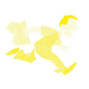
Here's our guinea pig, familiar from yesterday even if you don't remember Buddy from my book WHTTWOT. I deleted the gray ink wash background because we already dealt with grayscale halftone.

Here are the four CMYK channels that comprise that image:
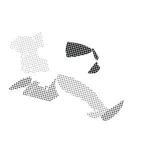
 Black. This is the basic line art, the part I drew with ink. Notice that there's also some gray that darkens the browns in Buddy's shoes and pants.
Cyan. But wait a second! If this is the cyan channel, why is this picture gray instead of cyan? Because the intensity of the gray indicates how saturated the cyan is. Remember, CMYK is meant for a printing press; this separation defines how much cyan ink the press will put on the paper. It's dark where the cyan is darkest, like on Buddy's turquoise shirt sleeves, and light where it's lightest.

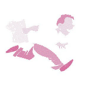
Magenta. There's a bit in his hair, as you'd expect, and some in the brown of his pants and shoes. None in his shirt.

Yellow. Buddy's orange-red hair has a lot of yellow in it. His shirt is entirely yellow (notice there's no cyan or magenta in it). His flesh tone is a mix of magenta and yellow, while his brown pants and shoes combine all four colors.
Making Color Halftones
Hang in there. Now I'm going to take each CMYK channel individually, turn them into halftones like we did yesterday, then recombine them at the end.
I'll use the cyan channel as my example. Here it is again, same as above:
In Photoshop, right-click on the cyan channel (on the small panel I showed above), click "Duplicate," and from the "Destination--Document" pull-down menu select "New." A new window will open looking just like the image above.
Like we did yesterday, convert to Bitmap mode, then Halftone Screen. You should assign each screen a different angle at 15 degree increments to keep their dots from perfectly coinciding. For WHTTWOT (based on old printing practices) cyan is 105 degrees, Magenta 75 degrees, Yellow 90 degrees, and Black 45 degrees. Since we're doing cyan now, enter 105 degrees and whatever frequency that gives the dotty result you want:
 See, just like yesterday. Now we're going to make it blue. Convert from Bitmap to Grayscale to CMYK mode. Then "Select Color Range," sample one of the black dots in the image, and "Edit--Fill" with 100% cyan (and 0% everything else):
 Same for the other three channels (the order doesn't matter). Notice the different screen angles of the dots:

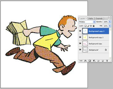
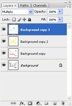
Now we're going to combine these four images into one. Copy or "Duplicate Layer" so they're all lying on top of each other in one file. Picture it like this: you've got four layers of paper, each printed in cyan, magenta, yellow or black, all stacked up.
Now imagine making the paper transparent so you can see all the layers! That's done via the "Layers" control panel shown immediately below and in close-up. See the word "Multiply?" For each layer (except the bottom one), change that setting from "Normal" to "Multiply." Now your layers are transparent and the dots of color are free to mix and blend.
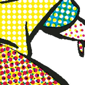
Below is a super close-up of our picture, showing how it works. Using nothing but cyan, magenta, yellow and black dots, we've produced turquoise, orange, browns, and peachy skin tones. Since your four colors are isolated on four different layers, it's easy to mess around with one color without changing the others. That's how I "printed" my old comic book colors out of register and introduced various blobby, smeary "defects."
Then if you're doing a graphic novel with 50 pages of old-timey comic book to fake, just do the same thing 49 more times and you're good to go. Good luck! I'm not dumb enough to try it again.
Completely unrelated but kind of cool: you're also now qualified to begin your second career as an art forgery and counterfeiting expert. While there's a long list of things that are reproduced by four-color process printing, there are a lot of things that aren't. For example, money. In addition, authentic silk-screen prints are made by squeezing many different colors of ink through stencils adhered to, yes, a silk screen. Some great old posters used 20 or more different inks to produce all their colors. If you look closely at a poster that says it's silk screened and see arrays of tiny dots like those in the image above, it's a reproduction. Likewise antique prints and etchings. Before the 20th century, printmakers created shades of gray by engraving fine cross-hatching or stippling on their plates. If you look closely and see tiny irregular dots, that's hand-crafted stippling. If you see dots too small and perfectly aligned for a human being to make, that's a modern copy.
If that tutorial wasn't sufficient, Wikipedia has some entries on CMYK, four-color process printing, and halftone. Also, I didn't say anything about Trapping. As always, I welcome additions, corrections, and discussion from people who know more about it than I do. Go nuts. I'm tapped out.
HOWEVER . . . If you've read this far, you might as well go ahead and check out this post from July detailing how I applied these techniques to make a page of my book, including adding imperfections intended to mimic bad printing technology and 70 years of age. It's fun!
5 comments:
Brian, thanks for the detailed write-up in the last two posts -very interesting and informative.
Please excuse what may be a stupid question. I'm pretty sure I read both posts closely, so I hope I didn't just miss this.
I'm curious what the reason behind halftoning is. What I mean is, I always thought that the spacing of the dots was the maximum resolution of the printer - it couldn't change the spacing; only the size of the dots. (I'm referring to the "olden days" printers, the output of which you're trying to duplicate, of course, not today's printers.) However, I see that your solid black lines can be very fine and detailed, seemingly totally unrelate to the dots. So, how could a printer create such high-resolution lines, but only do low-resolution coloring?
Thanks again. I really appreciate you taking the time to educate us all.
Tim, great to hear from you. It's not a stupid question and I'm not sure I'm qualified to answer, but I'll take a stab.
I think the explanation lies in the idea of "resolution." These digital days we think in terms of dpi, but I don't know if the term would've had the same meaning in the old days. Printing was an analog process, not digital, and resolution was essentially infinite (or limited only by the physical properties of the materials involved). Like the difference between film and digital photography.
What I mean is, if you took a tiny engraving tool and etched a super-fine line into a printing plate, then put ink on the plate and pressed it against paper, your line would be faithfully reproduced. Consider the microscopically fine engraving used on a dollar bill. The resolution of later printing technology, which involved photographing artwork to make the plate, allowed even finer detail. I think the only limitation would be how the ink physically interacted with the paper--if it bled, spread, oozed, blotched.
Halftone was invented to reproduce different tones with one color of ink--so you could use black ink to reproduce any shade of gray, for instance. I think the size/spacing/resolution of the halftone dots was limited only by the physical effects I mentioned: how small you could make them and how tightly you could pack them before the ink started to run together on the paper and make a muddy mess. Resolution per se, as we think of it today, wasn't an issue.
Also keep in mind that comics were historically printed on the cheapest, poorest quality paper available, both in newspapers and comic books. It bled like a paper towel, hence the need for big dots. In WHTTWOT, I subtly suggested technological progress by making my halftone dots smaller as the decades progressed.
I think that's right. Sounds good, anyway.
Very nice article. You got a really nice look to the finished image that I'm not getting with the Newsprint filter in Gimp (so far, I haven't found a way to do Halftone filtering in Gimp like you described). I found a 'fake-it' type of plugin for Gimp that will split up an image into CMYK layers, but since Gimp has no support for CMYK, the whole process is a waste of time without Photoshop. I just ran across a site called 4 Color Process that's posting close up images scanned from old comics - you might like it.
Thanks again.
Brian, I was wondering if you could estimate how many inkjet printer pages per finished book page you go through to achieve the final "look?"
This thought struck me as I was printing the sixth draft of one chapter of my thesis, and I'm just trying to figure: if I'm killing this many trees for just *words*, how many reams do you go through for pictures?
I try to proof as much as I can on my multi-screen monitors, but I notice my brain often only catches problems when they're actual ink on actual paper.
M42, thanks! I hope I answered some of your questions. I enjoyed trying.
Jim, odd question! My ream toll is hard to estimate. While working on WHTTWOT, I developed a system of snapping the latest version of each page into a three-ring binder--first as script, then sketch, then various stages of completion--writing my notes and corrections on the pages. When the binder was done, so was the book. But I don't think my environmental crime was TOO bad; I did most of my revising on the computer. Adding it up, I probably printed a couple thousand pages of research and source material. Then for a 208-page book, maybe another 800 or 1000 pages for the binder (4-5 sheets per page of book?). For the whole project I'd guess six reams, tops, over a couple of years.
I know what you mean about things looking different on paper. It reveals problems as well as solutions.
Post a Comment