Wednesday, December 29, 2010

A Fresh Sense of Wonder

Space Times, the magazine of the American Astronautical Society (AAS), which awarded WHTTWOT the 2009 Eugene M. Emme Astronautical Literature Award (Young Adult), has published a review that I thought was so terrific I'm reprinting the entire thing here. Continued thanks to the AAS for its support, this review, and
the cool plaque hanging on the wall over my left shoulder. Earning such nice recognition from a group like this is the best.


Whatever Happened to the World of Tomorrow? answers the
question--if it still needs to be asked--of whether a graphic novel can be as educational and entertaining as a standard book. Yes it can--perhaps it can do even more.


This is a book that can be enjoyed on a number of levels. There are some wonderfully sly and ironic asides that only a careful reader will spot. But mostly the book takes us on an enjoyable ride through the imagination of a young child from the 1930s onward. The personal tales show how America's love of space sciences and the promise of the future rose on lofty national dreams of a bright future where science cured all problems, only to be slowed by a mixture of cynicism and reality. Its examination of futures past is fascinating, especially to comapre them so closely side-by-side.

It would be a pessimistic finale, to look at how many of the dreams of prior decades did not happen, if not for the book's ending, which says something very important that few books for adults or youth ever capture--and certainly not as well as this book. In short, it shows how not reaching the dreams of the past is not always a bad thing, as long as they are replaced by newer, smarter, better dreams, based on new ideas, new experience, and a fresh sense of wonder.

We can't imagine a better time for young people to hear this inspiring message, and this book delivers it with grace and style.

.

Monday, December 27, 2010

Sketching with Passion

Last September I blogged about the great time I had taking part in a Cartoonists Sketch-a-Thon at the Charles M. Schulz Museum. To help celebrate the 60th anniversary of "Peanuts," the museum gathered 18 or so cartoonists--all of whom had done previous "Cartoonist in Residence" gigs--and set us up at tables to draw for and talk to the public. It was a very nice event.

Also attending was videographer Jay Hamilton-Roth, who schlepped his camera from table to table interviewing many of us. Jay's subject is "Business with Passion," and if there's any group of people passionate about what they do it's cartoonists because there sure ain't much money in it. Anyway, Jay has now assembled his report and produced this trailer:


The full half-hour feature is posted at Jay's website (I don't see a way to embed it and I'm happy to direct traffic to him). My bit starts at about 13:20 but I think the whole thing's worth watching. Seeing it really makes me wish I'd had time to meet and talk to people like Lark Pien, Brent Anderson and Paul Madonna, but I never really had the chance. I already knew and got to at least say hello to Dan Piraro, Alexis Fajardo, Shaenon Garrity plus a couple of others who were there but weren't interviewed by Jay.

My first impression of the interview is that I brag too much, for which I have two excuses: first, Jay naturally had no idea who I was so I needed to establish my bona fides and explain what I was doing there very quickly; second, we talked for quite a while and those are the bits he went with.

I really wish I hadn't called Whatever Happened to the World of Tomorrow "a more personal project" than Mom's Cancer. Argh! I can't imagine anything more "personal" than the true story of how my family dealt with my mother's disease, and when I build my time machine I'll go back and stop myself from completing that sentence. What I meant--and how I've expressed it elsewhen--is that WHTTWOT is a book I could have done if Mom's Cancer had never happened. It's me. Its themes of futurism, Space Age utopianism, pop culture appreciation, and optimism are part of my personality and close to my heart. In that narrow sense it's a more personal work. But if I could only choose one book to put in the time capsule of my life, it's Mom's Cancer.

In any event, it's a nice feature and I appreciate Jay's time and effort very much.

I mentioned a while back that the cartoonists were all asked to provide a drawing commemorating the anniversary of "Peanuts" and that mine was one of a few chosen to go on display. That's now happened, and turned out much nicer than I expected! If you visit the Schulz Museum sometime in the next few weeks, you'll find my piece up the stairs directly across from the restrooms:


Mine's at the upper right (I posted a scan of it here). The other three are by Greg Knight, Lark Pien and Thien Pham. The group of four to the left are other pieces unrelated to the Sketch-a-Thon (I think one is an original of the comic strip "Pickles" by Brian Crane that mentions "Peanuts").

Seeing my work hanging on this wall in this building goes on my list of all-time personal lifetime highlights. Among the many extraordinary things that have happened to me in my cartooning semi-career, this one stands out.


Friday, December 24, 2010

Bark Us All Bow-Wows of Folly

Time for a bit of whimsy that's been a tradition on my blog every Christmas Eve since waaay back in 2005. My best wishes to you, thanks for reading my stuff.

Deck us all with Boston Charlie,
Walla Walla, Wash., an' Kalamazoo!
Nora's freezin' on the trolley,
Swaller dollar cauliflower alley-garoo!


Don't we know archaic barrel,
Lullaby Lilla boy, Louisville Lou?
Trolley Molly don't love Harold,
Boola boola Pensacoola hullabaloo!

Bark us all bow-wows of folly,
Polly wolly cracker n' too-da-loo!
Hunky Dory's pop is lolly
gaggin' on the wagon,
Willy, folly go through!

Donkey Bonny brays a carol,
Antelope Cantaloup, 'lope with you!
Chollie's collie barks at Barrow,
Harum scarum five alarum bung-a-loo!


--Walt Kelly

Monday, December 13, 2010

Graphic Medicine: Call for Papers

Some of you may remember that I had the honor and fun of being a keynote speaker at a conference on Graphic Medicine in London last June. I must've looked like I had too much fun, because the organizers of that event asked me to help plan the next one and I said "yes."

It's scheduled for June 9-11, 2011 at Northwestern University in Chicago, and we're looking for interesting material to fill two days (expanded from the single day in London) of talks, workshops, panels, and general fol-de-rol. Stitches author David Small is a confirmed speaker and we're negotiating with other big-name creators to appear as well.

Some excerpts from our Call for Papers:

We invite proposals for scholarly papers (15 minutes), poster presentations, and panel discussions (60 minutes), focused on medicine and comics in any form (e.g., graphic novels, comic strips, graphic pathographies, manga, and/or web comics) . . . We also welcome workshops (120 minutes) by creators of comics on the process, rationale, methods, and general theories behind the use of comics to explore medical themes. These are intended to be “hands-on” interactive workshops for participants who wish to obtain particular skills with regard to the creation or teaching about comics in the medical context.

We envision this gathering as a collaboration among humanities scholars, comics scholars, comics creators, healthcare professionals, and comics enthusiasts.

300 word proposals should be submitted by Friday, 28 February 2011 to
submissions@graphicmedicine.org.

The full Call for Papers is available at http://graphicmedicine.org/#/conference-2011/4546507879. If I didn't think this was worth doing, I wouldn't be doing it.
.

Tuesday, December 7, 2010

Bookplates Roasting on an Open Fire


I posted this on my Whatever Happened to the World of Tomorrow Facebook Page but also wanted to mention it here:

Planning to buy that Space Age Baby Boomer or curious kid in your life WHTTWOT for Christmas? Want it signed? Better than going to the time and expense of mailing a book back and forth, just e-mail me (brianfies[at]comcast.net) your postal address and I'll mail you a bookplate--specially designed by me--inscribed however you want. Free! Then you can stick it in the book and smugly bask in their gratitude.

Sorry for the duplication, all six of you who read my blog and are also Facebook fans, but I've got stickers to unload and books to shill. 'Tis the season! And I do think it'd make a great gift for the right person. Why, I'll bet you're thinking of someone right now....
.

Sunday, December 5, 2010

Plus I Can Cut Meat on It

My postal carrier briefly interrupted the stream of junk mail and Christmas catalogs that jam our mailbox this time of year to bring me something I actually wanted: a handsome plaque from the American Astronautical Society (AAS). My Eugene M. Emme Astronautical Literature Award, Young Adult Category, for Whatever Happened to the World of Tomorrow.

You can tell I'm happy because of my totally relaxed and natural smile in the photo above. What a goober.

I've already written a bit about how much this honor means to me and don't want to belabor it. Just thought you might want to see the plaque. Since it's made of a luxurious rich dark wood that didn't photograph well when I held it, I scanned it and lightened it up a bit:

Pretty cool, huh? Thanks again to the AAS, not to mention (nor ever overlook) all the people who read and appreciated WHTTWOT in the first place. That's better than plaques.

Which I will still take.

.

Thursday, December 2, 2010

It's Sentimental, I Know

We've got a local radio station that will broadcast Christmas songs non-stop between now and December 25. I guess they're angling for that lucrative "playing quietly in the background while people shop at the strip mall" market.

Since my slice of Northern California doesn't get snow or many other external reminders of the holiday (I don't count rain), it's pleasant to tune in occasionally. However, the small repertoire of songs gets awfully repetitive, which is why I'm always looking for new carols to add to the canon. I think maybe I found one:


Singer-songwriter Tim Minchin is Australian, which is why his happy Christmas memories sound like warm-weather ones. Now go shop. You're already behind everyone else!
.

Tuesday, November 30, 2010

The Joy of Stats

I found the clip below, from a BBC program(me) called The Joy of Stats (!), fascinating in both form and content. It may also be the most I've learned in any given span of 4 minutes since the day I figured out that liquid + air = bubbles. Worth a look, I think. It reminds me of James Burke's Connections, which I remember as one of the greatest things ever committed to video.*


*Please don't tell me if I'm remembering wrong.

.

Saturday, November 27, 2010

Hey, I STILL Know Him!

Diary of a Wimpy Kid character Greg Heffley made his debut as a balloon at this year's Macy's Thanksgiving Day Parade. While I'm happy for author Jeff Kinney and all, I probably wouldn't have posted this clip if it weren't for a couple of moments around the 42-second mark:


That's my (and Jeff's) Editor Charlie waving at the camera, dangerously leaving his wife, the Lovely Rachel, to hold down the balloon by herself while he basks in his network television close-up. I wasn't able to watch the parade live but recorded it just to catch the Wimpy Kid balloon, and was rewarded with this bonus Thanksgiving greeting from my friend Charlie. "Hi" back at you, Bud. Feel free to pass this video around the office.

If you're interested in how the balloon got built (I am!; who wouldn't be?), Abrams Creative Director Chad W. Beckerman posted several photos and videos about it. Here's a blog post about Jeff fine-tuning its design (from which I nicked the photo below) and here's one showing the parade rehearsals. In all seriousness, I think having a balloon in the Macy's parade is a terrific piece of Americana. It only occurred to me on Thanksgiving morning that if I'd pleaded and whined and flown myself to New York City, I bet I could've pulled some strings (heh!) and gotten work as a Wimpy Kid balloon wrangler. Maybe next year. Congrats to Jeff and Charlie.

Jeff (left) and Editor Charlie inspecting the clay model from which the balloon was scaled up. (Photo by Mr. Beckerman, stolen with impunity.)

Friday, November 26, 2010

Character Design #4

Here are Installment #1, Installment #2 and Installment #3.

As I begin Installment #4, it occurs to me I may be overanalyzing. I don't want to discourage anyone from creating comics by making it sound like a horribly complicated, laborious ordeal. Seriously, just sitting down and drawing is 90% of the job. While I do think about these design elements, I don't have a checklist. There's no formula or recipe. I don't know if they work. That's what makes writing and drawing more art than science, and a risky one at that. My way isn't the only way or right way, YMMV, etc.

With those misgivings, this is what I was thinking when I designed Cap Crater and the Cosmic Kid. Like their counterparts Pop and Buddy, Cap and the Kid played similar but slightly different roles in WHTTWOT. Together, they represented and commented upon the comics, cartoons, TV programs, movies, books, pulps, and other futuristic pop culture produced during the eras of their adventures. However, having two characters let me attack from two different directions. Here they are again for reference:


Cap Crater's look was inspired by models such as:

Gemini astronauts
.
Apollo astronauts
.
NASA prototype spacesuits
.
Major Matt Mason, a popular toy from the 1960s.

Cap is an old-school barrel-chested hero. He's got a military buzz cut, and there's a tiny joke built into the name Commander Cap Crater: although "Cap" is usually a nickname given to a captain, our hero has the lesser rank of commander, suggesting he's been demoted. But the key to Cap Crater's design is that his spacesuit is relatively realistic, based on real-world examples. His look embodies the idea that sometimes the people making up stories about the future in the 1930s and '40s got it spectacularly right.

And sometimes they got it spectacularly wrong. In contrast to Cap Crater's fairly functional suit, the Cosmic Kid's uniform was inspired by models such as:

Tom Corbett, Space Cadet

Flash Gordon, of course

DC Comics' Adam Strange

Robin the Boy Wonder.

Not one of them practical or realistic in any way! So I wanted Cap Crater and the Cosmic Kid to represent contrasting visions of the World of Tomorrow, but still look like they not only belonged in the same reality but worked together as partners. I used one subtle graphic touch to try to pull them together: the hose bibs on Cap Crater's chest--the little red, green and yellow "buttons"--are the same colors as the Cosmic Kid's uniform. No other character in the book ever wears that palette. Those shared spots of color make them a team.

With all that, Cap Crater is a real pain to draw. His rigid metallic collar is a circle, which requires perfect circles or ellipses to look right. I had to buy an ellipse template just to draw his neck.

Fine. You'd expect a craftsman to purchase the tools of his trade. But in addition, that collar doesn't really sit right on Cap's shoulder and chest, and his elbow and knee joints proved difficult to draw in proper perspective without making them too bulbous. Also, the accordion joints (the three Jetson-like rings) at his waist were yet more ellipses that had to be perfectly parallel, demanding more work by template, French curve, or careful freehand. (In fact, Cap originally had the same type of joints at his elbows and knees, but I edited them out mid-way through because, even when drawn perfectly correctly, they often looked odd.)

Cap before and after I ironed out his accordion joints. By the way, any similarity between the look and palette of this cover and the "World's Fair" Superman comic above was purely intentional.

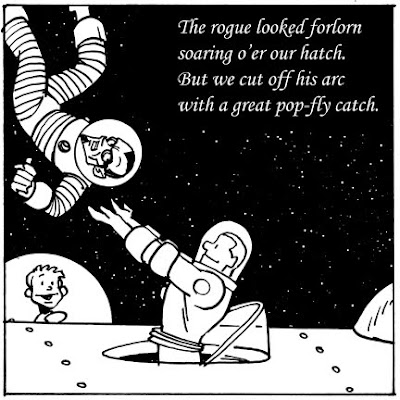
The Cosmic Kid is a lot more fun to draw. He's less stiff. I like his floppy hair. His shoulder epaulets, belt, and the red stripes on his gloves and trousers provide easy visual cues that highlight his position and movement. There are different textures at play--for example, both his sleeves and boots are black, but I always imagined his sleeves had a soft wool texture while his boots were leather--which call for different types of brush strokes. I sometimes found myself "cheating" to avoid drawing Cap in certain positions or angles; I never had to cheat with the Kid.

Which is why, as I said at the end of Installment #3, if you meet me in real life and ask me to sketch any character I want, I will almost always draw the Cosmic Kid. Also, if I had it to do over, I'd spend another few days of pre-production refining Cap Crater. Not that I'm not very fond of the big lug.

And with that, I think I'm done with Character Design. Among the bullet points:

  • To help readers effortlessly decode your comic, design characters to physically contrast: male/female, black/white, human/animal, tall/short, fat/thin, old/young. Apply the Silhouette Test.
  • Characters have to live in the universe you create for them. Their world affects and reflects their design.
  • At the same time, you have to live with them. Be sure they work from every angle (turnarounds) and are designed to do whatever you might need them to do. (And don't give them big round metallic collars.)
  • Constructing characters with a good, solid design from the start can minimize the gradual changes that creep into their look over time, and potentially avoid a lot of work later.
  • Character design can help communicate deeper insights into story themes, forms, and approach to storytelling--often in ways the reader won't consciously perceive, but that you hope they might pick up anyway. My theory is that subtle details accumulate to create a mood or impression that affects a reader without them quite realizing why.
  • Here's the important point: I think these guidelines are valid and worthwhile, but they won't fit every character or story. Feel free to violate them. But I'd suggest asking yourself why you're violating them, and whether you might get just a bit better performance from your characters if you apply them instead.

Hope you enjoyed the interesting parts, skipped the boring parts, took what works for you and ignored the rest. I'll keep trying to get better at it.

Wednesday, November 24, 2010

Character Design #3

Here's Installment #1 and here's Installment #2. Getting sick of me yet?

With Whatever Happened to the World of Tomorrow, I had the opportunity and challenge to design characters from scratch. I created Cap Crater and the Cosmic Kid first, then hit on the idea of giving them the "real life" alter egos of Pop and Buddy later (more about my thinking behind that in a bit). In the next post, I'll go into some detail about the design of each character; for now, I'll just point out that I adhered to the principles of contrast (old/young, tall/short, monochromatic/colorful) and that they pass the Silhouette Test.

The very first drawing I can find in my sketchbook of Cap Crater and the Cosmic Kid together. They began a bit more cartoony than they eventually turned out (below).


To really talk about character design, I need to get into some of the themes and motifs of the book--specifically, why the comic book Cap Crater and the Cosmic Kid look like "real-life" Pop and Buddy, and why Pop and Buddy don't age like regular people.

I wanted to weave three threads through WHTTWOT: A factual account of some historic and scientific touchstones between 1939 and 1975; reflections on the underappreciated effect of pop culture on how people saw and shaped the future; and a simple little story about a son growing up and realizing his father isn't the paragon he idolized when he was eight, meant to parallel the arc that (I argue) society traveled from optimisitic utopianism to pessimistic dystopianism--or as I glibly describe it, going from "Flash Gordon" to "Blade Runner." Cap Crater and the Cosmic Kid could carry some of that load but not all of it. I needed "real people" to live through the times and embody the father-son relationship at the heart of the story. I needed Pop and Buddy.

The not-aging-in-real-time thing--which I think really stumped a few readers and I might have handled better--came out of my desire for the father and son to experience the same transition from idealism to disillusion in about 10 years that society experienced in 35 or 40 years. I also aged Pop and Buddy at the same rate as Cap and the Cosmic Kid because I wanted to knot my three threads together in a dateless future (the last chapter) where the characters could be either pair or both, living in the future they all envisioned.

Pop and Buddy (or are they Cap Crater and the Cosmic Kid?) in the World of Tomorrow. This chapter is colored and lettered differently than the rest of the book to press the ambiguity.

At the same time, I flattered myself that I was making a witty meta-comment on the comics form itself. The conversation I always imagined having with a puzzled reader went like this:

Reader: "So why don't Pop and Buddy age like regular people?"

Me: "Why are you asking about Pop and Buddy, and not Cap Crater and the Cosmic Kid? They age at exactly the same rate."

Reader: "But Cap Crater and the Cosmic Kid are characters in a comic book."

Me: "And what do you think you're holding in your hands?"

A-ha! Then the imaginary reader buys me pizza and beer. The reason I'm over-explaining this is because the skeleton of my story affects the character designs I layer on top of it. For example, Pop's clothing changes through the decades. In 1939 he's wearing a snappy suit, in 1955 he's in work clothes that might be old Army fatigues, in 1965 he's in a NASA cap and Beach Boys-style casual shirt. His clothing helps define his role as a man who lived through those times.

Buddy and Pop, 1965

Buddy doesn't fill quite the same role. Oh, he still lives through those times, side by side with Pop. But Buddy wears the same turquoise and yellow t-shirt throughout the book to hint that he is a character in a comic whose costume doesn't change any more than Charlie Brown's zig-zag-striped shirt did in 50 years.

I thought long and hard about Buddy's shirt. Basically, I needed to dress him so he'd look right in 1939, 1975, and any year in between. A simple button-down shirt or striped pull-over would've worked, but I didn't find them visually interesting. So I was thinking along those lines while doing research for WHTTWOT, which included watching hours of movies shot at the 1939 World's Fair. Then I saw him: ambling across the fairgrounds, a boy in 1939 wearing a baseball-style half-sleeve t-shirt, just like the ones I've got in my drawer. It worked then, it works now, and the contrasting shapes and colors were just what I'd been looking for. Of course I doubt the 1939 kid's shirt was turquoise and yellow (he was filmed in black and white), but I thought those colors were eye-catching and I allowed myself the artistic license.

Finally, since it kinda sorta applies, I wanted to touch on my use of color in WHTTWOT. As I've described before, the "Space Age Adventure" comics within the comic were colored in Ben Day dots using era-appropriate palettes. The last chapter is pretty much full color. For the chapters depicting Pop and Buddy through the years, I wanted to use limited palettes in each chapter to differentiate them from each other as well as from the fake comic books and final chapter. I assigned each chapter a "mother color" based on a mood or theme I wanted to invoke.


WHTTWOT's Mother Colors

My choice of old-timey sepia for 1939 is obvious; 1945 has the cold gray of World War II movies; 1955 has the blue tint that old photos take on as their red dyes fade in sunlight; 1965 has the magenta hue that poor-quality vacation slides take on as they age; 1975 has purple because, honestly, I was running out of colors I liked and the story takes place at night. The "Chapter 6 (Future)" color just denotes the blue-gray metal of the habitat and doesn't really serve the same purpose as the colors in the other chapters. I constructed my mother colors so they'd all have about the same mid-range value or intensity; if you converted them to black-and-white, they'd all be similar shades of medium gray. My rule of thumb was that the percentages of cyan, magenta, yellow and black that comprised them added up to 100%. It wasn't a hard-and-fast rule, since obviously 100% black is more intense than 100% yellow, but more of a guideline that got me in the ballpark.

Today's take-away is similar to yesterday's: designing characters involves more than drawing and dressing them. Yesterday, I made the case that your characters' design has to reflect the universe you create for them to live in. Today, I argue that character design can also communicate something deeper about your story's themes, form, and approach to storytelling.

Coming up (someday): Why if you meet me in real life and ask me to sketch any character I want, I will almost always draw the Cosmic Kid.

EDITED TO ADD: Here's Installment #4.

.