Nothing profound today, I just wanted to post some drawings of the Cosmic Kid I did recently for a little side project (not the Scholastic edition--I'm told that's already off to the printer!).
I really enjoy drawing this character--unlike Cap Crater, whom I enjoy drawing less because I made some--well, I don't want to say "poor decisions," but let's say "less than optimal choices"--when I designed him. The Cosmic Kid is always expressive, energetic, and has different shapes and textures in his uniform for me to play with. I like drawing his gray undershirt and leather boots. I like drawing his Saturn emblem. It's always fun to revisit him.
WHTTWOT was recent enough that I can always dash off a Cap Crater or Cosmic Kid without reference. If I had to draw any other characters from the book, I'd probably take a quick look just to remind myself how I drew them. Sketching the characters from Mom's Cancer, as I recently did when signing books at the Medical Examinations Conference at UC Riverside, is more challenging both because I haven't drawn them in a while and I don't exactly draw like that anymore. No one else would notice the difference (I trust), but I kind of have to rewind my brain and think, "how would I have drawn them then?" In fact, embarrassing secret: before the Riverside signing I practiced so that I could casually dash off a sketch like it was no big thing. I worked at that.
There's another good reason to put a lot of thought and care into designing your comics characters: you may be living with them much longer than you think.
The Last Mechanical Monster. A Fire Story. Whatever Happened to the World of Tomorrow? Mom's Cancer.
Wednesday, July 31, 2013
Thursday, July 25, 2013
How I Make Comics
In my mind I think I write "How To" posts all the time. If you looked through seven years of archives on both this blog and its predecessor, you'd probably find dozens of them. However, I recently realized it's actually been a long time since I've described my overall cartooning process in any detail, and it's evolved a bit. So once more unto the breach.
First Critical Caveat: This is just my way. It's not the right way. There is no right way; whatever tools and methods work for you are fine with me. In fact, in our digital age in which increasing numbers of cartoonists work entirely in pixels on Wacom tablets and Intuos screens, my dedication to paper and ink makes me a dinosaur in denial that an asteroid has hit. My answer is the same as MAD Magazine cartoonist Tom Richmond's: paper and ink are fun. I enjoy the craft of creating a physical thing. Why would I give up the best part of the job?
What I can testify is that I've made a lot of mistakes, massaged out a lot of bugs, and this method works for producing publication-ready comic art. Revise the recipe to suit your taste.
My paper is 2-ply Bristol board, typically from Strathmore. For this project, my original page size is 27 x 42 cm (about 10.5 x 16.5 inches). Most artists draw 1.5 to 2 times larger than their comics' ultimate printed size, which in this case I don't know; I chose that size because its proportions are standard and it's the largest that fits on my scanner. My India ink is Dr. Ph. Martin's "Black Star." I used to use Higgins ink, but either their formula changed or my standards improved, because I find it unusable now. Too thin and blotchy. Martin's costs more but it's got a great consistency and covers paper like tar covers a road.
I typically write my comics first. It's an informal script, but in form and content resembles a screenplay: simple descriptions of settings and action, plus dialog. Sometimes a little doodle to remind me what I'm imagining. Not everyone scripts first. Some savants just start drawing and see what story comes out. I can't do that and barely comprehend it, but if you're a "pictures first" type of cartoonist you have my respect and admiration.
I'll often but not always do thumbnails--very rough sketches that lay out the page and the action in each panel. Sometimes the script is clear enough that I already see the page in my head and can go straight from script to penciling.
Pencils and Inks
Comics are traditionally drawn in pencil first, then gone over with black ink. This method is an artifact of century-old printing technology and isn't really necessary anymore, but it still works and is what I do. You can just use a plain ol' No. 2 graphite pencil, but you'll have to erase your lines later. I don't like to erase. It takes time and smudges ink lines. Instead, I use light blue pencil, another artifact of obsolete technology. In the old days of shooting Photostats, light blue became invisible so you didn't need to erase it. Even today, scanners and photocopiers don't reproduce it well, so it can still serve much the same purpose.
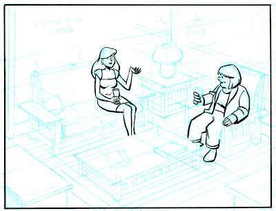
Here are my pencils for one panel of a comic I'm working on. I had to crank up the contrast very high to see the blue lines at all:
In this panel, two neighbors are having a glass of wine after work. First thing I want to point out, and this is very important: my top priority when composing a panel is figuring out where the words go. A lot of beginning cartoonists don't know this: THE WORDS GO FIRST. Blocks of text draw the reader's eye through the page, and their placement can make the reading experience an effortless joy or a hopeless muddle. It's not evident in the above scan, but I've sketched out a few key words from the script in the open space near the top of the panel (the one at top left reads "good old days") and am very aware of how much space the text will need.
Second thing I want to point out are the perspective lines. They all go toward two vanishing points far off-panel (actually, far off the edge of the paper as well). I don't lay out a perspective grid for every panel, but in this case--a medium-long shot that shows walls, a floor, furniture, and characters occupying that space--it's essential. Whenever I have trouble drawing something and it just isn't "working," I find that about half the time I've messed up my perspective somehow.
Next step: inking. In the old days, the words would be lettered on the page before anything else; that's how important they are. These days, I letter digitally near the end of the process (for reasons I'll explain later). As much as possible, I ink with a brush. Brushes take some practice but to me are worth it for the life they give a drawing. I use a "00" (double-zero) brush, which I understand is smaller than most cartoonists prefer, but I like the razor-thin line and fine control it gives me. Here I've drawn the panel border and inked the figures:
This panel is unusual in that I brushed very little of it. Generally I ink at least half of every page via brush, but this panel has a lot of fine straight lines that'll obviously require a pen. Sometimes I use a crow-quill dip pen, but in this case I'll use Pigma Micron pens in various sizes to complete the inking (I'm not a shill for Microns, but they make dark, colorfast lines that work well). Here's an intermediate step, in which I've defined the major shapes to make sure they're right before getting bogged down in fiddly bits.
Then the fiddly bits:
At last I join the 21st Century and scan the art into Photoshop. First step is general clean-up: smudges, smears, and other stuff that would've been fixed with white paint and rubber cement in the old days. I think you have to be very careful here. On a computer, it's very easy to zoom in on every microscopic spot and "fix" it until you've fixed all the spontaneity and life out of it. In my opinion, it's vital that the art still looks like it was done by a human rather than a robot. Know when to quit. At this point, I also use Photoshop to erase my blue pencil lines.
Here's some wisdom I learned from hard experience, and led to the Second-Best Advice I Ever Gave: when you scan your work into Photoshop, scan it at the highest resolution your computer can handle without choking. At a minimum, 600 dpi. I work at 900 dpi, but that's with original art drawn larger than the final art will be printed at, so it's really more like 1200 dpi. One reason is that, even if you're just doing a webcomic that'll be posted online at 72 dpi, you may need better-quality images down the road. Remastering original art is a painful waste of time.
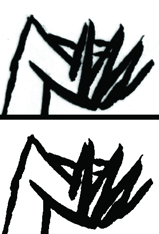
Here's another reason. At this stage, I do something that's hard to follow if you're not playing along (so don't worry if you're not): I convert my scan to bitmap (50% Threshold) and then back to CMYK mode. Why? Because converting to bitmap changes every pixel to either black or white--no grays. This gives me very crisp black lines that print and color very cleanly. As shown in the comparison below, where I've zoomed in to look at the hand of the woman on the sofa, it also gives lines a zig-zag sawtooth pattern. Scanning at high resolution makes the sawtooth disappear when you pull back.
Now: Words. As I said, in the old days, the words would've been inked first, directly on the original art. That's how I did Mom's Cancer. That's real cartooning and I respect it. However, here's what I learned on Mom's Cancer: it also makes editing very difficult. Imagine you want to move a word balloon, change or delete a bit of dialog, or just fix a typo. With the text and balloons on the original art, you might have to redraw an entire panel. And that's not even considering deleting all the words to get the pages ready for foreign translations! With some regret, I decided that digital lettering was the way to go on Whatever Happened to the World of Tomorrow, and haven't looked back. I scanned samples of my own hand lettering from Mom's Cancer and used a program called FontCreator (not a plug, there are others) to turn them into a computer font, which I've used since. Balloons go on a separate Photoshop layer in a process that isn't worth describing. All easily editable.
Finally, Coloring. Again, in Photoshop*. There are some technical aspects of preparing art for color printing that aren't worth getting into. Most importantly, I recommend coloring your work in CMYK (cyan, magenta, yellow, black) mode rather than RGB (red, green, blue) mode because CMYK works best for printing inks on paper while RGB works best for shooting electrons at a computer monitor. Unless you're absolutely certain that your artwork will only ever be seen on a screen, use CMYK or brace for a world of hurt later.
(* I know quite a few artists who color their comics by hand using watercolors or what have you, including Vanessa Davis and Carol Tyler. I believe their pages are simply prepared for printing by photographing or scanning them, as you would any other piece of art. I think that's wonderful and has a lot of integrity. It's just not what I do . . . although I'd love to try it.)
So I colored this drawing just to show how it might look:
This coloring is quick and dirty, not final; if this panel ever sees print, it might look quite different. I would go to some effort to create a palette for every character and location (which I haven't done here) to give each a characteristic look and feel. My goal is to have the colors communicate something about the person and place, and lead your eye where I want you to look. A lot of colorists take full advantage of Photoshop to do highlights, shading, blending, and similar effects (lens flare!). I do some of that but not a lot. My comics aesthetic leans toward a limited palette of mostly flat colors. To me that says "comics." But that's just me.
That's pretty much how she goes. It may seem like there's a lot to it, but you get into a rhythm and it flows pretty easily. I enjoy the change of pace moving back and forth between the drawing board and computer. At the end of the day you can say you turned white paper and black ink into something that didn't exist yesterday, which can be a very gratifying (or frustrating or depressing or exhilarating) feeling.
First Critical Caveat: This is just my way. It's not the right way. There is no right way; whatever tools and methods work for you are fine with me. In fact, in our digital age in which increasing numbers of cartoonists work entirely in pixels on Wacom tablets and Intuos screens, my dedication to paper and ink makes me a dinosaur in denial that an asteroid has hit. My answer is the same as MAD Magazine cartoonist Tom Richmond's: paper and ink are fun. I enjoy the craft of creating a physical thing. Why would I give up the best part of the job?
What I can testify is that I've made a lot of mistakes, massaged out a lot of bugs, and this method works for producing publication-ready comic art. Revise the recipe to suit your taste.
My paper is 2-ply Bristol board, typically from Strathmore. For this project, my original page size is 27 x 42 cm (about 10.5 x 16.5 inches). Most artists draw 1.5 to 2 times larger than their comics' ultimate printed size, which in this case I don't know; I chose that size because its proportions are standard and it's the largest that fits on my scanner. My India ink is Dr. Ph. Martin's "Black Star." I used to use Higgins ink, but either their formula changed or my standards improved, because I find it unusable now. Too thin and blotchy. Martin's costs more but it's got a great consistency and covers paper like tar covers a road.
I typically write my comics first. It's an informal script, but in form and content resembles a screenplay: simple descriptions of settings and action, plus dialog. Sometimes a little doodle to remind me what I'm imagining. Not everyone scripts first. Some savants just start drawing and see what story comes out. I can't do that and barely comprehend it, but if you're a "pictures first" type of cartoonist you have my respect and admiration.
I'll often but not always do thumbnails--very rough sketches that lay out the page and the action in each panel. Sometimes the script is clear enough that I already see the page in my head and can go straight from script to penciling.
Pencils and Inks
Comics are traditionally drawn in pencil first, then gone over with black ink. This method is an artifact of century-old printing technology and isn't really necessary anymore, but it still works and is what I do. You can just use a plain ol' No. 2 graphite pencil, but you'll have to erase your lines later. I don't like to erase. It takes time and smudges ink lines. Instead, I use light blue pencil, another artifact of obsolete technology. In the old days of shooting Photostats, light blue became invisible so you didn't need to erase it. Even today, scanners and photocopiers don't reproduce it well, so it can still serve much the same purpose.
Here are my pencils for one panel of a comic I'm working on. I had to crank up the contrast very high to see the blue lines at all:
In this panel, two neighbors are having a glass of wine after work. First thing I want to point out, and this is very important: my top priority when composing a panel is figuring out where the words go. A lot of beginning cartoonists don't know this: THE WORDS GO FIRST. Blocks of text draw the reader's eye through the page, and their placement can make the reading experience an effortless joy or a hopeless muddle. It's not evident in the above scan, but I've sketched out a few key words from the script in the open space near the top of the panel (the one at top left reads "good old days") and am very aware of how much space the text will need.
Second thing I want to point out are the perspective lines. They all go toward two vanishing points far off-panel (actually, far off the edge of the paper as well). I don't lay out a perspective grid for every panel, but in this case--a medium-long shot that shows walls, a floor, furniture, and characters occupying that space--it's essential. Whenever I have trouble drawing something and it just isn't "working," I find that about half the time I've messed up my perspective somehow.
Next step: inking. In the old days, the words would be lettered on the page before anything else; that's how important they are. These days, I letter digitally near the end of the process (for reasons I'll explain later). As much as possible, I ink with a brush. Brushes take some practice but to me are worth it for the life they give a drawing. I use a "00" (double-zero) brush, which I understand is smaller than most cartoonists prefer, but I like the razor-thin line and fine control it gives me. Here I've drawn the panel border and inked the figures:
This panel is unusual in that I brushed very little of it. Generally I ink at least half of every page via brush, but this panel has a lot of fine straight lines that'll obviously require a pen. Sometimes I use a crow-quill dip pen, but in this case I'll use Pigma Micron pens in various sizes to complete the inking (I'm not a shill for Microns, but they make dark, colorfast lines that work well). Here's an intermediate step, in which I've defined the major shapes to make sure they're right before getting bogged down in fiddly bits.
Then the fiddly bits:
At last I join the 21st Century and scan the art into Photoshop. First step is general clean-up: smudges, smears, and other stuff that would've been fixed with white paint and rubber cement in the old days. I think you have to be very careful here. On a computer, it's very easy to zoom in on every microscopic spot and "fix" it until you've fixed all the spontaneity and life out of it. In my opinion, it's vital that the art still looks like it was done by a human rather than a robot. Know when to quit. At this point, I also use Photoshop to erase my blue pencil lines.
Here's some wisdom I learned from hard experience, and led to the Second-Best Advice I Ever Gave: when you scan your work into Photoshop, scan it at the highest resolution your computer can handle without choking. At a minimum, 600 dpi. I work at 900 dpi, but that's with original art drawn larger than the final art will be printed at, so it's really more like 1200 dpi. One reason is that, even if you're just doing a webcomic that'll be posted online at 72 dpi, you may need better-quality images down the road. Remastering original art is a painful waste of time.
Here's another reason. At this stage, I do something that's hard to follow if you're not playing along (so don't worry if you're not): I convert my scan to bitmap (50% Threshold) and then back to CMYK mode. Why? Because converting to bitmap changes every pixel to either black or white--no grays. This gives me very crisp black lines that print and color very cleanly. As shown in the comparison below, where I've zoomed in to look at the hand of the woman on the sofa, it also gives lines a zig-zag sawtooth pattern. Scanning at high resolution makes the sawtooth disappear when you pull back.
![]() |
| Before (top) and after (bottom) converting back and forth to bitmap mode. |
Finally, Coloring. Again, in Photoshop*. There are some technical aspects of preparing art for color printing that aren't worth getting into. Most importantly, I recommend coloring your work in CMYK (cyan, magenta, yellow, black) mode rather than RGB (red, green, blue) mode because CMYK works best for printing inks on paper while RGB works best for shooting electrons at a computer monitor. Unless you're absolutely certain that your artwork will only ever be seen on a screen, use CMYK or brace for a world of hurt later.
(* I know quite a few artists who color their comics by hand using watercolors or what have you, including Vanessa Davis and Carol Tyler. I believe their pages are simply prepared for printing by photographing or scanning them, as you would any other piece of art. I think that's wonderful and has a lot of integrity. It's just not what I do . . . although I'd love to try it.)
So I colored this drawing just to show how it might look:
This coloring is quick and dirty, not final; if this panel ever sees print, it might look quite different. I would go to some effort to create a palette for every character and location (which I haven't done here) to give each a characteristic look and feel. My goal is to have the colors communicate something about the person and place, and lead your eye where I want you to look. A lot of colorists take full advantage of Photoshop to do highlights, shading, blending, and similar effects (lens flare!). I do some of that but not a lot. My comics aesthetic leans toward a limited palette of mostly flat colors. To me that says "comics." But that's just me.
That's pretty much how she goes. It may seem like there's a lot to it, but you get into a rhythm and it flows pretty easily. I enjoy the change of pace moving back and forth between the drawing board and computer. At the end of the day you can say you turned white paper and black ink into something that didn't exist yesterday, which can be a very gratifying (or frustrating or depressing or exhilarating) feeling.
Monday, July 15, 2013
Four Harvey Noms for "Team Cul de Sac"
Nice news from Baltimore this morning: Team Cul de Sac: Cartoonists Draw the Line at Parkinson's, a book I was proud to be a small part of (specifically, about 1/150th a part), has been nominated for four of the comics industry's Harvey Awards. It's up for Special Award for Humor in Comics; Best Anthology; Best Biographical, Historical, or Journalistic Presentation; and Special Award for Excellence in Presentation. Team Cul de Sac was organized by Chris Sparks and inspired by cartoonist Richard Thompson, creator of the comic strip "Cul de Sac," which Richard retired when his Parkinson's Disease symptoms grew too severe for him to continue. It's an anthology of drawings by other cartoonists playing in Richard's sandbox--interpreting his characters in their own styles, mashing them up with their own characters, etc. Sparks found some of the best cartoonists around, most notably drawing out "Calvin and Hobbes" cartoonist Bill Watterson to contribute an oil painting. "Cul de Sac" and Richard's talent were so admired and respected (I wrote my own appreciation of "Cul de Sac" last August) that filling a book with the work of admirers was easy, and I feel lucky that mine was accepted. Proceeds go toward Parkinson's research, and I believe the book has raised more than $100,000 so far.
Other Harvey nominations that caught my eye were my friend Raina Telgemeier's book Drama for Best Original Graphic Publication for Younger Readers, as well as two books from my publisher Abrams, The Carter Family and My Friend Dahmer, competing in the Best Graphic Album Original category. They're both excellent, and deciding which gets my vote will be hard. I also want to give a nod to Best Online Comics Work nominee "Nimona" by Noelle Stevenson, which I discovered when looking over the list of potential nominees and is the only one I've kept up with. It's a futuristic/medieval charmer.
The Harvey Awards, named for cartoonist and editor Harvey Kurtzman, are nominated and selected by comics pros. I got one once. It's neat. For the past several years their awards ceremony has coincided with the Baltimore Comic-Con, as it will this September 7. The full list of nominations is here.
Monday, July 8, 2013
My Team is Better Than Yours
My baseball team is better than your baseball team.
When Karen and I go to a baseball game, as we did on Sunday, we drive our car to a ferry.
We board the board the boat and set off on a one-hour cruise that includes sights such as
Alcatraz Island and the Golden Gate Bridge,
the graceful skyline of one of America's great cities,
and some always-impressive public works projects. Plus a dolphin and a sea lion. So, you know, it's already a pretty good day even before the boat gets to the ballpark.
Where it pulls up to a dock steps away from the leftfield gate
conveniently close to where our seats were.
Other reasons my baseball team is better than your baseball team: my baseball team sells garlic fries,
is adorned with a giant baseball glove and Coke bottle,
and has a very cute Despicable Me blimp floating overhead.
After a good three hours sitting in the sun refreshed by cool Bay breezes, when my baseball team is done losing 4-1 to the despised Dodgers (despite my personal, repeated and heartfelt exhortations of "Beat L.A.!" and "we want a pitcher, not a belly-itcher!"), we get to thrillingly re-enact Alfred Hitchcock's "The Birds"
as thousands of gulls descend on the stadium to eat our discarded garlic fries and other treats. I don't know how they all know when the game's over; maybe they carry teeny transistor radios and earbuds. Then we get back on the boat,
which courteously waits a half hour after the game to cast off, and go back the way we came.
A perfect day? No. But definitely one of the great ones.
Wednesday, June 26, 2013
Coming Soon to a Classroom Near You
If anyone's noticed an extra spring in my step or song on my lips in the past week or so, it's because I recently learned that Scholastic has licensed the paperback rights to Whatever Happened to the World of Tomorrow. It's going to be a school book!
Wow. I did not see that coming.
Scholastic Education will incorporate WHTTWOT into its Guided Reading Non-Fiction Focused educational collection, and also offer it through the usual school book clubs and fairs. Territories will include North America and several international markets. And they want to move pretty fast, with a tentative publishing date of this December.
After learning of the opportunity from my publisher Abrams, I spent a couple of days last week remastering more than 50 pages of artwork for Scholastic. Most of the changes are because Scholastic (quite reasonably) won't print on the different paper stocks we used to recreate my old-timey comic book inserts, so I digitally added a transparent yellow-brown pulpy texture to each page to mimic crummy paper (I created the texture by high-res scanning an actual blank sheet of 30-year-old pulp paper I had lying around). I also took the chance to fix a few text and art errors that've always nagged me.
When WHTTWOT came out, I often said I thought it'd be a great supplement to a school curriculum. My research was extensive, my facts and conclusions solid. I think I connected some novel historical dots. But I didn't really expect anyone to take me up on it, or have any idea how to make it happen. Now it has.
This is really just about the best, coolest outcome I can imagine for this book. Thanks to Scholastic, I will be warping--I mean informing and guiding--young minds around the world. I like to imagine WHTTWOT might hit the right kid at the right time to really make a difference in how they see the universe and their future in it, just as a few key books really made a difference in my life.
I'm never going to the Moon or Mars. But someday, some kid who reads my book might. What's better than that?
Ad astra per aspera!
Wow. I did not see that coming.
Scholastic Education will incorporate WHTTWOT into its Guided Reading Non-Fiction Focused educational collection, and also offer it through the usual school book clubs and fairs. Territories will include North America and several international markets. And they want to move pretty fast, with a tentative publishing date of this December.
After learning of the opportunity from my publisher Abrams, I spent a couple of days last week remastering more than 50 pages of artwork for Scholastic. Most of the changes are because Scholastic (quite reasonably) won't print on the different paper stocks we used to recreate my old-timey comic book inserts, so I digitally added a transparent yellow-brown pulpy texture to each page to mimic crummy paper (I created the texture by high-res scanning an actual blank sheet of 30-year-old pulp paper I had lying around). I also took the chance to fix a few text and art errors that've always nagged me.
When WHTTWOT came out, I often said I thought it'd be a great supplement to a school curriculum. My research was extensive, my facts and conclusions solid. I think I connected some novel historical dots. But I didn't really expect anyone to take me up on it, or have any idea how to make it happen. Now it has.
This is really just about the best, coolest outcome I can imagine for this book. Thanks to Scholastic, I will be warping--I mean informing and guiding--young minds around the world. I like to imagine WHTTWOT might hit the right kid at the right time to really make a difference in how they see the universe and their future in it, just as a few key books really made a difference in my life.
I'm never going to the Moon or Mars. But someday, some kid who reads my book might. What's better than that?
Ad astra per aspera!
Thursday, June 20, 2013
Proto-Comics
I'd call myself less a student of comics history than an interested bystander. If you're interested, Wikipedia's article on the topic is as good as most. Standard histories date the comic book to early 20th Century humor anthologies, and the newspaper comic strip to Hearst's "The Yellow Kid" in 1895. Political cartoons are much older--Ben Franklin's "Live Free or Die" is one example--with credit usually given to William Hogarth around 1720-30. One of comics' unique devices, the speech balloon, first shows up around then.
As I say, that's the standard history. Of course, just as surely as any mention of the Wright Brothers turns up a dozen outraged partisans griping that their guy really flew first, as surely as every mention of Columbus prods someone to champion the Vikings, any claim to be the first comic of this or that sort kicks up an argument.
Some try to discern the origins of comics much deeper in the mists of the past. I'm not sure why. I think sometimes comics lovers are a little embarrassed by our artform and want to dig up a better pedigree. "See, I'm not peasant scum, my great-great-grandfather was a prince!" Others are just honest scholars trying to connect historical dots. It's not unusual to find learned texts on comics that point to the Bayeux Tapestry, Egyptian hieroglyphics, or ancient cave paintings as comics' precursors.
Although very early artwork occasionally displays some of the characteristics of comics, I don't buy it--not unless you want to expand the definition of "comics" to include "any depiction of something happening." None of these examples, in my opinion, shows the essential comicness (comicicity?) of combining art and text to tell a sequential story.
Personally, I've always embraced comics as modern vulgar art (in the old sense of "vulgar" meaning common and unrefined--the art of the people). It's messy, random, free, spontaneous, sometimes dangerous, sometimes tasteless and, until relatively recently, free of academic pontificating and elite taste-setting. I like its youth. Comics is Jazz, man. Dig it!
And that was pretty much my entire position on the subject until this morning, when I saw this:
Holy Moley! That's from a 12th Century manuscript called the Bible of Stephen Harding, and as far as I'm concerned, that's a comic!
You read it left to right, top to bottom. It's got panels (boxes), descriptive captions, characters' speech floating around their heads--no word balloons, but you can't have everything. And that bottom picture of David and Goliath, with Goliath's enormous size emphasized by drawing him not only bursting through the panel boundary but far into the border with his spear off the very edge of the page itself, is like something Jack Kirby might've drawn (also notice David's sling snapping toward the top of the page). Goliath looks stunned to find a stone embedded in his forehead in mid-strike. It's magnificent! This anonymous artist wasn't just some primitive proto-cartoonist, he was actually good!
There aren't many days when you learn some new bit of information that changes your entire view on a subject. Today is one for me. I like those days.
.
![]() |
| Hogarth 1724, with speech balloons scrolling from the characters' mouths. |
As I say, that's the standard history. Of course, just as surely as any mention of the Wright Brothers turns up a dozen outraged partisans griping that their guy really flew first, as surely as every mention of Columbus prods someone to champion the Vikings, any claim to be the first comic of this or that sort kicks up an argument.
Some try to discern the origins of comics much deeper in the mists of the past. I'm not sure why. I think sometimes comics lovers are a little embarrassed by our artform and want to dig up a better pedigree. "See, I'm not peasant scum, my great-great-grandfather was a prince!" Others are just honest scholars trying to connect historical dots. It's not unusual to find learned texts on comics that point to the Bayeux Tapestry, Egyptian hieroglyphics, or ancient cave paintings as comics' precursors.
Although very early artwork occasionally displays some of the characteristics of comics, I don't buy it--not unless you want to expand the definition of "comics" to include "any depiction of something happening." None of these examples, in my opinion, shows the essential comicness (comicicity?) of combining art and text to tell a sequential story.
![]() |
| Cave painting, France. Not a comic. |
![]() |
| Sections of Bayeux Tapestry, 11th Century: Also not a comic. |
Personally, I've always embraced comics as modern vulgar art (in the old sense of "vulgar" meaning common and unrefined--the art of the people). It's messy, random, free, spontaneous, sometimes dangerous, sometimes tasteless and, until relatively recently, free of academic pontificating and elite taste-setting. I like its youth. Comics is Jazz, man. Dig it!
And that was pretty much my entire position on the subject until this morning, when I saw this:
You read it left to right, top to bottom. It's got panels (boxes), descriptive captions, characters' speech floating around their heads--no word balloons, but you can't have everything. And that bottom picture of David and Goliath, with Goliath's enormous size emphasized by drawing him not only bursting through the panel boundary but far into the border with his spear off the very edge of the page itself, is like something Jack Kirby might've drawn (also notice David's sling snapping toward the top of the page). Goliath looks stunned to find a stone embedded in his forehead in mid-strike. It's magnificent! This anonymous artist wasn't just some primitive proto-cartoonist, he was actually good!
There aren't many days when you learn some new bit of information that changes your entire view on a subject. Today is one for me. I like those days.
.
Thursday, June 13, 2013
Stop Hitting Your Sister with a Giant Lollipop While She's Sitting on the Toilet
The three videos below have been all over the Internet lately, but as a service to you I've gathered them all in one place. You're welcome.
As related in this article, "Convos with My 2-Year-Old" got started when filmmaker/musician Matthew Clarke was talking to his toddler daughter Coco, "stepped outside it for a second and thought, If she was 3 feet taller, this would be completely unacceptable." These short films play out that premise by re-enacting conversations between Clarke and Coco, but with the child replaced by a grown man. The substitution really hits how self-centered, creepy, and downright psychotic a 2-year-old kid is. Good thing they're so darn cute.
Clarke was surprised his videos went viral, with hits in the millions. I'm not surprised. As Clarke himself analyzed, "It’s concise. A simple but clear concept. It doesn’t take a lot of investment to understand what’s going on." Their beauty is their universality. Anyone who's spent time with a child has confronted the futility of reason, the absurdity of thinking you're going to "win" or should even be competing. The videos also hit the old reliable "kids say the darnedest things" button. If they were comic strips, they'd be hanging on a million refrigerators.
BTW, today's post title is something I actually yelled once, after which I immediately realized how ridiculous I was. As a father of two former two year olds (simultaneously!), I offer you "Convos with My 2-Year-Old" as a window into my past. Worth a few minutes of your time, I think. Clarke promises more to come.
As related in this article, "Convos with My 2-Year-Old" got started when filmmaker/musician Matthew Clarke was talking to his toddler daughter Coco, "stepped outside it for a second and thought, If she was 3 feet taller, this would be completely unacceptable." These short films play out that premise by re-enacting conversations between Clarke and Coco, but with the child replaced by a grown man. The substitution really hits how self-centered, creepy, and downright psychotic a 2-year-old kid is. Good thing they're so darn cute.
Clarke was surprised his videos went viral, with hits in the millions. I'm not surprised. As Clarke himself analyzed, "It’s concise. A simple but clear concept. It doesn’t take a lot of investment to understand what’s going on." Their beauty is their universality. Anyone who's spent time with a child has confronted the futility of reason, the absurdity of thinking you're going to "win" or should even be competing. The videos also hit the old reliable "kids say the darnedest things" button. If they were comic strips, they'd be hanging on a million refrigerators.
BTW, today's post title is something I actually yelled once, after which I immediately realized how ridiculous I was. As a father of two former two year olds (simultaneously!), I offer you "Convos with My 2-Year-Old" as a window into my past. Worth a few minutes of your time, I think. Clarke promises more to come.
Wednesday, June 12, 2013
The Nomination's the Honor. No, Really!
My friend Mike Peterson (journalist, editor, and proprietor of the very fine Comic Strip of the Day blog) has a saying: "Plaques are for haques." I get that, especially in his world of newspapering where regional, state and national competitions pass out more ribbons than a jam-making contest at the county fair. Although I ruefully note that, in my two years as a reporter for a daily newspaper, I never won one. Still, if I'd stuck around long enough I would have, and like the 49th person named "Employee of the Month" at a 50-person firm, it wouldn't have fooled anyone.
And yet. I've won some plaques and statuettes and doodads with little spinning globes on top, and I like them just fine thankyouverymuch. A token of respect from one's peers, or from a group that thinks you did a good job dipping into their area of expertise, is very gratifying. They look good on a shelf. Sometimes they get you noticed by people who otherwise wouldn't and maybe help sell a few books. I am happy and grateful for them.
Today is the deadline for comics professionals to cast their votes for the industry's Eisner Awards, to be presented this July at the San Diego Comic-Con. I cast my votes for both the Eisners and the complementary/competing Harvey Award nominations weeks ago, and had a few thoughts about the process.
Voting for these awards is a responsibility I take seriously, but even with the best intentions I find hard to do "right." First and foremost, there's just too much stuff out there for anyone to read it all. If I'm entirely ignorant in a category, I leave it blank. If I've seen, say, three out of five, I think it's fair to cast a vote even though one I've missed might theoretically be better. I make an effort to at least familiarize myself with all the nominees. Excerpts are often available online, and a look through a couple weeks of a webcomic's archives gives a good feel.
Honestly, the first thing I do is scan the list for work done by friends or my publisher, Abrams. I don't think that's a scandalous confession; I'd never base my entire decision on it, and I often vote for something else I sincerely feel is superior, but I think supporting the home team is a valid tie-breaker. I'll especially throw a vote to a pal if it's obvious they're going to get crushed. Everyone, including me, loves an underdog.
When deciding how seriously to take an award, you have to know how they're awarded. For example, Harvey Award nominees are chosen via an open vote of comics professionals; in contrast, Eisner Award nominations are determined by a committee of industry experts (representing a cross-section of creators, academics, retailers, etc.) who look through hundreds of works to put together a short list. In both cases, the nominees are then published and pros get several weeks to vote for their favorites, and there's the rub.
It all comes down to popularity, and why shouldn't it? That's the point. Generally, someone who's been active and beloved in the business for 30 years will beat someone nobody's ever heard of. Generally, a book that sold 500,000 copies will beat a book that sold 5,000. Many years there are one or two critically acclaimed big sellers that take every category they're in*. How could it be otherwise? And yet that outcome has little to do with the intrinsic quality of the work. That's the big grain of salt you've got to swallow along with the results.
I've been fortunate to win both an Eisner and Harvey award; I've also been nominated for other Eisner and Harvey awards and lost. I don't place any importance on the losses--don't honestly remember what they were, except for one that stung. In 2010, Whatever Happened to the World of Tomorrow got an Eisner nomination for Best Publication Design and I sincerely believe that, if you'd locked all the voters in a room and made them read all the nominees, we would've deservedly won that one. But that's not how the process works.
In that case, just knowing that a committee of comics experts had pored through scores of submissions and decided that mine was one of the year's six best-designed books was honor enough. No, really!
* Says the guy who lost to Fun Home and Asterios Polyp.
And yet. I've won some plaques and statuettes and doodads with little spinning globes on top, and I like them just fine thankyouverymuch. A token of respect from one's peers, or from a group that thinks you did a good job dipping into their area of expertise, is very gratifying. They look good on a shelf. Sometimes they get you noticed by people who otherwise wouldn't and maybe help sell a few books. I am happy and grateful for them.
Today is the deadline for comics professionals to cast their votes for the industry's Eisner Awards, to be presented this July at the San Diego Comic-Con. I cast my votes for both the Eisners and the complementary/competing Harvey Award nominations weeks ago, and had a few thoughts about the process.
Voting for these awards is a responsibility I take seriously, but even with the best intentions I find hard to do "right." First and foremost, there's just too much stuff out there for anyone to read it all. If I'm entirely ignorant in a category, I leave it blank. If I've seen, say, three out of five, I think it's fair to cast a vote even though one I've missed might theoretically be better. I make an effort to at least familiarize myself with all the nominees. Excerpts are often available online, and a look through a couple weeks of a webcomic's archives gives a good feel.
Honestly, the first thing I do is scan the list for work done by friends or my publisher, Abrams. I don't think that's a scandalous confession; I'd never base my entire decision on it, and I often vote for something else I sincerely feel is superior, but I think supporting the home team is a valid tie-breaker. I'll especially throw a vote to a pal if it's obvious they're going to get crushed. Everyone, including me, loves an underdog.
When deciding how seriously to take an award, you have to know how they're awarded. For example, Harvey Award nominees are chosen via an open vote of comics professionals; in contrast, Eisner Award nominations are determined by a committee of industry experts (representing a cross-section of creators, academics, retailers, etc.) who look through hundreds of works to put together a short list. In both cases, the nominees are then published and pros get several weeks to vote for their favorites, and there's the rub.
It all comes down to popularity, and why shouldn't it? That's the point. Generally, someone who's been active and beloved in the business for 30 years will beat someone nobody's ever heard of. Generally, a book that sold 500,000 copies will beat a book that sold 5,000. Many years there are one or two critically acclaimed big sellers that take every category they're in*. How could it be otherwise? And yet that outcome has little to do with the intrinsic quality of the work. That's the big grain of salt you've got to swallow along with the results.
I've been fortunate to win both an Eisner and Harvey award; I've also been nominated for other Eisner and Harvey awards and lost. I don't place any importance on the losses--don't honestly remember what they were, except for one that stung. In 2010, Whatever Happened to the World of Tomorrow got an Eisner nomination for Best Publication Design and I sincerely believe that, if you'd locked all the voters in a room and made them read all the nominees, we would've deservedly won that one. But that's not how the process works.
In that case, just knowing that a committee of comics experts had pored through scores of submissions and decided that mine was one of the year's six best-designed books was honor enough. No, really!
* Says the guy who lost to Fun Home and Asterios Polyp.
Thursday, June 6, 2013
Evenhanded
Saw an article recently about handedness--how right-handed and left-handed people differ, and what it all means. It's an old pop-sci chestnut, stories propagated every so often by some new bit of research that doesn't really prove anything, but I find them fascinating. Because when it comes to handedness, I'm a mess.
When I was a kid, I was completely ambidextrous. That lasted until the third grade, when my teacher caught me writing the left half of a page with my left hand then switching the pencil and writing the right half of the page with my right hand. Well, she declared that the laziest thing she'd ever seen! From that day to this, I only write right-handed. Although I sometimes wonder if I could retrain my left hand, just to show her.
An off-the-cuff compendium of how I do what:
High jump, which I did on the junior-high track team, deserves its own note. I approached the bar from the left while nearly everyone else approached it from the right. All those right-footers typically scooched the landing mat toward the left, either deliberately or just through the repeated momentum of their landings. Consequently, when I jumped in the other direction, about one time out of four I missed the mat entirely and landed on the ground. This was not conducive to an extended high-jumping career.
I enjoy my flexibility. It's been suggested that it accounts for my love of and work in both science and the arts, although I understand the whole "left brain/right brain" thing isn't really true anymore. Every once in a while I do find myself standing in the kitchen staring at a jar in my hands, paralyzed, trying to figure out which hand turns the lid because neither feels right. It's a small price to pay.
One of my identical twin daughters is left-handed and the other right-handed. This would seem to belie the definition of "identical," yet I understand it's common within the Split-Zygote Community (SZC™). Coincidentally, the left-handed kid's name starts with an "L" and the right-handed kid's name starts with an "R," an unintended but swell mnemonic.
In my lifetime, left-handedness has gone from being a sign of something not quite right in the brain to an unremarkable thread in humanity's rainbow tapestry. You hear old horror stories of kids having their left hand tied down so they're forced to use their right, a sinister (heh!) practice I'm glad is mostly extinct. I don't remember any trauma from my third grade teacher's training but do kind of wish she'd left me alone. Would've been interesting to see how I turned out.
When I was a kid, I was completely ambidextrous. That lasted until the third grade, when my teacher caught me writing the left half of a page with my left hand then switching the pencil and writing the right half of the page with my right hand. Well, she declared that the laziest thing she'd ever seen! From that day to this, I only write right-handed. Although I sometimes wonder if I could retrain my left hand, just to show her.
An off-the-cuff compendium of how I do what:
- Throw: left.
- Bat: right.
- Kick: left.
- Write and Pencil: right.
- Ink and Paint: mostly right but sometimes left (less fine motor control required, I think)
- Golf (I don't golf but have played mini-golf and assume the mechanics are similar): right.
- Tennis: left (when I first played in my early teens I switched the racket from hand to hand depending on where the shot was headed: no backhands! However, I learned that was bad form and I looked stupid dropping the racket during the hand-off, so settled on left).
- Archery: both (I'm left-eye dominant so my own bow is left-handed, but I shoot my daughter's right-handed bow just to keep things even).
- Bowling: left.
- Teethbrushing: both. I switch halfway.
- Scissors: right.
- Kitchen knives: left.
High jump, which I did on the junior-high track team, deserves its own note. I approached the bar from the left while nearly everyone else approached it from the right. All those right-footers typically scooched the landing mat toward the left, either deliberately or just through the repeated momentum of their landings. Consequently, when I jumped in the other direction, about one time out of four I missed the mat entirely and landed on the ground. This was not conducive to an extended high-jumping career.
I enjoy my flexibility. It's been suggested that it accounts for my love of and work in both science and the arts, although I understand the whole "left brain/right brain" thing isn't really true anymore. Every once in a while I do find myself standing in the kitchen staring at a jar in my hands, paralyzed, trying to figure out which hand turns the lid because neither feels right. It's a small price to pay.
One of my identical twin daughters is left-handed and the other right-handed. This would seem to belie the definition of "identical," yet I understand it's common within the Split-Zygote Community (SZC™). Coincidentally, the left-handed kid's name starts with an "L" and the right-handed kid's name starts with an "R," an unintended but swell mnemonic.
In my lifetime, left-handedness has gone from being a sign of something not quite right in the brain to an unremarkable thread in humanity's rainbow tapestry. You hear old horror stories of kids having their left hand tied down so they're forced to use their right, a sinister (heh!) practice I'm glad is mostly extinct. I don't remember any trauma from my third grade teacher's training but do kind of wish she'd left me alone. Would've been interesting to see how I turned out.
Monday, May 27, 2013
Antiquated
Yesterday Karen and I went to an Antiques Fair, which often puts me in an agreeably reflective mood. I like antiques, particularly antique gadgets. If I allowed myself, I could fill a room with old radios (vacuum tubes!) and telegraph equipment (electromagnets!). Fortunately, I remain strong and my home uncluttered. Relatively.
I do have a small collection of stereo cards and a stereoscope with which to view them. These early 3-D Viewmasters were all the rage in the 1890s. I can imagine Victorian parlors with cabinets full of stereo cards, families and guests gathering after supper to go through them.
Stereo cards were often published in series with common themes: world travel, religious tableau, slice of life. Some were saucy. These cards would have provided a startling "you are there" experience for people who seldom went anywhere. The Holy Land and other exotic locales were popular topics. World capitals. Natural wonders. And folks sure used to love taking 3-D photos of Niagara Falls.
I don't collect any particular themes; I just look for cards that interest me and are in good condition. It's a cheap hobby--typically $2 to $10 per card. I like photos of places I've actually been myself, as well as vistas of long-vanished life (admirals reviewing an armada of sailing ships, ranks of mounted cavalry, farmhouses on empty plains, cute little kids who all got old and died). Science is always good--one of my favorites is a 3-D image of the Moon, which really drives home the fact that it's a sphere.
What I appreciate most about antiques are their connections to other people's lives. I saw a fat loose-leaf photo album yesterday that appeared to capture about 20 years of a young couple's courtship and marriage, including the man's service in World War II. What was a treasure like that doing on a table for me to paw through and pay pennies on the decade for? Why isn't it with their family? Did they not have any? Or was it one of those keepsakes that would have been cherished by someone but instead just slipped away, sold off by a greedy great-aunt at the estate sale? Every abandoned photo album is a tragedy, I think.
I once found an old wedding certificate in an antique store. It had small inset photos of the husband and wife, with ornate scroll work and graceful calligraphy. They were married in a small town on the East Coast, and their surname was unusual enough that I thought I had a shot at finding a modern relative. I wrote down the info and went online to find a historical society in their county and, failing that, the town library. The librarian didn't know that particular couple but told me there were families sharing their unique last name all over the place, undoubtedly related. I returned to the antique store and, for sixty bucks, sent a little fragment of someone's history back home, where the librarian was thrilled to get it and hang it on the wall. It was the right thing to do.
Yesterday I saw a cross-stitch sampler done by a young New England girl in 1824. What would she have thought if she'd known that in 2013, a man in California--which was still Spanish terra incognita at the time--would admire her needlework? Would that mean anything to her at all? How could it possibly? But don't you wish there were some way to let her know?
Karen and I are getting to an age where the artifacts we see have gone from being things we remember in our grandparents' homes to things we remember in our parents' homes to things we actually have in our home. Crying out "hey, I bought that new!" at an antiques fair is an alarming rite of passage.
I paid $10 for three stereo cards and Karen picked up a couple of pieces of costume jewelry that looks just like the stuff we used to make fun of my Grandma for wearing but I guess is cool these days as long as you wear it ironically. What our descendants make of it is their problem.
I do have a small collection of stereo cards and a stereoscope with which to view them. These early 3-D Viewmasters were all the rage in the 1890s. I can imagine Victorian parlors with cabinets full of stereo cards, families and guests gathering after supper to go through them.
![]() |
| Like this: a Time Machine that, sadly, only goes one way. |
Stereo cards were often published in series with common themes: world travel, religious tableau, slice of life. Some were saucy. These cards would have provided a startling "you are there" experience for people who seldom went anywhere. The Holy Land and other exotic locales were popular topics. World capitals. Natural wonders. And folks sure used to love taking 3-D photos of Niagara Falls.
I don't collect any particular themes; I just look for cards that interest me and are in good condition. It's a cheap hobby--typically $2 to $10 per card. I like photos of places I've actually been myself, as well as vistas of long-vanished life (admirals reviewing an armada of sailing ships, ranks of mounted cavalry, farmhouses on empty plains, cute little kids who all got old and died). Science is always good--one of my favorites is a 3-D image of the Moon, which really drives home the fact that it's a sphere.
![]() |
| If you've mastered free fusing, try this one and be dazzled. |
What I appreciate most about antiques are their connections to other people's lives. I saw a fat loose-leaf photo album yesterday that appeared to capture about 20 years of a young couple's courtship and marriage, including the man's service in World War II. What was a treasure like that doing on a table for me to paw through and pay pennies on the decade for? Why isn't it with their family? Did they not have any? Or was it one of those keepsakes that would have been cherished by someone but instead just slipped away, sold off by a greedy great-aunt at the estate sale? Every abandoned photo album is a tragedy, I think.
I once found an old wedding certificate in an antique store. It had small inset photos of the husband and wife, with ornate scroll work and graceful calligraphy. They were married in a small town on the East Coast, and their surname was unusual enough that I thought I had a shot at finding a modern relative. I wrote down the info and went online to find a historical society in their county and, failing that, the town library. The librarian didn't know that particular couple but told me there were families sharing their unique last name all over the place, undoubtedly related. I returned to the antique store and, for sixty bucks, sent a little fragment of someone's history back home, where the librarian was thrilled to get it and hang it on the wall. It was the right thing to do.
Yesterday I saw a cross-stitch sampler done by a young New England girl in 1824. What would she have thought if she'd known that in 2013, a man in California--which was still Spanish terra incognita at the time--would admire her needlework? Would that mean anything to her at all? How could it possibly? But don't you wish there were some way to let her know?
Karen and I are getting to an age where the artifacts we see have gone from being things we remember in our grandparents' homes to things we remember in our parents' homes to things we actually have in our home. Crying out "hey, I bought that new!" at an antiques fair is an alarming rite of passage.
I paid $10 for three stereo cards and Karen picked up a couple of pieces of costume jewelry that looks just like the stuff we used to make fun of my Grandma for wearing but I guess is cool these days as long as you wear it ironically. What our descendants make of it is their problem.
Tuesday, May 14, 2013
Clair de Lune
Seduced by the crescent Moon, I dusted off my little telescope and took it out for the first time in a long time last night. I don't stargaze as much as I'd like because I'm in a bad place for it: tree canopy blocks most of the sky in my backyard and there's a street light out front. But it was a warm and pretty night, I hadn't yet peeked at Jupiter this season, and I wanted to check out a yellowish star in the southeast that had no business being where it was. So I lugged the 'scope out front and parked it literally under the street light (figured I might get fewer annoying reflections that way) and began my tour.
The Moon was gorgeous, Earthshine illuminating its shaded side. Jupiter was low in the western haze, trembling in the warm air rising from my neighbor's roof, but still and always worth a look. And the yellowish star in the southwest was Saturn, always stunning.
When I was in college, and taught astronomy labs once or twice a week and ran my university observatory's public viewing sessions, I really knew the sky. Not just the names of stars and constellations, but where to find the good stuff. I could spin a telescope around and point it right at a nebula or galaxy without looking, and tell you what it was and how it got there. I liked to flatter myself that I knew my 'scope and sky like a mariner knows his ship and sea. I'm not as facile now as when I starhopped two or three nights a week thirty years ago (and had better eyesight), but it turns out I can still bumble my way around the neighborhood.
People are often stunned when they see the Moon or Saturn through a telescope for the first time. At public viewing sessions, I had more than one visitor peer into the front of the telescope to be sure I hadn't hung a little model in there. Despite millions of photos a million times brighter and sharper than any image I could show you through my 'scope, there's something uniquely thrilling about seeing it in real time with your own eye. It's authentic. If you're looking at something particularly small or obscure, there's a possibility you're the only person in the universe seeing it at that moment. Anything could happen!
Anyway, just before I closed shop for the night, I thought to run inside and grab a camera. I don't have a high-end SLR, just a little point-and-shoot digital camera, and I didn't have the time or inclination to try anything fancy. I literally held the camera up to the eyepiece to see what I could see. My results are below and, to be clear, they aren't examples of my astrophotography prowess that I'm proud of. They're bad. I shot much better pics in college on film. Still, for shoving my camera lens against the eyepiece and clicking away on the automatic setting, I was kind of pleased with the results.
Go out, take a look. Get to know your way around the neighborhood.
The Moon was gorgeous, Earthshine illuminating its shaded side. Jupiter was low in the western haze, trembling in the warm air rising from my neighbor's roof, but still and always worth a look. And the yellowish star in the southwest was Saturn, always stunning.
When I was in college, and taught astronomy labs once or twice a week and ran my university observatory's public viewing sessions, I really knew the sky. Not just the names of stars and constellations, but where to find the good stuff. I could spin a telescope around and point it right at a nebula or galaxy without looking, and tell you what it was and how it got there. I liked to flatter myself that I knew my 'scope and sky like a mariner knows his ship and sea. I'm not as facile now as when I starhopped two or three nights a week thirty years ago (and had better eyesight), but it turns out I can still bumble my way around the neighborhood.
People are often stunned when they see the Moon or Saturn through a telescope for the first time. At public viewing sessions, I had more than one visitor peer into the front of the telescope to be sure I hadn't hung a little model in there. Despite millions of photos a million times brighter and sharper than any image I could show you through my 'scope, there's something uniquely thrilling about seeing it in real time with your own eye. It's authentic. If you're looking at something particularly small or obscure, there's a possibility you're the only person in the universe seeing it at that moment. Anything could happen!
Anyway, just before I closed shop for the night, I thought to run inside and grab a camera. I don't have a high-end SLR, just a little point-and-shoot digital camera, and I didn't have the time or inclination to try anything fancy. I literally held the camera up to the eyepiece to see what I could see. My results are below and, to be clear, they aren't examples of my astrophotography prowess that I'm proud of. They're bad. I shot much better pics in college on film. Still, for shoving my camera lens against the eyepiece and clicking away on the automatic setting, I was kind of pleased with the results.
Go out, take a look. Get to know your way around the neighborhood.
![]() |
| The haze in this photo is real. The fog had started to come in. |
![]() |
| Saturn. The image is fuzzy because I couldn't hold the camera steady for the 1/8-second exposure. It looked very crisp to the eye. |
Labels:
Space
Monday, May 13, 2013
And Her Favorite Film is "2001: A Space Odyssey"
Karen and our girls were exploring the features of their iPhones this weekend and started playing with Siri, the upbeat on-board A.I. They discovered they could dictate a text to Siri, who'd then send that text to whomever she was told. Then the text recipient could ask Siri to read the text aloud. You could do it all by voice! No typing necessary! A 21st Century marvel!
I interrupted from the next room.
"Isn't that the same as a telephone?"
Wednesday, May 8, 2013
While You Wait....
...for me to get less busy, here's a video of a cute puppy to pass the time.
See? The world's not such a bad place after all, is it? You're welcome.
Subscribe to:
Posts (Atom)