Sunday, August 29, 2010

"Charm City" My Butt


Sad news from last night's Harvey Awards, announced at the Baltimore Comic-Con: my streak of successfully predicting the winners of awards for which I was nominated came to an end. Even sadder, it didn't end because I unexpectedly won.

The results:

Best Lettering: David Mazzucchelli, Asterios Polyp. I picked it: 1-0.

Best Single Issue or Story: Mazzucchelli, Polyp. Picked it: 2-0.

Best Original Graphic Album: Mazzucchelli, Polyp. Picked it: 3-0.

Best Artist: Robert Crumb, Book of Genesis. Picked it: 4-0.

Best Colorist: Laura Martin, the Rocketeer: The Complete Adventures. Ooh, did not see that coming! I haven't actually seen this collection of the late Dave Stevens's Rocketeer series, but if the coloring was as gorgeous as the art--and better yet, complemented the art without overpowering it--the honor was well deserved. 4-1.

Counting my two correct Eisner forecasts, my 2010 prognostication record is 6-1, or 86%, while my award win-loss record is 0-7. Clearly I'm in the wrong business.

Editor Charlie texted me the news at the ceremony's end. While he sat in a Baltimore ballroom itching for a chance to leap to the stage and accept a trophy on my behalf, I was attending a members' reception at the Schulz Museum to celebrate the opening of a new show, "Peanuts . . . Naturally." Sitting in the sun on the museum's back patio talking to nice people and listening to a bluegrass ensemble while sipping wine and nibbling fruit skewers, artisan cheeses, and vegan appetizers (befitting the exhibition's ecological theme), Karen and I agreed we'd made the right choice. Still, I'm sincerely grateful for my five (!) Harvey nominations and the support of everyone who voted for me. Congratulations to the winners.

Oh, and the four-word acceptance speech I asked Editor Charlie to give on my behalf if I won? "I demand a recount."
.

Wednesday, August 25, 2010

How It's Gonna Go Down This Time


Just before the Eisner Awards in July, I successfully predicted the winners in the two categories for which I was nominated. Neither of them was me. Let's see if I can keep my streak alive for the Harvey Awards, which will be announced at the Baltimore Comic Con this Saturday. Unfortunately, I won't be there. I genuinely wish I could--when people are nice enough to nominate me for something I feel it's polite to show up, and I always enjoy a good convention--but the trip's not in my travel budget, which right now would cover a tank of gas and a donut. Sorry, Baltimore.

Whatever Happened to the World of Tomorrow and I are inexplicably nominated for Best Artist, Best Letterer, Best Colorist, Best Original Graphic Album, and Best Single Issue or Story. I can dispatch four of my Harvey predictions at once: in the categories of Lettering, Coloring, Original Graphic Album, and Single Issue or Story, I'm up against David Mazzucchelli's Asterios Polyp, which will win.

There are other strong contenders in those four categories, some of which I personally prefer. But Asterios Polyp is this year's 800-pound gorilla: widely read, beloved by critics, written by a popular and respected creator. One or two books like Asterios Polyp come along every year, and all you can do is step aside and watch in awe and envy.

This insight is brought to you by a guy whose last book competed against Alison Bechdel's Fun Home.

In an oversight, Mazzucchelli wasn't nominated for Best Artist. My competition there is Robert Crumb (Book of Genesis), Guy Davis (BPRD: Black Goddess), David Petersen (Mouse Guard), Frank Quitely (Batman and Robin), and J.H. Williams III (Detective Comics). If I hadn't voted for myself, I would've voted for Petersen. His work in Mouse Guard is exceptional. Quitely earned a lot of acclaim for 2008's All-Star Superman and could win this one, if only because I imagine more voters have read his books than the others. But I just don't see how anybody beats Crumb doing The Bible, and that's my prediction.

Brian's Harvey Picks: I will go 0-4 against Mazzucchelli and 0-1 against God. I mean, Crumb.

I'm so confident of being shut out that I was momentarily dumbfounded when my wife Karen asked if anyone would be there to accept for me if I won. I had no idea. The possibility had honestly not occurred to me. Fortunately, I learned that Editor Charlie and his wife, the Lovely Rachel, plan to attend and represent several Abrams books in addition to mine. I've given Charlie a four-word acceptance speech (in addition to asking him to thank all the proper people, including himself) just in case.

Results here Sunday! I wouldn't mind being wrong.
.

Monday, August 23, 2010

Star Trek 365

When I shill, I do it honestly. If I didn't genuinely love the new book Star Trek 365 by Paula M. Block with Terry J. Erdmann, I wouldn't mention it--notwithstanding the fact that it's being released by my publisher Abrams and my name is listed in the Acknowledgments.

Ahem.

That's right! All my teenage hours wasted on the adventures of Captain Kirk and crew finally paid off! There's a lesson for you kiddies out there, though I'll be darned if I know what it is.

The book is the latest in Abrams's "365" series. There are "365" books on golf, punk, astronomy, wisdom, Africa, Chihuly, baseball, gardens, the Grateful Dead. I think the concept is you leave it open on your desk and turn one page per day, getting a great photo and some interesting nugget of information on your favorite topic every day of the year. I wonder if anyone actually does that. I'd read it straight through.

Star Trek 365 focuses only on The Original Series (TOS, also known as "The ONLY Series" to some--all right, me). Each day is a two-page spread about a character, actor, episode, alien, planet, prop, or behind-the-scenes tidbit. It's a thick, hardcover brick of a book, nicely conceived and assembled. What I particularly appreciated was that Block and Erdmann came up with some stories and pictures I'd never seen--which is saying a lot after 40 years as an attentive Trekkie. Even many of the familiar photos are freshened up, and the reproduction quality is as good as I've seen.

The book's editor is Eric Klopfer and its project manager is Charlie Kochman, my editor, who has long known of my Trek proclivities and likes me anyway. I don't remember if Charlie asked me to review a proof or if I begged him to let me. One way or another, I wound up with an early draft and spent several happy hours combing through my DVDs, references, and memories to return five pages of single-spaced notes on locations of planets, names of starships, and a very serious discussion of whether Mr. Spock's groovy Vulcan harp is a "lute" or "lyre" (sources vary; I argued for lyre). I also had some editorial suggestions apart from content, such as layout and subject-verb agreement. My contributions were minor--I found just one factual error that I considered serious--but the task was a heck of a lot of fun.

If you're an old-school Trek fan, I think you'll find much to appreciate in Star Trek 365. Put it on your birthday or Christmas list. My copy is going on the bookshelf with my other Star Trek references, and I can't tell you how much it blows my mind to have my name (in teeny tiny print) in one of them. Thanks to Eric and Charlie for letting me play in the sandbox.
.

Sunday, August 22, 2010

Happy Birthday, Mom.

She would have been 71 today. When I think of her, which is pretty often, I smile.

Saturday, August 21, 2010

I Can See My House From Here

Yours, too.

I've got a new candidate for "Coolest Picture Ever" today: an image shot by the Messenger space probe from 114 million miles away showing, at lower left, our Earth and Moon.

As NASA explains here, Messenger wasn't really aiming for us. We just happened to fall into its field of view as it searched for small asteroids in the neighborhood of Mercury, which it was sent to explore.

What I love about this picture is that it shows how we essentially live on a rare double planet. Our moon is unusually large in proportion to its mother planet (there are bigger moons in our solar system, but they accompany much bigger worlds). Being able to look up and see our satellite as a sphere with surface craters and mare, rather than a featureless bright light moving through the sky, is a rare gift we take for granted because we grew up here. And that's not even counting the fact that it has just the right orbit and size to perfectly eclipse the Sun, a one-in-a-jillion coincidence itself! If there were such a thing as alien tourists, they might travel halfway across the galaxy to see such a wonder. And its impossible to guess how different life on Earth would be--or if there'd even be life at all--without it.

The very best Best Pictures Ever remind us to look around once in a while and marvel.
.

Thursday, August 19, 2010

Dots, Part 2: The Empire CMYKs Back


First, read yesterday's post to catch up. Ready?

(By the way, I don't expect everyone to read these posts. Don't feel guilty for passing them by. But I bet they'll still be getting Google hits months from now!)

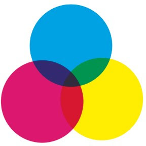
Color process printing is typically done with four inks: cyan, magenta, yellow, and black, abbreviated "CMYK" (I understand the "K" actually stands for "Key Color"--which is always black). Most of the color printing you see in books, magazines, newspapers, billboards, posters, and cereal boxes is CMYK.

The little color wheel up top shows how that works: overlapping transparent inks produce all the colors of the rainbow. C+Y = green, Y+M = red, M+C = violet, and C+Y+M = dark gray. When you use the halftone process to made different shades of those base colors, and add different shades of gray as well, you end up with a pretty large (but finite) palette.

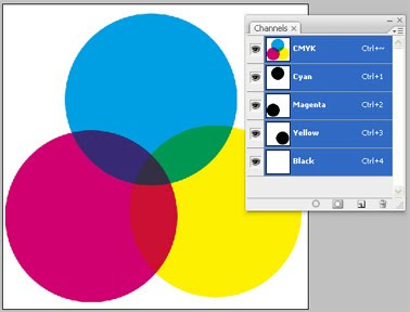
Here's a Photoshop screenshot to help illustrate my point. See the three "Channels" showing cyan, magenta and yellow? The little thumbnail images with each channel show the contributions of cyan, magenta and yellow to the large image--the three big circles. We'll be using Channels later and I wanted to offer a peek.


I'm going to write about CMYK vs. RGB for a second. "RGB" is "red-green-blue," the colors of light your computer monitor generates to compose images. The big difference between RGB and CMYK is that RGB mixes light while CMYK mixes pigment. Remember from junior high science how combining red, green and blue light makes white light? Well, combining red, green and blue (or cyan, magenta and yellow) pigment makes mud.

So if you're doing artwork that will only be seen on a computer--maybe a website or PowerPoint presentation--go ahead and work in RGB. But if there's a chance it'll be professionally printed someday--any chance at all--I'd advise working in CMYK from the start. Pretty much all CMYK colors can be converted to RGB equivalents, but a lot of RGB colors don't convert to CMYK. One day you'll try to print out a nice poster of your best webcomic and the colors will look like yak barf. I warned you.

Now let's do a color separation and make some dots! NOTE: there are other, better ways to do color separations in Photoshop. I did it in this labor-intensive, hands-on fashion because I wanted to accomplish some particular comic-booky effects with my pages. Nobody does real color separations this way, but my original anonymous questioner asked how I faked it for my book. This is how I did it.

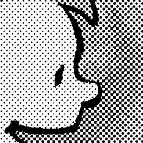
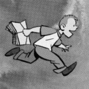
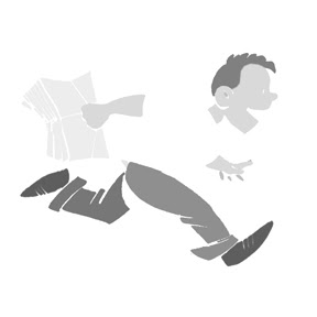
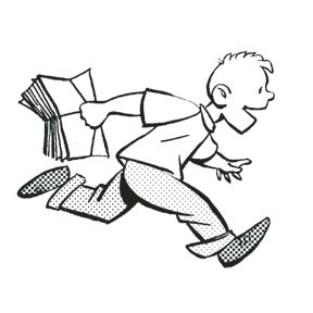
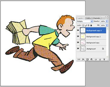
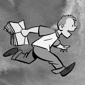
Here's our guinea pig, familiar from yesterday even if you don't remember Buddy from my book WHTTWOT. I deleted the gray ink wash background because we already dealt with grayscale halftone.


Here are the four CMYK channels that comprise that image:

Black. This is the basic line art, the part I drew with ink. Notice that there's also some gray that darkens the browns in Buddy's shoes and pants.


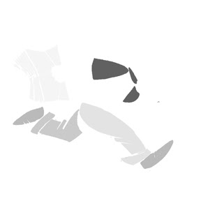
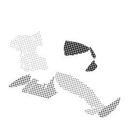
Cyan. But wait a second! If this is the cyan channel, why is this picture gray instead of cyan? Because the intensity of the gray indicates how saturated the cyan is. Remember, CMYK is meant for a printing press; this separation defines how much cyan ink the press will put on the paper. It's dark where the cyan is darkest, like on Buddy's turquoise shirt sleeves, and light where it's lightest.


Magenta. There's a bit in his hair, as you'd expect, and some in the brown of his pants and shoes. None in his shirt.


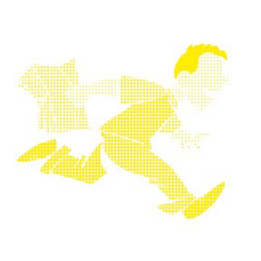
Yellow. Buddy's orange-red hair has a lot of yellow in it. His shirt is entirely yellow (notice there's no cyan or magenta in it). His flesh tone is a mix of magenta and yellow, while his brown pants and shoes combine all four colors.

Making Color Halftones
Hang in there. Now I'm going to take each CMYK channel individually, turn them into halftones like we did yesterday, then recombine them at the end.

I'll use the cyan channel as my example. Here it is again, same as above:


In Photoshop, right-click on the cyan channel (on the small panel I showed above), click "Duplicate," and from the "Destination--Document" pull-down menu select "New." A new window will open looking just like the image above.

Like we did yesterday, convert to Bitmap mode, then Halftone Screen. You should assign each screen a different angle at 15 degree increments to keep their dots from perfectly coinciding. For WHTTWOT (based on old printing practices) cyan is 105 degrees, Magenta 75 degrees, Yellow 90 degrees, and Black 45 degrees. Since we're doing cyan now, enter 105 degrees and whatever frequency that gives the dotty result you want:

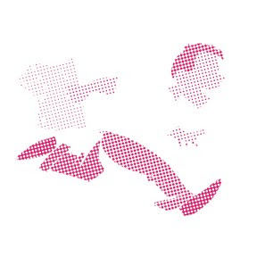
See, just like yesterday. Now we're going to make it blue. Convert from Bitmap to Grayscale to CMYK mode. Then "Select Color Range," sample one of the black dots in the image, and "Edit--Fill" with 100% cyan (and 0% everything else):

Same for the other three channels (the order doesn't matter). Notice the different screen angles of the dots:

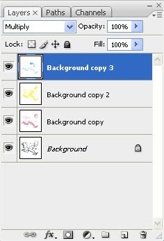
Now we're going to combine these four images into one. Copy or "Duplicate Layer" so they're all lying on top of each other in one file. Picture it like this: you've got four layers of paper, each printed in cyan, magenta, yellow or black, all stacked up.

Now imagine making the paper transparent so you can see all the layers! That's done via the "Layers" control panel shown immediately below and in close-up. See the word "Multiply?" For each layer (except the bottom one), change that setting from "Normal" to "Multiply." Now your layers are transparent and the dots of color are free to mix and blend.

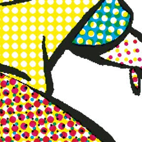
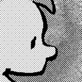
Below is a super close-up of our picture, showing how it works. Using nothing but cyan, magenta, yellow and black dots, we've produced turquoise, orange, browns, and peachy skin tones. Since your four colors are isolated on four different layers, it's easy to mess around with one color without changing the others. That's how I "printed" my old comic book colors out of register and introduced various blobby, smeary "defects."

Then if you're doing a graphic novel with 50 pages of old-timey comic book to fake, just do the same thing 49 more times and you're good to go. Good luck! I'm not dumb enough to try it again.

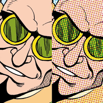
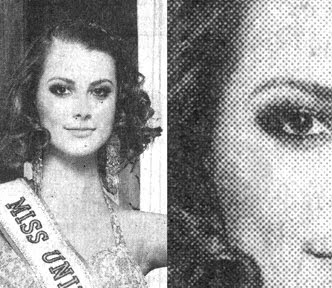
Completely unrelated but kind of cool: you're also now qualified to begin your second career as an art forgery and counterfeiting expert. While there's a long list of things that are reproduced by four-color process printing, there are a lot of things that aren't. For example, money. In addition, authentic silk-screen prints are made by squeezing many different colors of ink through stencils adhered to, yes, a silk screen. Some great old posters used 20 or more different inks to produce all their colors. If you look closely at a poster that says it's silk screened and see arrays of tiny dots like those in the image above, it's a reproduction. Likewise antique prints and etchings. Before the 20th century, printmakers created shades of gray by engraving fine cross-hatching or stippling on their plates. If you look closely and see tiny irregular dots, that's hand-crafted stippling. If you see dots too small and perfectly aligned for a human being to make, that's a modern copy.

If that tutorial wasn't sufficient, Wikipedia has some entries on CMYK, four-color process printing, and halftone. Also, I didn't say anything about Trapping. As always, I welcome additions, corrections, and discussion from people who know more about it than I do. Go nuts. I'm tapped out.

HOWEVER . . . If you've read this far, you might as well go ahead and check out this post from July detailing how I applied these techniques to make a page of my book, including adding imperfections intended to mimic bad printing technology and 70 years of age. It's fun!

Wednesday, August 18, 2010

Dots, Part 1


Leaving a late comment on an old post, Anonymous asked me to "expand on the process of creating the benday dots" in Whatever Happened to the World of Tomorrow. I replied with a brief, inadequate explanation, to which Anon suggested I write up an illustrated tutorial. Just to be clear: I don't do everything that anonymous blog readers tell me to, but this one sounded interesting so I'm giving it a shot.
.
Standard Disclaimer: This isn't the only way, right way, or best way. It's just mine. Nor is this meant to be comprehensive. There's a lot I'm glossing over or don't know. It's an intro.
.
So we're talking about the dots, also known as halftone, screening, shading, Ben Day, benday, or Roy Lichtenstein's meal ticket. The dots were invented to reproduce a wide range of tones and tints in print media using very limited palettes. For example, for a long time newspapers could only print black ink on white paper. Nothing but black. So reproducing black-and-white photos with gradations of gray required printers to get clever in their use of black. The solution: use different sizes of tiny black dots spaced to convey the illusion of grays. That's still true today.

I scanned this photo from yesterday's newspaper. From reading distance, it looks like a black-and-white picture with a full range of gray tones. Close-up, it's a grid of different sized black dots.

Same for comics. In the early days, cartoonists typically shaded via cross-hatching or stippling like their printmaking cousins did. But starting mid-century (20th, that is), the dots arrived. I've seen a few kinds, but the most widely used were sheets of transparent sticky plastic with the dot patterns printed on them. Brand names included Zip-A-Tone, Chart-Pak, and Letratone.

In addition to different shades of gray, there were special-effect patterns that came in different textures and gradients of light to dark. Hundreds of varieties! Artists cut out the shape they wanted to shade, peeled it off its paper backing, and stuck it to the art. I used to use these a lot. In fact, I still have several sheets stuffed under my desk.
.

I nicked this photo of Letratone from cartoonist Eddie Campbell, but could have pulled the same sheets out of my briefcase.
In his later years, Charles Schulz was very playful and creative with his use of dots. In this example, he used them not only to shade the doghouse and Olaf's hat, but to convey the leafy texture of the hedge behind them. These were all the "cut and stick" kind.

What's fascinating is that, after seeming to fall out of fashion for a while, dots are coming back bigger than ever, thanks largely to manga. There's something about their pure, almost-retro cartoon iconography that appeals to young artists. Of course these days nobody is cutting and sticking anything to anything. It's all done by computer. I find it odd and charming that kids these days are using digital techniques to reproduce a graphic style that many of them probably don't know the origin of. Kind of a comics cargo cult.

One Way To Do It
Step One: Get Photoshop. (I'm reminded of Steve Martin's foolproof advice for becoming a millionaire. First, get a million dollars. Then . . .)
.
Anon asked me about other programs that might be more affordable than Photoshop. I don't know anything about them. There are many types of digital art programs; I assume some can make dots and some can't. Thanks to my artistic children and their friends, I have a dim semi-awareness of programs developed specifically for making manga that offer a library of templates and tools for applying a plethora of dotty effects. Haven't used them. Ask someone half my age.

In Photoshop, an artist can work on an image in different "modes." One mode is "CMYK," or cyan-magenta-yellow-black, for color work destined for print. Another mode is "Grayscale," for black-and-white pictures. The mode we care about is "Bitmap," in which images are rendered only in stark, grayless black and white--which, as you'll recall, is all our newspaper-printing ancestors had to work with. Ah ha!

Here's an example using Photoshop CS3, my current version. Things work very similarly in older versions. I know that because I did both of my graphic novels with Photoshop 5.5, a laughably antiquated program. I hear you snickering out there.

To start, I filled a rectangle with 33% black to make a medium gray. I started in CMYK mode and set the cyan, magenta, and yellow channels to 0% (meaning there's no trace of those colors in the gray) and the black "K" channel to 33%, as circled in red.
.
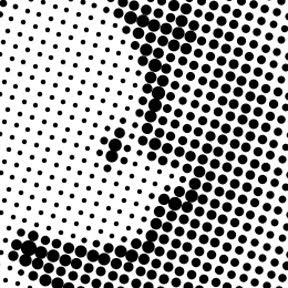
Then I transformed the image from "CMYK" mode to "Grayscale" mode, and then to "Bitmap." You can't go directly from CMYK to Bitmap; don't know why. No big deal. Bitmap mode offers several options. We want "Halftone Screen." The window below pops up.
.

Now the fun starts. You can pick the shape of your dots (diamond, ellipse, line, square, cross . . .). Right-thinking purists choose "round." You can pick the angle your dots make on the page. For black dots, choose 45 degrees unless you're a crazed lunatic.
.
"Frequency" means how small your dots are. Bigger numbers = smaller dots (more per inch or cm). This is tricky. Higher frequency gives you smoother shading; on the other hand, if your dots are too small, they may look blotchy or produce moire patterns. It's important to think about how your art will be seen and reproduced, and the effect you want to convey (e.g., you may or may not want the dots to be apparent). This decision will require some judgment and trial and error. If you're doing art that you already know will be reproduced in a particular medium, ask your editor/publisher/designer/art director/printer their halftone line screen specifications. They'll give you a number; you do the math, taking into account any size difference between your original and published art. When in doubt, err on the side of bigger dots (i.e., smaller frequency).
.
An example of my 33% gray straight (left) and halftoned at two different lines per inch. The halftone frequency in the middle is four times that of the right. It doesn't look like it close up, but if you stood far enough away or shrank the image small enough, these three fields would be the same shade of gray. .
.
I know some artists who do exactly what I did above to create a library of dot patterns they can then use to shade their comics--an almost exact analog of the old technique of cutting them out with a knife and pasting them down, using Photoshop layers or brushes to apply their pre-made dot patterns to their work. I guess it works for them. Personally, I don't see the point. It seems unnecessarily time consuming and artistically limiting (what if you want to use some tone or pattern you don't have a sheet for?). I say: shade your black-and-white artwork however you want--doesn't have to be on a computer, you could just as well color it with markers or paint and then scan it--and then do the halftone screening in one step when you're done.
.
Fun Time!
As a demo, I put together a black-and-white drawing colored in shades of gray with an ink wash background. I added the wash because I wanted something with some subtle variation to it.
.

This was originally a pretty high-resolution image: about 2 by 2 inches at 800 dpi. That matters, for reasons that I'll try to explain later. My fundamental advice when doing any digital art: Work at the highest resolution your computer can handle. Then, as the last step, convert to whatever resolution and format are needed for your final product.
.
So here it is, halftoned exactly as described above: Grayscale to Bitmap to Halftone Screen, with round dots at 45 degrees. There's no point in reporting the Frequency, since your results will be different with different size art done at a different resolution and not rescaled for reproduction on a blog. I just wanted you to be able to see the dots.
.

And here's an extreme close-up of same. Note the different size dots to the right that reproduce the uneven shading of the ink wash. Notice also that Photoshop's "Halftone Screen" mode did not mess up the original black line art, which is as smooth and unpixelated as ever. That's one reason for working at high resolution: going into Bitmap mode eliminates any gray "anti-aliasing" that softens the black lines. Low-resolution line art will emerge from Bitmap as a choppy, sawtoothed mess.

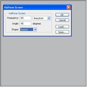
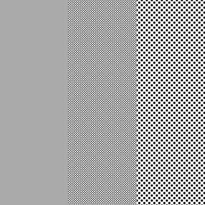
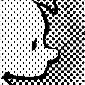
To give some idea of the different looks you can achieve, here's the same image at half the halftone frequency above:
.

And half again:
.

When you're all done, don't forget to switch back to Grayscale, CMYK, or other mode as appropriate, since you'll find you can't do much useful in Bitmap mode.
It wouldn't be fair to move on without acknowledging that Photoshop does have one button that offers to do it all for you faster and easier than the whole Bitmap rigamarole. It's under Filter--Pixelate--Color Halftone, and it looks like this:

If you want, fool around with the "Max. Radius" value and see what happens. The results look like this:
.

Here's a close-up that reveals why I don't like or use it. See how it renders not just the grays, but also the black line art, as dots?
.

That's unacceptable for my purposes, and not consistent with the old comic book printing techniques I was mimicking in WHTTWOT. However, this may be exactly the right look for your project. If so, it's an easy way to go.
.
For some terrific additional reading on the subject, please see these blog posts by Eddie Campbell, who applies dots exceedingly artistically and, in my opinion, is one of the few people in the business really trying to make literary comics for grown-ups (warning: there are some drawings of nekkid people at that link). Comments and corrections from artists who know more about the subject than I do will be happily accepted.
.
.

Next: Color! (Click on this sentence to go to the next post.) Spoiler alert: It's four times as complicated.
.

Monday, August 16, 2010

Ends & Odds

Just some bite-sized tapas today. One reader left a comment on an old post suggesting I write up a tutorial on how I did the "Ben Day" dot patterns for the comic book sections of WHTTWOT. If I can find time, I think I'll do that in the next couple of days. Some people like the crafty stuff--or at least Google it a lot after the fact. Meanwhile...

* * *

The 60th anniversary of the comic strip "Peanuts" is coming up, and I'm helping it celebrate. On September 11 from 1 to 3 p.m., the Charles M. Schulz Museum and Research Center in Santa Rosa, Calif., is hosting a "Sketch-A-Thon" at which a whole bunch of cartoonists will set up in the museum's Great Hall to draw pictures, talk to folks, and maybe sell a few books. In addition to me (blush), people scheduled to participate include Michael Capozzola, Alexis Fajardo, Shaenon Garrity, Mike Gray, Rhoda Grossman, Debbie Huey, Jonathan Lemon, Paul Madonna, Brian Narelle, and Lark Pien. I understand we'll also be asked to draw something Peanuts-themed to mark the occassion and contribute to the museum's collection, which I'd consider quite an honor.
.
Come on by and keep me company.
.
* * *
.
Last weekend, Karen and I helped our 22-year-old twin daughters move to San Francisco for graduate studies and work. I have a question for parents with adult children older than mine: Do they ever stop being your little babies? Because while the physical part of the move wasn't too tough, I confess that abandoning my kids to the urban jungle took some fortitude. I'm excited for them: two young, smart, single gals could really flourish in one of the world's great cities. I also imagine they sometimes wonder what they hell they've gotten themselves into.

I just want to kiss their boo-boos and make them better. Can't always do that. Shouldn't, either.
.
* * *
.
I realized this morning that I've spent most of my life confusing the actors Leo G. Carroll and E.G. Marshall. How I've survived this long is beyond me.
.
Carroll and Marshall--or vice versa.

.

Wednesday, August 11, 2010

Mo Willems

Karen and I had a very nice time last night at a small, casual gathering to welcome writer-illustrator Mo Willems and his wife Cher as they visited our area. Mo is a multi-award-winning (Caldecott, Carnegie, etc.) author of children's books, some of which he illustrates himself and some of which are drawn by others. He regularly makes bestseller lists with books featuring his characters Knuffle Bunny, Elephant and Piggy, and an odd-looking pop-eyed Pigeon. He puts out five or six books a year, which may make him the most prolific person I've ever met.


Before yesterday, I didn't know that about Mo. His kids lit career got going after my own children were too old for his books. What we know him for around my house, and why my now-grown girls were excited I got to meet him, was that several years ago he was the head writer for the animated Cartoon Network series "Codename: Kids Next Door." (He also created the series "Sheep in the Big City" and won Emmys for a decade of work on "Sesame Street.") Laura and Robin charged me with telling Mo that their favorite KND character was "Number Four," which I made sure to do first thing, to which Mo nodded knowingly and replied, "Ah yes, the 'bad boy!'"

The cast of "Codename: Kids Next Door." Number Four is the blond.

We later had a nice talk about that show, which intrigued me at the time because it could be incredibly dark and bleak, especially for a kids' program. You didn't see many 1984-style dystopian alternative futures in, say, Spongebob Squarepants.

But I spent much of my time with Mo playing petanque. Mo knows the game well, Cher coached me, and I seem to have a natural rough-hewn gift. I'm thinking of turning pro.

One of the nicer benefits of my cartooning semi-career has been meeting people like Mo who are in similar lines of work. When I was young, I sort of thought that if I ever reached a certain level of comics notoriety, I'd be taught the secret-society handshake and welcomed to the clubhouse. If someone had truthfully told me there's no such thing, I wouldn't have believed them. On the other hand, if they'd told me I'd someday be getting backspin tips from a person with a resume like Mo's, I wouldn't have believed that, either.

Mo gave me a copy of a little self-published sketchbook of his titled Float, and signed it to my girls. The drawing at top right is the "Kids Next Door" character Number One, because he's cooler than Number Four.

.

Thursday, August 5, 2010

Breakfast at the Forum

I had a terrific time this morning speaking at a meeting of the Sonoma County Forum, a group of women community leaders who gather for breakfast at a local hotel twice a month. The list of speakers they invite to their meetings is pretty impressive, and I was honored that Celeste--whom I met when I did my cartoonist-in-residence gig at the Schulz Museum--thought to ask me.

This was a challenging, unique speech for me. Most of my talks are to either "comics people" or "cancer people," who are interested in very different things. Not that I do anything by rote, but I've got "off-the-shelf" presentations for those two types of audiences that I can dust off and tailor pretty readily. But I'd never spoken to a group quite like the Forum before, which wasn't focused on either of those topics but just wanted an interesting speaker. I think I put together a nice custom blend of comics, publishing, Mom's Cancer, World of Tomorrow, and me that seemed well received. It was fun.

One very nice surprise was that a couple of the Forum members actually knew my Mom and family. One was a family friend whose daughter went to school with my sister Lis ("Kid Sis"), another knew my parents more recently. They shared lovely comments and memories, and made it an extra special event for me.

Many thanks to Celeste and the ladies of the Forum for their warm reception. I shy away from doing local talks, books signings, press and so forth (not that there's much demand) because I'm uneasy when my Book Life intersects my Real Life. I grew up in this town and have to live here. But the couple of times I've broken that rule (more a guideline, really) have turned out so nicely I may have to rethink it.
.

Wednesday, August 4, 2010

Hitchens on Cancer

Author and provocateur Christopher Hitchens is a better writer than I am. That became clear as I read this article from Vanity Fair describing his diagnosis and early treatment for metastatic cancer. It is touching, witty, evocative, nearly free of self-pity and, from what I've seen of similar circumstances, honest and accurate. I liked this passage, describing the emergency medical team responding to the crisis that revealed his cancer:

I had the time to wonder why they needed so many boots and helmets and so much heavy backup equipment, but now that I view the scene in retrospect I see it as a very gentle and firm deportation, taking me from the country of the well across the stark frontier that marks off the land of malady.

I wish I'd thought of that metaphor for Mom's Cancer. Very visual. It would've been good to draw.

Hitchens notices some of the same things I did during my mother's experience: why all the war metaphors, why is cancer always a "battle," yet what better language exists to express what's happening? What's this sudden intimacy, where strangers feel entitled to lay their hands all over you without an introduction or explanation? He also writes about feelings or experiences that could only be described by the afflicted, which I'm always quick to say I wasn't.

Hitchens is a polarizing personality. Some people passionately hate him for his politics and others for his outspoken atheism. Some cheered when he announced his cancer diagnosis. I appreciate his talents and public persona both because and in spite of the positions he argues. I just like the fact that he argues--passionately, wittily, and well. I also like good writing on any topic wherever I find it. I think his Vanity Fair piece, on a topic I've covered as well, is very good.
..

Tuesday, August 3, 2010

Read This on Your Individual Computation Engine

Saw this, enjoyed it, thought of you. I know not everyone shares my cheery optimism about the World of Tomorrow. In fact, these days it seems like hardly anybody does; that's why I wrote the book. But I think this short film helps put things in perspective by pointing out what a fantastic science-fictional paradise we actually live in today. If this doesn't convince you of our big, bright, beautiful tomorrow, nothing will.

You're welcome.


Thanks to Ian Williams for showing it to me!
.

Monday, August 2, 2010

Comic-Con Finale

You know the end of the Independence Day fireworks show, when they shoot off half their rockets in a booming, fiery frenzy of celebratory ecstasy? This post is nothing like that.

I did take one more video at Comic-Con, and then I'm done. Mostly for my own curiosity and fun, I started recording at one end of the Exhibit Hall and walked straight through the center--the belly of the beast--to the other end, just to see how long it would take. The answer was about 14-and-a-half minutes. Our tour starts in Artists Alley, goes through the dazzlingly loud and flashy movie and TV section, and slowly eases into the quieter west half of the hall where people still buy, sell, and talk about comics.

I promise, you'll only find this video interesting if you're a patient person extremely curious about the Comic-Con experience. Even then, although I panned from side to side to capture what I could, I didn't catch a tenth of it. There are two or three other aisles paralleling this one that would have provided entirely different tours, plus an equal area dedicated to panels upstairs and more events happening off site. My apologies for the jiggles and poor aiming; I was holding my camera over my head and trying not to crush or be crushed.


After getting back home and reading other people's Comic-Con reports, I found that Scott Edelman had had exactly the same idea, and posted his march in two parts. His took 14 minutes, about the same as mine, so I think we can define that as an official benchmark. Interestingly, he started at the opposite end of the hall than I did. I don't know when he shot his video, but how cool would it be if we passed each other somewhere in the middle? Someday I may watch all of his and look for myself.


I can't recommend anyone sit here for 15 minutes to watch mine (or 30 minutes to watch Scott's and mine). But if you want a sense of what Comic-Con is like, just expand this video to fill your wide-screen monitor, turn your speakers up as loud as they'll go, choke down a big stale soft pretzel, and pound your feet with a hammer until it hurts to walk. It's almost the same as being there.
.