.
This is kind of a tough topic because it's about knowing how something on your computer monitor is going to look when it winds up in print--which I can only try to explain here using a computer monitor. Still, I'm gonna give it a shot because it's what I've been working on the last couple of days, and yet another way in which I'm trying to turn problems I had on Mom's Cancer into solutions for Whatever Happened to the World of Tomorrow?
I've posted before about how full-color pictures are typically printed using four colors of ink: cyan, magenta, yellow, and black (CMYK). If you've got an inkjet printer, same deal. The first three colored inks are transparent, so that printing cyan atop yellow produces green, for example. Black ink is . . . oh, I don't know . . . not quite transparent but definitely not opaque. Semi-transparent? The key is that, although black covers better than the other inks, it doesn't cover totally. You can't just paint an area black and expect it to cover everything underneath.
I don't think I'm giving away anything about a book titled Whatever Happened to the World of Tomorrow by revealing that some of it deals with outer space. Now, on my computer monitor, when I color an area with 100% black, it looks as black as the inkiest ink puddle at the bottom of an ink well on Planet Ink. But when I hand off those digital files to Designer Neil, he can push a button ("overprint preview" in Adobe InDesign) to approximate what they'll look like when reproduced with actual ink on paper. The result: something that appears solid black on screen comes out kind of charcoal gray in print.
Okay, I knew that. Learned it on Mom's Cancer. Black by itself doesn't cover as well as you'd like or expect. To help black ink look really black, you need to fortify it with other colors to make what's called a "rich black." It's like laying down a primer coat when painting a wall at home. As shown below, different color combinations yield different tints of black.

You might be tempted to mix all the colors with black--100% black plus 100% cyan plus 100% magenta plus 100% yellow--but that would be a gloppy mistake. You need to remember you're working with liquid inks on absorbent paper. Reality trumps theory. No one wants an ink slick.
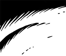
What I didn't really have a handle on until Neil and I started talking was how those different tints of black would look together. For example, below is a panel with black and black on black: the shaded side of the Earth and the shaded side of the Moon on the blackness of space behind them. My goal was to make those three blacks very subtly different. To that end, the blackness of space has some cyan and magenta mixed into it, the blackness of Earth has a bit more cyan (hard to tell in this low-res image), while the blackness of the Moon has a greyish earthtone.

It took some effort to get the tones of those blacks to balance. If they're too different, the different elements can either wash out or become too prominent. For example, in my first try, the star background was too gray and the planets looked like stickers stuck on a piece of faded construction paper. I'm pretty happy with the look I achieved above.
Anyway, that's what I did today: went through the entire book looking at every big patch of black to decide if it needed other colors mixed with it (not all did), what those colors should be, and how they worked with other blacks, grays, and colors around them.
While I'm on the subject, I'll talk about grays. There are a couple of ways to skin that particular cat, and it helps to have a sense of how they'll each look in print. One way is to use only black ink printed in tiny dots of various sizes to give the illusion of different shades of gray, as in a black-and-white newspaper photo. The other is to mix cyan, magenta, and yellow inks (plus black for darker tones) to produce a gray.
In the image below, the top left square and top right square look like about the same shade of gray. They're not. The close-up views below show that the left gray box is composed of little black dots, while the right gray box is composed of overlapping cyan, magenta and yellow dots.

While the grays look interchangeable on a computer monitor, they give you different effects in print. A black-only gray is colder and crisper, while a cyan-magenta-yellow gray is warmer and softer. It's a hard difference to describe but can be quite apparent on the page, especially when two different types of gray are next to each other. I had some trouble with that in Mom's Cancer, and tried to turn it to my advantage in WHTTWOT as a subtle effect I could deliberately wield where I wanted.
We'll see how it all works in actual print, and if it was worth the effort.
I understand Neil has already transmitted some final files to the printer. We'll still have opportunities to make changes to the proofs if needed, but the book is essentially locked down now. A milestone achieved.


 Jeff at work. Barnes & Noble counted 2,800 people last night. Insane.
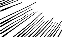
 The lines above were made by (top to bottom) a brush, a stiff crow-quill nib, and a more flexible crow-quill nib. I make them thick or thin just by pressing harder or lighter as I draw. I can use these different line weights in a few ways: first, to indicate light and shadow; second, to suggest mass; third and more subtly, to represent something I'm not sure what to call but the best word I can think of is "tension."
 In this drawing, light's coming from above. My line is thinnest at the crown of the head both because it's nearest the light and the skin stretches tight and thin against the skull. In fact, it's so thin the line actually disappears for a bit. Ditto for the bridge of the nose: it's facing the light and the skin is taut. The line is thicker under the nose and lower lip, where shadows fall, and along the jawline, which is both farthest from the light and fleshier. However, it's thinner on the chin itself because the skin is firmer there. The lines defining the sides of the head gradually widen from top to bottom, indicating the transition from light to shadow and also the fact that the face gets looser toward the bottom. This is a slightly saggy middle-aged person; if I wanted to draw a teenager, I'd keep the line lighter toward the bottom because the skin is tighter.
 "Steve Canyon" by Milt Caniff. If I had 1%
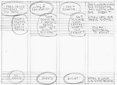 The words go first because it's critical that they have enough room and the eye follows them around the page as intended. Then I pencil the art. It's still pretty loose at this point:
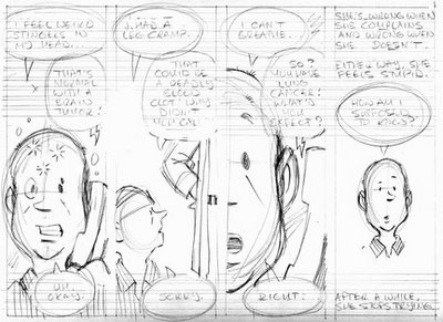 I rule borders and other straight lines using a fountain pen, and letter with waterproof black India ink using Speedball nibs B-6 and B-5 (for bold).
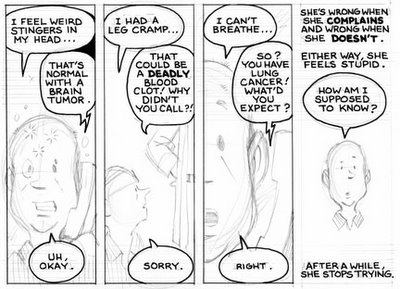
 After erasing pencil lines with a kneaded eraser, I scan the art into Photoshop to add shading and any color needed. I also do a fair amount of editing at this stage...fixing mistakes, erasing blemishes, and sometimes rewriting entire bits of dialogue by cutting and pasting words or even individual letters. A few years ago, this would've been done with X-Acto knives, rubber cement and White Out. Computers are much better.
 When I had the time to sit down and work non-stop, I could finish two or three pages per day. However, I very rarely got such time and did the best I could, when I could. The hardest part? Laying down Line One on Day One, knowing that I had more than 100 pages and many months to go. Anne Lamott tells a story about her 10-year-old brother struggling to complete a huge report on birds the night before it was due. Overwhelmed and immobilized, he asked his father how he could possibly get it done. Dad answered, "Bird by bird, buddy. Just take it bird by bird." That's how I did Mom's Cancer: bird by bird.


 Click the pic to embiggen it.
 Beautiful Matamata: land of Hobbits and librarians who like my book.
 Valerie asked for Axis Ape, who appeared in exactly one panel of WHTTWOT. Great request!
 Kid Sis for Susan, who was the kid sis in her family.
 Dr. Xandra for Jim, who's studying to become an actual rocket scientist. Not an evil one, I hope.
 Brian asked for a drawing of Buddy, representing himself as a boy, reading Popular Science with his cat Flash looking over his shoulder.
 Duck Dodgers in the 24½th Century for Charles, who collects duck art. I thought of the subject myself.
 Me, for my college buddy Tina, who knew me when.